Introduction to Recommendation Engines

This is the second article of article series Getting started with the top eCommerce use cases. If you are interested in reading the first article you can find it here.

What are Recommendation Engines?

Recommendation engines are the automated systems which helps select out similar things whenever a user selects something online. Be it Netflix, Amazon, Spotify, Facebook or YouTube etc. All of these companies are now using some sort of recommendation engine to improve their user experience. A recommendation engine not only helps to predict if a user prefers an item or not but also helps to increase sales, ,helps to understand customer behavior, increase number of registered users and helps a user to do better time management. For instance Netflix will suggest what movie you would want to watch or Amazon will suggest what kind of other products you might want to buy. All the mentioned platforms operates using the same basic algorithm in the background and in this article we are going to discuss the idea behind it.

What are the techniques?

There are two fundamental algorithms that comes into play when there’s a need to generate recommendations. In next section these techniques are discussed in detail.

Content-Based Filtering

The idea behind content based filtering is to analyse a set of features which will provide a similarity between items themselves i.e. between two movies, two products or two songs etc. These set of features once compared gives a similarity score at the end which can be used as a reference for the recommendations.

There are several steps involved to get to this similarity score and the first step is to construct a profile for each item by representing some of the important features of that item. In other terms, this steps requires to define a set of characteristics that are discovered easily. For instance, consider that there’s an article which a user has already read and once you know that this user likes this article you may want to show him recommendations of similar articles. Now, using content based filtering technique you could find the similar articles. The easiest way to do that is to set some features for this article like publisher, genre, author etc. Based on these features similar articles can be recommended to the user (as illustrated in Figure 1). There are three main similarity measures one could use to find the similar articles mentioned below.


Figure 1: Content-Based Filtering


Minkowski distance

Minkowski distance between two variables can be calculated as:

(x,y)= (\sum_{i=1}^{n}{|X_{i} - Y_{i}|^{p}})^{1/p}


Cosine Similarity

Cosine similarity between two variables can be calculated as :

  \mbox{Cosine Similarity} = \frac{\sum_{i=1}^{n}{x_{i} y_{i}}} {\sqrt{\sum_{i=1}^{n}{x_{i}^{2}}} \sqrt{\sum_{i=1}^{n}{y_{i}^{2}}}} \


Jaccard Similarity


  J(X,Y) = |X ∩ Y| / |X ∪ Y|


These measures can be used to create a matrix which will give you the similarity between each movie and then a function can be defined to return the top 10 similar articles.


Collaborative filtering

This filtering method focuses on finding how similar two users or two products are by analyzing user behavior or preferences rather than focusing on the content of the items. For instance consider that there are three users A,B and C.  We want to recommend some movies to user A, our first approach would be to find similar users and compare which movies user A has not yet watched and recommend those movies to user A.  This approach where we try to find similar users is called as User-User Collaborative Filtering.  

The other approach that could be used here is when you try to find similar movies based on the ratings given by others, this type is called as Item-Item Collaborative Filtering. The research shows that item-item collaborative filtering works better than user-user collaborative filtering as user behavior is really dynamic and changes over time. Also, there are a lot more users and increasing everyday but on the other side item characteristics remains the same. To calculate the similarities we can use Cosine distance.


Figure 2: Collaborative Filtering


Recently some companies have started to take advantage of both content based and collaborative filtering techniques to make a hybrid recommendation engine. The results from both models are combined into one hybrid model which provides more accurate recommendations. Five steps are involved to make a recommendation engine work which are collection of data, storing of data, analyzing the data, filtering the data and providing recommendations. There are a lot of attributes that are involved in order to collect user data including browsing history, page views, search logs, order history, marketing channel touch points etc. which requires a strong data architecture.  The collection of data is pretty straightforward but it can be overwhelming to analyze this amount of data. Storing this data could get tricky on the other hand as you need a scalable database for this kind of data. With the rise of graph databases this area is also improving for many use cases including recommendation engines. Graph databases like Neo4j can also help to analyze and find similar users and relationship among them. Analyzing the data can be carried in different ways, depending on how strong and scalable your architecture you can run real time, batch or near real time analysis. The fourth step involves the filtering of the data and here you can use any of the above mentioned approach to find similarities to finally provide the recommendations.

Having a good recommendation engine can be time consuming initially but it is definitely beneficial in the longer run. It not only helps to generate revenue but also helps to to improve your product catalog and customer service.

Getting started with the top eCommerce use cases

Nowadays, almost all the projects in eCommerce companies are data-dependent and everyone wants to leverage data science techniques to mine as much information as they can from that data. From tracking their customer’s shopping behavior to recommending them what to buy, from finding new leads for their market to calculating their lifetime value, from improving customer experience to increase their profitability. When we navigate through any website, we leave our traces and companies track these touchpoints to get insights about how we behave online. Companies sometimes have different landing pages based on the gender of the user.

This post will be focused on some of the use cases in marketing which are gaining attention over the past few years. I have been associated with different eCommerce companies as a data science consultant.

Upcoming months has a lot to offer as I will be writing blogs about the following use cases:

  1. Multi-touch attribution: A data-driven approach
  2. Introduction to Recommendation engines
  3. How Important is Customer Lifetime Value?
  4. Customer Segmentation
  5. Dynamic Pricing


If you are interested in reading the success story for the Multi-touch attribution project you can find it here.

Best machine learning algorithms you should know

Machine learning is a key technology tool businesses use to build tools that enhance their operations. To do that, they take advantage of machine learning algorithms that come in different shapes and sizes, servicing different purposes and working on different data sets. Choosing the right algorithm for the job is what makes machine learning and deep learning projects successful. That’s why being aware of all the different types of machine learning algorithms is so important – that’s how you get better results and build more advanced solutions.

Here’s an overview of the best machine learning algorithms you should know before starting your project.

What is meant by machine learning algorithms?

First things first, what is machine learning and how do algorithms fit into the picture? A machine learning (ML) algorithm is a process or set of procedures that allow a model to adapt to the data with a specific objective set as the goal.

An ML algorithm specifies how the data is transformed from the input to output, helping the model to learn the appropriate mapping from input to output. That model specifies the mapping functions and holds the parameters in place, while the machine learning algorithm updates the parameters to help the model match its goal.

What are the algorithms used in machine learning?

Algorithms can model problems in many different ways. The easiest way to differentiate between different ML algorithms is by comparing them by learning styles that they can adapt. Generally, machine learning algorithms can adapt to several learning styles that help to solve different problems.

Here are four learning styles in machine learning you need to know:

1 Supervised learning

In supervised learning, the input data serves as training data and comes with a known label or result – for example, the price at a time or spam/not-spam.

In this variant, the training process is critical for preparing a model that makes predictions and then is corrected when the predictions are wrong. The training process continues until the model achieves the appropriate level of accuracy. Classification and regression are examples of problems for this learning type.


2 Unsupervised learning

In unsupervised learning, input data isn’t labeled and doesn’t come with a known result. Data scientists prepare models by deducing the structures in the input data to extract general rules or reduce redundancy through mathematical processes. Unsupervised learning addresses problems such as association rule learning, dimensionality reduction, and clustering.

3 Semi-supervised learning

In this learning style, the input data is a mixture of labeled and unlabeled examples. The prediction problem is known, but the model needs to learn the structures for organizing data and making predictions on its own. This learning style is used to address problems such as regression and classification.

4 Reinforcement learning

One of three basic machine learning paradigms together with supervised learning and unsupervised learning, reinforcement learning (RL) is an area of machine learning that focuses on the ways in which software agents should take actions to maximize a specified notion of cumulative reward in a given environment.

The best machine learning algorithms you should know

1 Linear Regression

Linear regression is an algorithm that correlates between two variables in the data set, examining the input and output sets to show a relationship between them. For example, the algorithm can show how changing one of the input variables affects the other variable. The relationship is represented by plotting a line on the graph.

Linear regression is one of the most popular algorithms in machine learning because it’s transparent and requires no tuning to work. Practical applications of this algorithm are risk assessment or sales forecasting solutions.

2 Logistic regression

Logistic regression is a type of constrained Linear Regression with a non-linearity application after you apply weights. Note that this algorithm is used for classification, not regression. The algorithm restricts the outputs close to +/- classes (and 1 and 0 in the case of sigmoid) and can be trained with Gradient Descent or L-BFGS.

Logistic regression is used in Natural Language Processing (NLP) applications, where it often appears under the name of Maximum Entropy Classifier.

3 Principal component analysis (PCA or LDA)

Principal component analysis is an unsupervised method that helps data scientists to understand better the global properties of a data set that consists of vectors. It analyzes the covariance matrix of data points to learn which dimensions/data points have high variance among themselves and low covariance with others. The algorithm helps data scientists to get data points with reduced dimensions.

4 K-means clustering

K- means clustering is a type of unsupervised clustering algorithm that sorts data sets through defined clusters. It offers results in the form of groups based on internal patterns.

For example, you can use a K-means algorithm for sorting web results for the word “cat,” and it will show all the results in the form of groups. The main advantage of this algorithm is its accuracy as it provides data groupings faster than other algorithms.


5 Decision trees

A decision tree is made of various branches that represent the outcome of many decisions. This algorithm collects and graphs data in multiple branches to predict response variables on the basis of past decisions. It comes in handy for mapping our decisions and presents results visually to communicate findings easily.

Decision trees work best for smaller data sets and relatively low-stake decisions – otherwise, the long-tail visuals can be hard to decipher. The key advantage of this algorithm is that it allows showing multiple outcomes and tests without having to involve data scientists – it’s easy to use.

6 Random forests

A random forest consists of a great number of individual decision trees where they all operate as an ensemble. An individual tree in the random forest generates a class prediction – the class which receives the highest number of votes becomes the model’s prediction. Having many relatively uncorrelated models (trees) operating as a committee easily outperforms individual constituent models.

The low correlation between these models is the strength of this approach because it allows producing ensemble predictions that are far more accurate than individual predictions. Note that decisions trees protect each other from individual errors. While some trees may generate false predictions, others will generate the right ones – as a group; they will be able to move in the right direction.

7 Support Vector Machine

Support Vector Machines (SVMs) are linear models similar to linear or logistic regression we’ve discussed earlier. However, there’s one difference – they have a different margin-based loss function, which can be optimized by using methods such as L-BFGS or SGD. SVMs internally analyze data sets into classes, which is helpful for future classifications.

The main idea behind SVM is separating data into classes and maximizing the margins of entering future data into classes. This type of algorithm works best for training data. However, it can also serve as a tool for processing nonlinear data. The financial sector makes use of Support Vector Machines thanks to its accuracy in classifying both current and future data sets.

8 Apriori

The Apriori algorithm is used a lot in market analysis. It’s based on the principle of Apriori and checks for positive and negative correlations between products after analyzing values in data sets.

For example, if two values often correlate in a data set, the algorithm will conclude that A will often lead to B, referring to the information in data sets. For example, if customers often buy product A and product B together, this relation will hold a high percentage and help companies like Google or Amazon to predict product searches and purchases.

9 Naive Bayes Classifier

This handy classification technique is based on Bayes’ Theorem, which assumes independence among predictors. The algorithm will assume that the presence of a specific feature in a class is not related to the presence of any other feature in the same class.

For example, a fruit may be considered a banana if it’s yellow, curved, and about 15 cm long. These features depend on each other, and on the existence of hooter features, they all independently contribute to the probability that this fruit is a banana. That’s why the algorithm bears the name “Naive.”

The algorithm offers a model that is easy to build and helpful in handling very large data sets. It can outperform the most sophisticated classification methods.

10 K-Nearest Neighbors (KNN)

This is one of the simplest algorithm types used in machine learning for classification and regression. KNN algorithms classify new data points on the basis of similarity measures, such as the distance function. They perform classification by using a majority vote of the data points’ neighbors. They then assign data to the class, which has the nearest neighbors. Together with increasing the number of nearest neighbors (the value of k), the accuracy may increase as well.

11 Ordinary Least Squares Regression (OLSR)

Ordinary Least Squares Regression (OLSR) is a generalized linear modeling technique data scientists use for estimating unknown parameters that are part of a linear regression model. OLSR describes the relationship between a dependent variable and one or more of its independent variables.

The algorithm is applied in diverse fields such as economics, finance, medicine, and social sciences. Companies use it in machine learning and predictive analytics to dynamically predict specific outcomes on the basis of variables that change dynamically.

We hope that this machine learning algorithms list helps you pick the right tools of the trade for your next machine learning project. If you’d like to learn more about Machine Learning, Data Science and Web Development, visit the Sunscrapers company blog.

Wie passt Machine Learning in eine moderne Data- & Analytics Architektur?

Einleitung

Aufgrund vielfältiger potenzieller Geschäftschancen, die Machine Learning bietet, arbeiten mittlerweile viele Unternehmen an Initiativen für datengetriebene Innovationen. Dabei gründen sie Analytics-Teams, schreiben neue Stellen für Data Scientists aus, bauen intern Know-how auf und fordern von der IT-Organisation eine Infrastruktur für “heavy” Data Engineering & Processing samt Bereitstellung einer Analytics-Toolbox ein. Für IT-Architekten warten hier spannende Herausforderungen, u.a. bei der Zusammenarbeit mit interdisziplinären Teams, deren Mitglieder unterschiedlich ausgeprägte Kenntnisse im Bereich Machine Learning (ML) und Bedarfe bei der Tool-Unterstützung haben. Einige Überlegungen sind dabei: Sollen Data Scientists mit ML-Toolkits arbeiten und eigene maßgeschneiderte Algorithmen nur im Ausnahmefall entwickeln, damit später Herausforderungen durch (unkonventionelle) Integrationen vermieden werden? Machen ML-Funktionen im seit Jahren bewährten ETL-Tool oder in der Datenbank Sinn? Sollen ambitionierte Fachanwender künftig selbst Rohdaten aufbereiten und verknüpfen, um auf das präparierte Dataset einen populären Algorithmus anzuwenden und die Ergebnisse selbst interpretieren? Für die genannten Fragestellungen warten junge & etablierte Software-Hersteller sowie die Open Source Community mit “All-in-one”-Lösungen oder Machine Learning-Erweiterungen auf. Vor dem Hintergrund des Data Science Prozesses, der den Weg eines ML-Modells von der experimentellen Phase bis zur Operationalisierung beschreibt, vergleicht dieser Artikel ausgewählte Ansätze (Notebooks für die Datenanalyse, Machine Learning-Komponenten in ETL- und Datenvisualisierungs­werkzeugen vs. Speziallösungen für Machine Learning) und betrachtet mögliche Einsatzbereiche und Integrationsaspekte.

Data Science Prozess und Teams

Im Zuge des Big Data-Hypes kamen neben Design-Patterns für Big Data- und Analytics-Architekturen auch Begriffsdefinitionen auf, die Disziplinen wie Datenintegration von Data Engineering und Data Science vonein­ander abgrenzen [1]. Prozessmodelle, wie das ab 1996 im Rahmen eines EU-Förderprojekts entwickelte CRISP-DM (CRoss-Industry Standard Process for Data Mining) [2], und Best Practices zur Organisation erfolgreich arbeitender Data Science Teams [3] weisen dabei die Richtung, wie Unternehmen das Beste aus den eigenen Datenschätzen herausholen können. Die Disziplin Data Science beschreibt den, an ein wissenschaftliches Vorgehen angelehnten, Prozess der Nutzung von internen und externen Datenquellen zur Optimierung von Produkten, Dienstleistungen und Prozessen durch die Anwendung statistischer und mathematischer Modelle. Bild 1 stellt in einem Schwimmbahnen-Diagramm einzelne Phasen des Data Science Prozesses den beteiligten Funktionen gegenüber und fasst Erfahrungen aus der Praxis zusammen [5]. Dabei ist die Intensität bei der Zusammenarbeit zwischen Data Scientists und System Engineers insbesondere bei Vorbereitung und Bereitstellung der benötigten Datenquellen und später bei der Produktivsetzung des Ergebnisses hoch. Eine intensive Beanspruchung der Server-Infrastruktur ist in allen Phasen gegeben, bei denen Hands-on (und oft auch massiv parallel) mit dem Datenpool gearbeitet wird, z.B. bei Datenaufbereitung, Training von ML Modellen etc.

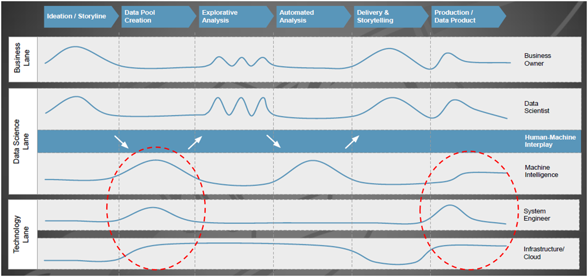
Abbildung 1: Beteiligung und Interaktion von Fachbereichs-/IT-Funktionen mit dem Data Science Team

Mitarbeiter vom Technologie-Giganten Google haben sich reale Machine Learning-Systeme näher angesehen und festgestellt, dass der Umsetzungsaufwand für den eigentlichen Kern (= der ML-Code, siehe den kleinen schwarzen Kasten in der Mitte von Bild 2) gering ist, wenn man dies mit der Bereitstellung der umfangreichen und komplexen Infrastruktur inklusive Managementfunktionen vergleicht [4].

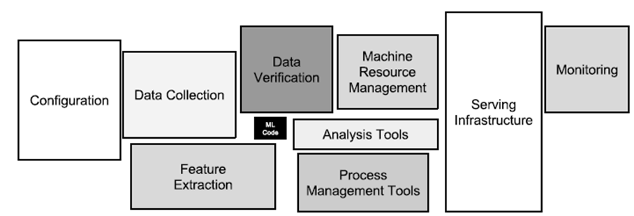
Abbildung 2: Versteckte technische Anforderungen in maschinellen Lernsystemen

Konzeptionelle Architektur für Machine Learning und Analytics

Die Nutzung aller verfügbaren Daten für Analyse, Durchführung von Data Science-Projekten, mit den daraus resultierenden Maßnahmen zur Prozessoptimierung und -automatisierung, bedeutet für Unternehmen sich neuen Herausforderungen zu stellen: Einführung neuer Technologien, Anwendung komplexer mathematischer Methoden sowie neue Arbeitsweisen, die in dieser Form bisher noch nicht dagewesen sind. Für IT-Architekten gibt es also reichlich Arbeit, entweder um eine Data Management-Plattform neu aufzubauen oder um das bestehende Informationsmanagement weiterzuentwickeln. Bild 3 zeigt hierzu eine vierstufige Architektur nach Gartner [6], ausgerichtet auf Analytics und Machine Learning.

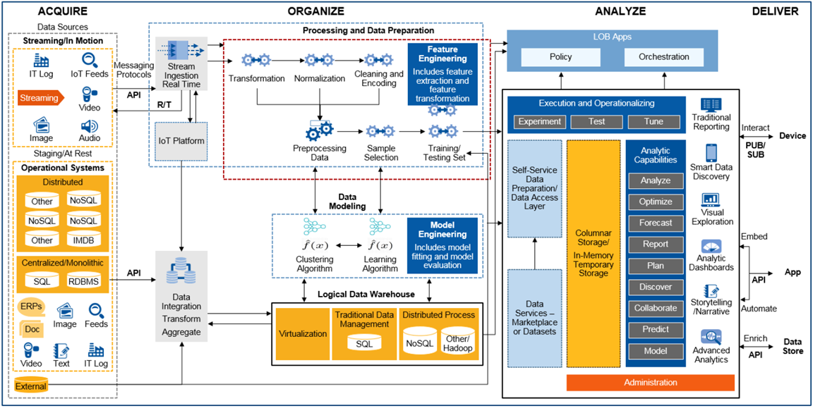
Abbildung 3: Konzeptionelle End-to-End Architektur für Machine Learning und Analytics

Was hat sich im Vergleich zu den traditionellen Data Warehouse- und Business Intelligence-Architekturen aus den 1990er Jahren geändert? Denkt man z.B. an die Präzisionsfertigung eines komplexen Produkts mit dem Ziel, den Ausschuss weiter zu senken und in der Produktionslinie eine höhere Produktivitätssteigerung (Kennzahl: OEE, Operational Equipment Efficiency) erzielen zu können: Die an der Produktherstellung beteiligten Fertigungsmodule (Spezialmaschinen) messen bzw. detektieren über zahlreiche Sensoren Prozesszustände, speicherprogrammierbare Steuerungen (SPS) regeln dazu die Abläufe und lassen zu Kontrollzwecken vom Endprodukt ein oder mehrere hochauflösende Fotos aufnehmen. Bei diesem Szenario entsteht eine Menge interessanter Messdaten, die im operativen Betrieb häufig schon genutzt werden. Z.B. für eine Echtzeitalarmierung bei Über- oder Unterschreitung von Schwellwerten in einem vorher definierten Prozessfenster. Während früher vielleicht aus Kostengründen nur Statusdaten und Störungsinformationen den Weg in relationale Datenbanken fanden, hebt man heute auch Rohdaten, z.B. Zeitreihen (Kraftwirkung, Vorschub, Spannung, Frequenzen,…) für die spätere Analyse auf.

Bezogen auf den Bereich Acquire bewältigt die IT-Architektur in Bild 3 nun Aufgaben, wie die Übernahme und Speicherung von Maschinen- und Sensordaten, die im Millisekundentakt Datenpunkte erzeugen. Während IoT-Plattformen das Registrieren, Anbinden und Management von Hunderten oder Tausenden solcher datenproduzierender Geräte („Things“) erleichtern, beschreibt das zugehörige IT-Konzept den Umgang mit Protokollen wie MQTT, OPC-UA, den Aufbau und Einsatz einer Messaging-Plattform für Publish-/Subscribe-Modelle (Pub/Sub) zur performanten Weiterverarbeitung von Massendaten im JSON-Dateiformat. Im Bereich Organize etablieren sich neben relationalen Datenbanken vermehrt verteilte NoSQL-Datenbanken zum Persistieren eingehender Datenströme, wie sie z.B. im oben beschriebenen Produktionsszenario entstehen. Für hochauflösende Bilder, Audio-, Videoaufnahmen oder andere unstrukturierte Daten kommt zusätzlich noch Object Storage als alternative Speicherform in Frage. Neben der kostengünstigen und langlebigen Datenauf­bewahrung ist die Möglichkeit, einzelne Objekte mit Metadaten flexibel zu beschreiben, um damit später die Auffindbarkeit zu ermöglichen und den notwendigen Kontext für die Analysen zu geben, hier ein weiterer Vorteil. Mit dem richtigen Technologie-Mix und der konsequenten Umsetzung eines Data Lake– oder Virtual Data Warehouse-Konzepts gelingt es IT-Architekten, vielfältige Analytics Anwendungsfälle zu unterstützen.

Im Rahmen des Data Science Prozesses spielt, neben der sicheren und massenhaften Datenspeicherung sowie der Fähigkeit zur gleichzeitigen, parallelen Verarbeitung großer Datenmengen, das sog. Feature-Engineering eine wichtige Rolle. Dazu wieder ein Beispiel aus der maschinellen Fertigung: Mit Hilfe von Machine Learning soll nach unbekannten Gründen für den zu hohen Ausschuss gefunden werden. Was sind die bestimmenden Faktoren dafür? Beeinflusst etwas die Maschinenkonfiguration oder deuten Frequenzveränderungen bei einem Verschleißteil über die Zeit gesehen auf ein Problem hin? Maschine und Sensoren liefern viele Parameter als Zeitreihendaten, aber nur einige davon sind – womöglich nur in einer bestimmten Kombination – für die Aufgabenstellung wirklich relevant. Daher versuchen Data Scientists bei der Feature-Entwicklung die Vorhersage- oder Klassifikationsleistung der Lernalgorithmen durch Erstellen von Merkmalen aus Rohdaten zu verbessern und mit diesen den Lernprozess zu vereinfachen. Die anschließende Feature-Auswahl wählt bei dem Versuch, die Anzahl von Dimensionen des Trainingsproblems zu verringern, die wichtigste Teilmenge der ursprünglichen Daten-Features aus. Aufgrund dieser und anderer Arbeitsschritte, wie z.B. Auswahl und Training geeigneter Algorithmen, ist der Aufbau eines Machine Learning Modells ein iterativer Prozess, bei dem Data Scientists dutzende oder hunderte von Modellen bauen, bis die Akzeptanzkriterien für die Modellgüte erfüllt sind. Aus technischer Sicht sollte die IT-Architektur auch bei der Verwaltung von Machine Learning Modellen bestmöglich unterstützen, z.B. bei Modell-Versionierung, -Deployment und -Tracking in der Produktions­umgebung oder bei der Automatisierung des Re-Trainings.

Die Bereiche Analyze und Deliver zeigen in Bild 3 einige bekannte Analysefähigkeiten, wie z.B. die Bereitstellung eines Standardreportings, Self-service Funktionen zur Geschäftsplanung sowie Ad-hoc Analyse und Exploration neuer Datasets. Data Science-Aktivitäten können etablierte Business Intelligence-Plattformen inhaltlich ergänzen, in dem sie durch neuartige Kennzahlen, das bisherige Reporting „smarter“ machen und ggf. durch Vorhersagen einen Blick in die nahe Zukunft beisteuern. Machine Learning-as-a-Service oder Machine Learning-Produkte sind alternative Darreichungsformen, um Geschäftsprozesse mit Hilfe von Analytik zu optimieren: Z.B. integriert in einer Call Center-Applikation, die mittels Churn-Indikatoren zu dem gerade anrufenden erbosten Kunden einen Score zu dessen Abwanderungswilligkeit zusammen mit Handlungsempfehlungen (Gutschein, Rabatt) anzeigt. Den Kunden-Score oder andere Risikoeinschätzungen liefert dabei eine Service Schnittstelle, die von verschiedenen unternehmensinternen oder auch externen Anwendungen (z.B. Smartphone-App) eingebunden und in Echtzeit angefragt werden kann. Arbeitsfelder für die IT-Architektur wären in diesem Zusammenhang u.a. Bereitstellung und Betrieb (skalierbarer) ML-Modelle via REST API’s in der Produktions­umgebung inklusive Absicherung gegen unerwünschten Zugriff.

Ein klassischer Ansatz: Datenanalyse und Machine Learning mit Jupyter Notebook & Python

Jupyter ist ein Kommandozeileninterpreter zum interaktiven Arbeiten mit der Programmiersprache Python. Es handelt sich dabei nicht nur um eine bloße Erweiterung der in Python eingebauten Shell, sondern um eine Softwaresuite zum Entwickeln und Ausführen von Python-Programmen. Funktionen wie Introspektion, Befehlszeilenergänzung, Rich-Media-Einbettung und verschiedene Editoren (Terminal, Qt-basiert oder browserbasiert) ermöglichen es, Python-Anwendungen als auch Machine Learning-Projekte komfortabel zu entwickeln und gleichzeitig zu dokumentieren. Datenanalysten sind bei der Arbeit mit Juypter nicht auf Python als Programmiersprache begrenzt, sondern können ebenso auch sog. Kernels für Julia, R und vielen anderen Sprachen einbinden. Ein Jupyter Notebook besteht aus einer Reihe von “Zellen”, die in einer Sequenz angeordnet sind. Jede Zelle kann entweder Text oder (Live-)Code enthalten und ist beliebig verschiebbar. Texte lassen sich in den Zellen mit einer einfachen Markup-Sprache formatieren, komplexe Formeln wie mit einer Ausgabe in LaTeX darstellen. Code-Zellen enthalten Code in der Programmiersprache, die dem aktiven Notebook über den entsprechenden Kernel (Python 2 Python 3, R, etc.) zugeordnet wurde. Bild 4 zeigt auszugsweise eine Analyse historischer Hauspreise in Abhängigkeit ihrer Lage in Kalifornien, USA (Daten und Notebook sind öffentlich erhältlich [7]). Notebooks erlauben es, ganze Machine Learning-Projekte von der Datenbeschaffung bis zur Evaluierung der ML-Modelle reproduzierbar abzubilden und lassen sich gut versionieren. Komplexe ML-Modelle können in Python mit Hilfe des Pickle Moduls, das einen Algorithmus zur Serialisierung und De-Serialisierung implementiert, ebenfalls transportabel gemacht werden.


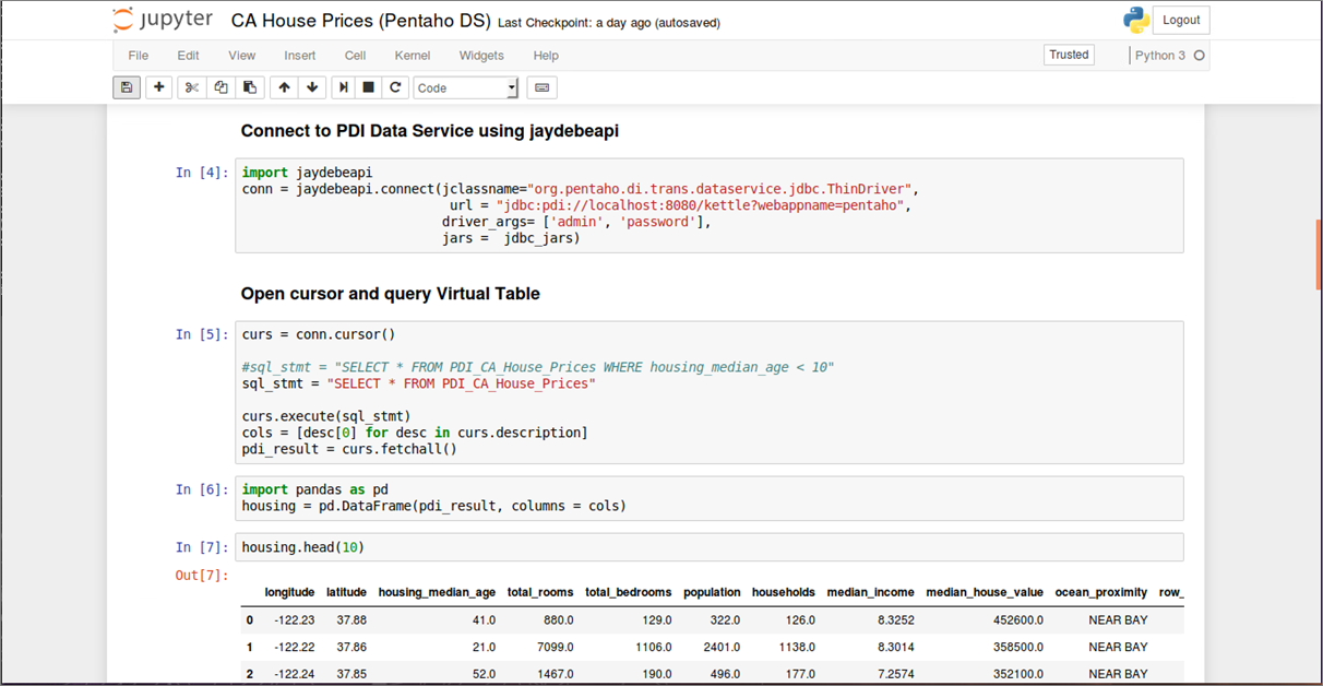
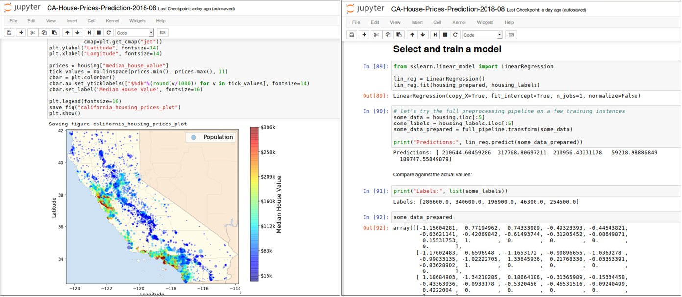
Abbildung 4: Datenbeschaffung, Inspektion, Visualisierung und ML Modell-Training in einem Jupyter Notebook (Pro-grammiersprache: Python)

Ein Problem, auf das man bei der praktischen Arbeit mit lokalen Jupyter-Installationen schnell stößt, lässt sich mit dem “works on my machine”-Syndrom bezeichnen. Kleine Data Sets funktionieren problemlos auf einem lokalen Rechner, wenn sie aber auf die Größe des Produktionsdatenbestandes migriert werden, skaliert das Einlesen und Verarbeiten aller Daten mit einem einzelnen Rechner nicht. Aufgrund dieser Begrenzung liegt der Aufbau einer server-basierten ML-Umgebung mit ausreichend Rechen- und Speicherkapazität auf der Hand. Dabei ist aber die Einrichtung einer solchen ML-Umgebung, insbesondere bei einer on-premise Infrastruktur, eine Herausforderung: Das Infrastruktur-Team muss physische Server und/oder virtuelle Maschinen (VM’s) auf Anforderung bereitstellen und integrieren. Dieser Ansatz ist aufgrund vieler manueller Arbeitsschritte zeitaufwändig und fehleranfällig. Mit dem Einsatz Cloud-basierter Technologien vereinfacht sich dieser Prozess deutlich. Die Möglichkeit, Infrastructure on Demand zu verwenden und z.B. mit einem skalierbaren Cloud-Data Warehouse zu kombinieren, bietet sofortigen Zugriff auf Rechen- und Speicher-Ressourcen, wann immer sie benötigt werden und reduziert den administrativen Aufwand bei Einrichtung und Verwaltung der zum Einsatz kommenden ML-Software. Bild 5 zeigt den Code-Ausschnitt aus einem Jupyter Notebook, das im Rahmen des Cloud Services Amazon SageMaker bereitgestellt wird und via PySpark Kernel auf einen Multi-Node Apache Spark Cluster (in einer Amazon EMR-Umgebung) zugreift. In diesem Szenario wird aus einem Snowflake Cloud Data Warehouse ein größeres Data Set mit 220 Millionen Datensätzen via Spark-Connector komplett in ein Spark Dataframe geladen und im Spark Cluster weiterverarbeitet. Den vollständigen Prozess inkl. Einrichtung und Konfiguration aller Komponenten, beschreibt eine vierteilige Blog-Serie [8]). Mit Spark Cluster sowie Snowflake stehen für sich genommen zwei leistungsfähige Umgebungen für rechenintensive Aufgaben zur Verfügung. Mit dem aktuellen Snowflake Connector für Spark ist eine intelligente Arbeitsteilung mittels Query Pushdown erreichbar. Dabei entscheidet Spark’s optimizer (Catalyst), welche Aufgaben (Queries) aufgrund der effizienteren Verarbeitung an Snowflake delegiert werden [9].

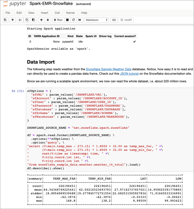
Abbildung 5: Jupyter Notebook in der Cloud – integriert mit Multi-Node Spark Cluster und Snowflake Cloud Data Warehouse

Welches Machine Learning Framework für welche Aufgabenstellung?

Bevor die nächsten Abschnitte weitere Werkzeuge und Technologien betrachten, macht es nicht nur für Data Scientists sondern auch für IT-Architekten Sinn, zunächst einen Überblick auf die derzeit verfügbaren Machine Learning Frameworks zu bekommen. Aus Architekturperspektive ist es wichtig zu verstehen, welche Aufgabenstellungen die jeweiligen ML-Frameworks adressieren, welche technischen Anforderungen und ggf. auch Abhängigkeiten zu den verfügbaren Datenquellen bestehen. Ein gemeinsamer Nenner vieler gescheiterter Machine Learning-Projekte ist häufig die Auswahl des falschen Frameworks. Ein Beispiel: TensorFlow ist aktuell eines der wichtigsten Frameworks zur Programmierung von neuronalen Netzen, Deep Learning Modellen sowie anderer Machine Learning Algorithmen. Während Deep Learning perfekt zur Untersuchung komplexer Daten wie Bild- und Audiodaten passt, wird es zunehmend auch für Use Cases benutzt, für die andere Frameworks besser geeignet sind. Bild 6 zeigt eine kompakte Entscheidungsmatrix [10] für die derzeit verbreitetsten ML-Frameworks und adressiert häufige Praxisprobleme: Entweder werden Algorithmen benutzt, die für den Use Case nicht oder kaum geeignet sind oder das gewählte Framework kann die aufkommenden Datenmengen nicht bewältigen. Die Unterteilung der Frameworks in Small Data, Big Data und Complex Data ist etwas plakativ, soll aber bei der Auswahl der Frameworks nach Art und Volumen der Daten helfen. Die Grenze zwischen Big Data zu Small Data ist dabei dort zu ziehen, wo die Datenmengen so groß sind, dass sie nicht mehr auf einem einzelnen Computer, sondern in einem verteilten Cluster ausgewertet werden müssen. Complex Data steht in dieser Matrix für unstrukturierte Daten wie Bild- und Audiodateien, für die sich Deep Learning Frameworks sehr gut eignen.

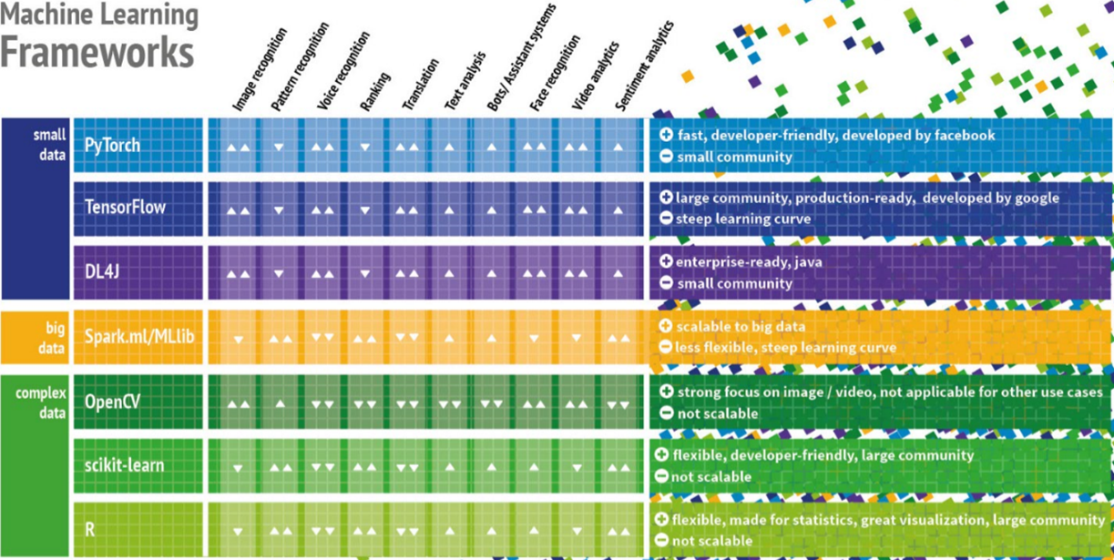
Abbildung 6: Entscheidungsmatrix zu aktuell verbreiteten Machine Learning Frameworks

Self-Service Machine Learning in Business Intelligence-Tools

Mit einfach zu bedienenden Business Intelligence-Werkzeugen zur Datenvisualisierung ist es für Analytiker und für weniger technisch versierte Anwender recht einfach, komplexe Daten aussagekräftig in interaktiven Dashboards zu präsentieren. Hersteller wie Tableau, Qlik und Oracle spielen ihre Stärken insbesondere im Bereich Visual Analytics aus. Statt statische Berichte oder Excel-Dateien vor dem nächsten Meeting zu verschicken, erlauben moderne Besprechungs- und Kreativräume interaktive Datenanalysen am Smartboard inklusive Änderung der Abfragefilter, Perspektivwechsel und Drill-downs. Im Rahmen von Data Science-Projekten können diese Werkzeuge sowohl zur Exploration von Daten als auch zur Visualisierung der Ergebnisse komplexer Machine Learning-Modelle sinnvoll eingesetzt werden. Prognosen, Scores und weiterer ML-Modell-Output lässt sich so schneller verstehen und unterstützt die Entscheidungsfindung bzw. Ableitung der nächsten Maßnahmen für den Geschäftsprozess. Im Rahmen einer IT-Gesamtarchitektur sind Analyse-Notebooks und Datenvisualisierungswerkzeuge für die Standard-Analytics-Toolbox Unternehmens gesetzt. Mit Hinblick auf effiziente Team-Zusammenarbeit, unternehmensinternen Austausch und Kommunikation von Ergebnissen sollte aber nicht nur auf reine Desktop-Werkzeuge gesetzt, sondern Server-Lösungen betrachtet und zusammen mit einem Nutzerkonzept eingeführt werden, um zehnfache Report-Dubletten, konkurrierende Statistiken („MS Excel Hell“) einzudämmen.

Abbildung 7: Datenexploration in Tableau – leicht gemacht für Fachanwender und Data Scientists


Zusätzliche Statistikfunktionen bis hin zur Möglichkeit R- und Python-Code bei der Analyse auszuführen, öffnet auch Fachanwender die Tür zur Welt des Maschinellen Lernens. Bild 7 zeigt das Werkzeug Tableau Desktop mit der Analyse kalifornischer Hauspreise (demselben Datensatz wie oben im Jupyter Notebook-Abschnitt wie in Bild 4) und einer Heatmap-Visualisierung zur Hervorhebung der teuersten Wohnlagen. Mit wenigen Klicks ist auch der Einsatz deskriptiver Statistik möglich, mit der sich neben Lagemaßen (Median, Quartilswerte) auch Streuungsmaße (Spannweite, Interquartilsabstand) sowie die Form der Verteilung direkt aus dem Box-Plot in Bild 7 ablesen und sogar über das Vorhandensein von Ausreißern im Datensatz eine Feststellung treffen lassen. Vorteil dieser Visualisierungen sind ihre hohe Informationsdichte, die allerdings vom Anwender auch richtig interpretiert werden muss. Bei der Beurteilung der Attribute, mit ihren Wertausprägungen und Abhängigkeiten innerhalb des Data Sets, benötigen Citizen Data Scientists (eine Wortschöpfung von Gartner) allerdings dann doch die mathematischen bzw. statistischen Grundlagen, um Falschinterpretationen zu vermeiden. Fraglich ist auch der Nutzen des Data Flow Editors [11] in Oracle Data Visualization, mit dem eins oder mehrere der im Werkzeug integrierten Machine Learning-Modelle trainiert und evaluiert werden können: technisch lassen sich Ergebnisse erzielen und anhand einiger Performance-Metriken die Modellgüte auch bewerten bzw. mit anderen Modellen vergleichen – aber wer kann die erzielten Ergebnisse (wissenschaftlich) verteidigen? Gleiches gilt für die Integration vorhandener R- und Python Skripte, die am Ende dann doch eine Einweisung der Anwender bzgl. Parametrisierung der ML-Modelle und Interpretationshilfen bei den erzielten Ergebnissen erfordern.

Machine Learning in und mit Datenbanken

Die Nutzung eingebetteter 1-click Analytics-Funktionen der oben vorgestellten Data Visualization-Tools ist zweifellos komfortabel und zum schnellen Experimentieren geeignet. Der gegenteilige und eher puristische Ansatz wäre dagegen die Implementierung eigener Machine Learning Modelle in der Datenbank. Für die Umsetzung des gewählten Algorithmus reichen schon vorhandene Bordmittel in der Datenbank aus: SQL inklusive mathematischer und statistische SQL-Funktionen, Tabellen zum Speichern der Ergebnisse bzw. für das ML-Modell-Management und Stored Procedures zur Abbildung komplexer Geschäftslogik und auch zur Ablaufsteuerung. Solange die Algorithmen ausreichend skalierbar sind, gibt es viele gute Gründe, Ihre Data Warehouse Engine für ML einzusetzen:

  • Einfachheit – es besteht keine Notwendigkeit, eine andere Compute-Plattform zu managen, zwischen Systemen zu integrieren und Daten zu extrahieren, transferieren, laden, analysieren usw.
  • Sicherheit – Die Daten bleiben dort, wo sie gut geschützt sind. Es ist nicht notwendig, Datenbank-Anmeldeinformationen in externen Systemen zu konfigurieren oder sich Gedanken darüber zu machen, wo Datenkopien verteilt sein könnten.
  • Performance – Eine gute Data Warehouse Engine verwaltet zur Optimierung von SQL Abfragen viele Metadaten, die auch während des ML-Prozesses wiederverwendet werden könnten – ein Vorteil gegenüber General-purpose Compute Plattformen.

Die Implementierung eines minimalen, aber legitimen ML-Algorithmus wird in [12] am Beispiel eines Entscheidungsbaums (Decision Tree) im Snowflake Data Warehouse gezeigt. Decision Trees kommen für den Aufbau von Regressions- oder Klassifikationsmodellen zum Einsatz, dabei teilt man einen Datensatz in immer kleinere Teilmengen auf, die ihrerseits in einem Baum organisiert sind. Bild 8 zeigt die Snowflake Benutzer­oberfläche und ein Ausschnitt von der Stored Procedure, die dynamisch alle SQL-Anweisungen zur Berechnung des Decision Trees nach dem ID3 Algorithmus [13] generiert.

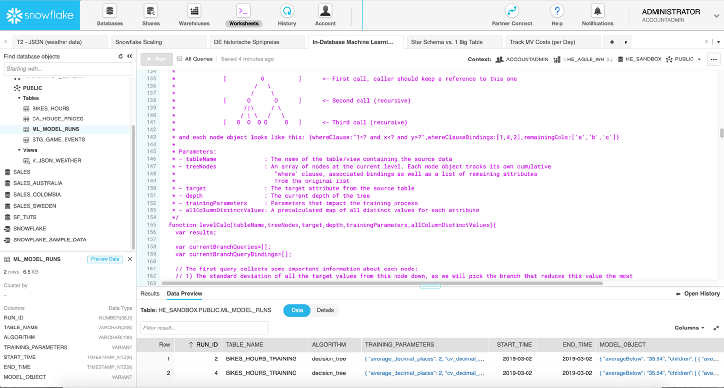
Abbildung 8: Snowflake SQL-Editor mit Stored Procedure zur Berechnung eines Decission Trees

Allerdings ist der Entwicklungs- und Implementierungsprozess für ein Machine Learning Modell umfassender: Es sind relevante Daten zu identifizieren und für das ML-Modell vorzubereiten. Einfach Rohdaten bzw. nicht aggregierten Informationen aus Datenbanktabellen zu extrahieren reicht nicht aus, stattdessen benötigt ein ML-Modell als Input eine flache, meist sehr breite Tabelle mit vielen Aggregaten, die als Features bezeichnet werden. Erst dann kann der Prozess fortgesetzt und der für die Aufgabenstellung ausgewählte Algorithmus trainiert und die Modellgüte bewertet werden. Ist das Ergebnis zufriedenstellend, steht die Implementierung des ML-Modells in der Zielumgebung an und muss sich künftig beim Scoring „frischer Datensätze“ bewähren. Viele zeitaufwändige Teilaufgaben also, bei der zumindest eine Teilautomatisierung wünschenswert wäre. Allein die Datenaufbereitung kann schon bis zu 70…80% der gesamten Projektzeit beanspruchen. Und auch die Implementierung eines ML-Modells wird häufig unterschätzt, da in Produktionsumgebungen der unterstützte Technologie-Stack definiert und ggf. für Machine Learning-Aufgaben erweitert werden muss. Daher ist es reizvoll, wenn das Datenbankmanagement-System auch hier einsetzbar ist – sofern die geforderten Algorithmen dort abbildbar sind. Wie ein ML-Modell für die Kundenabwanderungsprognose (Churn Prediction) werkzeuggestützt mit Xpanse AI entwickelt und beschleunigt im Snowflake Cloud Data Warehouse bereitgestellt werden kann, beschreibt [14] sehr anschaulich: Die benötigten Datenextrakte sind schnell aus Snowflake entladen und stellen den Input für ein neues Xpanse AI-Projekt dar. Sobald notwendige Tabellenverknüpfungen und andere fachliche Informationen hinterlegt sind, analysiert das Tool Datenstrukturen und transformiert alle Eingangstabellen in eine flache Zwischentabelle (u.U. mit Hunderten von Spalten), auf deren Basis im Anschluss ML-Modelle trainiert werden. Nach dem ML-Modell-Training erfolgt die Begutachtung der Ergebnisse: das erstellte Dataset, Güte des ML-Modells und der generierte SQL(!) ETL-Code zur Erstellung der Zwischentabelle sowie die SQL-Repräsentation des ML-Modells, das basierend auf den Input-Daten Wahrscheinlichkeitswerte berechnet und in einer Scoring-Tabelle ablegt. Die Vorteile dieses Ansatzes sind liegen auf der Hand: kürzere Projektzeiten, der Einsatz im Rahmen des Snowflake Cloud Data Warehouse, macht das Experimentieren mit der Zuweisung dedizierter Compute-Ressourcen für die performante Verarbeitung äußerst einfach. Grenzen liegen wiederum bei der zur Verfügung stehenden Algorithmen.

Spezialisierte Software Suites für Machine Learning

Während sich im Markt etablierte Business Intelligence- und Datenintegrationswerkzeuge mit Erweiterungen zur Ausführung von Python- und R-Code als notwendigen Bestandteil der Analyse-Toolbox für den Data Science Prozess positionieren, gibt es daneben auch Machine-Learning-Plattformen, die auf die Arbeit mit künstlicher Intelligenz (KI) zugeschnittenen sind. Für den Einstieg in Data Science bieten sich die oft vorhandenen quelloffenen Distributionen an, die auch über Enterprise-Versionen mit erweiterten Möglichkeiten für beschleunigtes maschinelles Lernen durch Einsatz von Grafikprozessoren (GPUs), bessere Skalierung sowie Funktionen für das ML-Modell Management (z.B. durch Versionsmanagement und Automatisierung) verfügen.

Eine beliebte Machine Learning-Suite ist das Open Source Projekt H2O. Die Lösung des gleichnamigen kalifornischen Unternehmens verfügt über eine R-Schnittstelle und ermöglicht Anwendern dieser statistischen Programmiersprache Vorteile in puncto Performance. Die in H2O verfügbaren Funktionen und Algorithmen sind optimiert und damit eine gute Alternative für das bereits standardmäßig in den R-Paketen verfügbare Funktionsset. H2O implementiert Algorithmen aus dem Bereich Statistik, Data-Mining und Machine Learning (generalisierte Lineare Modelle, K-Means, Random Forest, Gradient Boosting und Deep Learning) und bietet mit einer In-Memory-Architektur und durch standardmäßige Parallelisierung über alle vorhandenen Prozessorkerne eine gute Basis, um komplexe Machine-Learning-Modelle schneller trainieren zu können. Bild 9 zeigt wieder anhand des Datensatzes zur Analyse der kalifornischen Hauspreise die webbasierte Benutzeroberfläche H20 Flow, die den oben beschriebenen Juypter Notebook-Ansatz mit zusätzlich integrierter Benutzerführung für die wichtigsten Prozessschritte eines Machine-Learning-Projektes kombiniert. Mit einigen Klicks kann das California Housing Dataset importiert, in einen H2O-spezifischen Dataframe umgewandelt und anschließend in Trainings- und Testdatensets aufgeteilt werden. Auswahl, Konfiguration und Training der Machine Learning-Modelle erfolgt entweder durch den Anwender im Einsteiger-, Fortgeschrittenen- oder Expertenmodus bzw. im Auto-ML-Modus. Daran anschließend erlaubt H20 Flow die Vorhersage für die Zielvariable (im Beispiel: Hauspreis) für noch unbekannte Datensätze und die Aufbereitung der Ergebnismenge. Welche Unterstützung H2O zur Produktivsetzung von ML-Modellen anbietet, wird an einem Beispiel in den folgenden Abschnitten betrachtet.

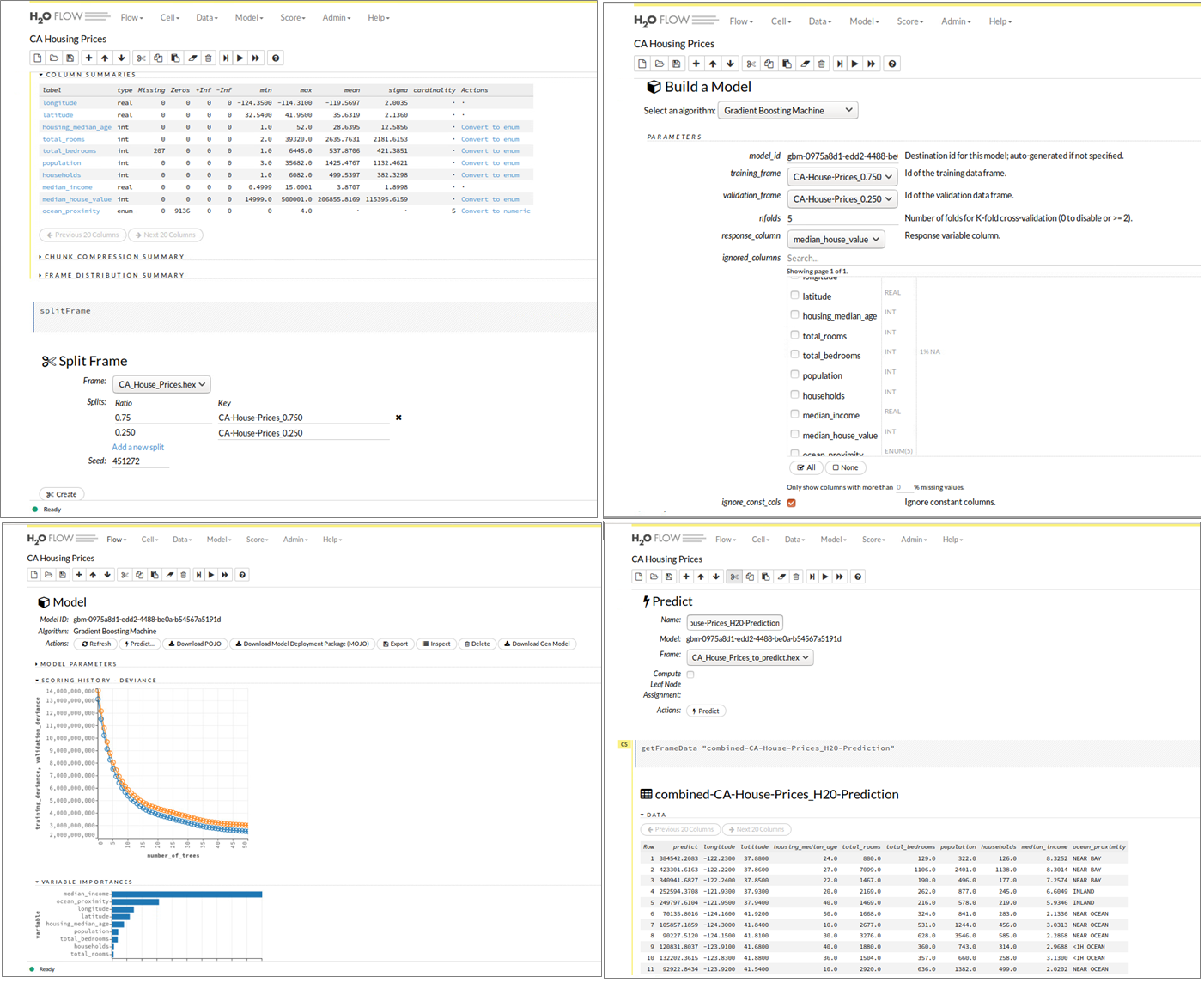
Abbildung 9: H2O Flow Benutzeroberfläche – Datenaufbereitung, ML-Modell-Training und Evaluierung.

Vom Prototyp zur produktiven Machine Learning-Lösung

Warum ist es für viele Unternehmen noch schwer, einen Nutzen aus ihren ersten Data Science-Aktivitäten, Data Labs etc. zu ziehen? In der Praxis zeigt sich, erst durch Operationalisierung von Machine Learning-Resultaten in der Produktionsumgebung entsteht echter Geschäftswert und nur im Tagesgeschäft helfen robuste ML-Modelle mit hoher Güte bei der Erreichung der gesteckten Unternehmensziele. Doch leider erweist sich der Weg vom Prototypen bis hin zum Produktiveinsatz bei vielen Initativen noch als schwierig. Bild 10 veranschaulicht ein typisches Szenario: Data Science-Teams fällt es in ihrer Data Lab-Umgebung technisch noch leicht, Prototypen leistungsstarker ML-Modelle mit Hilfe aktueller ML-Frameworks wie TensorFlow-, Keras- und Word2Vec auf ihren Laptops oder in einer Sandbox-Umgebung zu erstellen. Doch je nach verfügbarer Infrastruktur kann, wegen Begrenzungen bei Rechenleistung oder Hauptspeicher, nur ein Subset der Produktionsdaten zum Trainieren von ML-Modellen herangezogen werden. Ergebnispräsentationen an die Stakeholder der Data Science-Projekte erfolgen dann eher durch Storytelling in MS Powerpoint bzw. anhand eines Demonstrators – selten aber technisch schon so umgesetzt, dass anderere Applikationen z.B. über eine REST-API von dem neuen Risiko Scoring-, dem Bildanalyse-Modul etc. (testweise) Gebrauch machen können. Ausgestattet mit einer Genehmigung vom Management, übergibt das Data Science-Team ein (trainiertes) ML-Modell an das Software Engineering-Team. Nach der Übergabe muss sich allerdings das Engineering-Team darum kümmern, dass das ML-Modell in eine für den Produktionsbetrieb akzeptierte Programmiersprache, z.B. in Java, neu implementiert werden muss, um dem IT-Unternehmensstandard (siehe Line of Governance in Bild 10) bzw. Anforderungen an Skalierbarkeit und Laufzeitverhalten zu genügen. Manchmal sind bei einem solchen Extraschritt Abweichungen beim ML-Modell-Output und in jedem Fall signifikante Zeitverluste beim Deployment zu befürchten.

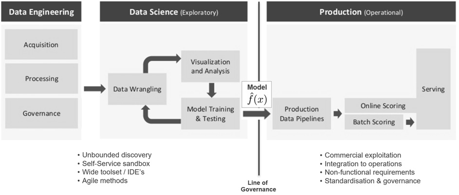
Abbildung 10: Übergabe von Machine Learning-Resultaten zur Produktivsetzung im Echtbetrieb

Unterstützt das Data Science-Team aktiv bei dem Deployment, dann wäre die Einbettung des neu entwickelten ML-Modells in eine Web-Applikation eine beliebte Variante, bei der typischerweise Flask, Tornado (beides Micro-Frameworks für Python) und Shiny (ein auf R basierendes HTML5/CSS/JavaScript Framework) als Technologiekomponenten zum Zuge kommen. Bei diesem Vorgehen müssen ML-Modell, Daten und verwendete ML-Pakete/Abhängigkeiten in einem Format verpackt werden, das sowohl in der Data Science Sandbox als auch auf Produktionsservern lauffähig ist. Für große Unternehmen kann dies einen langwierigen, komplexen Softwareauslieferungsprozess bedeuten, der ggf. erst noch zu etablieren ist. In dem Zusammenhang stellt sich die Frage, wie weit die Erfahrung des Data Science-Teams bei der Entwicklung von Webanwendungen reicht und Aspekte wie Loadbalancing und Netzwerkverkehr ausreichend berücksichtigt? Container-Virtualisierung, z.B. mit Docker, zur Isolierung einzelner Anwendungen und elastische Cloud-Lösungen, die on-Demand benötigte Rechenleistung bereitstellen, können hier Abhilfe schaffen und Teil der Lösungsarchitektur sein. Je nach analytischer Aufgabenstellung ist das passende technische Design [15] zu wählen: Soll das ML-Modell im Batch- oder Near Realtime-Modus arbeiten? Ist ein Caching für wiederkehrende Modell-Anfragen vorzusehen? Wie wird das Modell-Deployment umgesetzt, In-Memory, Code-unabhängig durch Austauschformate wie PMML, serialisiert via R- oder Python-Objekte (Pickle) oder durch generierten Code? Zusätzlich muss für den Produktiveinsatz von ML-Modellen auch an unterstützenden Konzepten zur Bereitstellung, Routing, Versions­management und Betrieb im industriellen Maßstab gearbeitet werden, damit zuverlässige Machine Learning-Produkte bzw. -Services zur internen und externen Nutzung entstehen können (siehe dazu Bild 11)

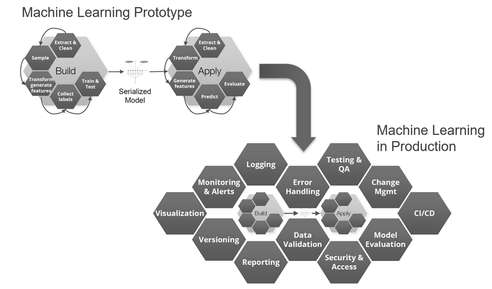
Abbildung 11: Unterstützende Funktionen für produktive Machine Learning-Lösungen

Die Deployment-Variante „Machine Learning Code-Generierung“ lässt sich gut an dem bereits mit H2O Flow besprochenen Beispiel veranschaulichen. Während Bild 9 hierzu die Schritte für Modellaufbau, -training und -test illustriert, zeigt Bild 12 den Download-Vorgang für den zuvor generierten Java-Code zum Aufbau eines ML-Modells zur Vorhersage kalifornischer Hauspreise. In dem generierten Java-Code sind die in H2O Flow vorgenommene Datenaufbereitung sowie alle Konfigurationen für den Gradient Boosting Machine (GBM)-Algorithmus gut nachvollziehbar, Bild 13 gibt mit den ersten Programmzeilen einen ersten Eindruck dazu und erinnert gleichzeitig an den ähnlichen Ansatz der oben mit dem Snowflake Cloud Data Warehouse und dem Tool Xpanse AI bereits beschrieben wurde.

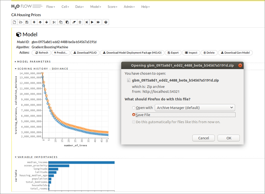
Abbildung 12: H2O Flow Benutzeroberfläche – Java-Code Generierung und Download eines trainierten Models

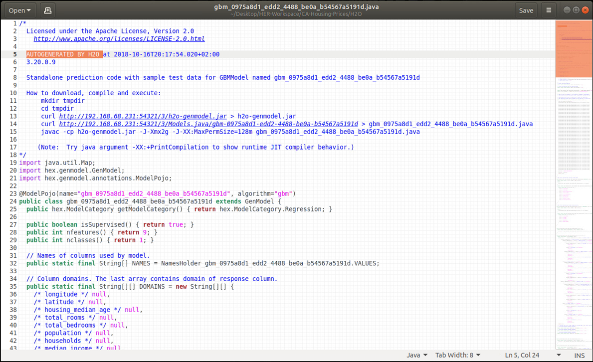
Abbildung 13: Generierter Java-Code eines Gradient Boosted Machine – Modells zur Vorhersage kaliforn. Hauspreise

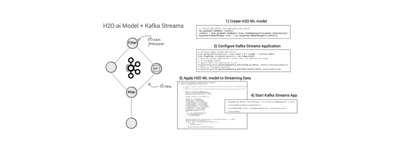
Nach Abschluss der Machine Learning-Entwicklung kann der Java-Code des neuen ML-Modells, z.B. unter Verwendung der Apache Kafka Streams API, zu einer Streaming-Applikation hinzugefügt und publiziert werden [16]. Vorteil dabei: Die Kafka Streams-Applikation ist selbst eine Java-Applikation, in die der generierte Code des ML-Modells eingebettet werden kann (siehe Bild 14). Alle zukünftigen Events, die neue Immobilien-Datensätze zu Häusern aus Kalifornien mit (denselben) Features wie Geoposition, Alter des Gebäudes, Anzahl Zimmer etc. enthalten und als ML-Modell-Input über Kafka Streams hereinkommen, werden mit einer Vorhersage des voraussichtlichen Gebäudepreises von dem auf historischen Daten trainierten ML-Algorithmus beantwortet. Ein Vorteil dabei: Weil die Kafka Streams-Applikation unter der Haube alle Funktionen von Apache Kafka nutzt, ist diese neue Anwendung bereits für den skalierbaren und geschäftskritischen Einsatz ausgelegt.

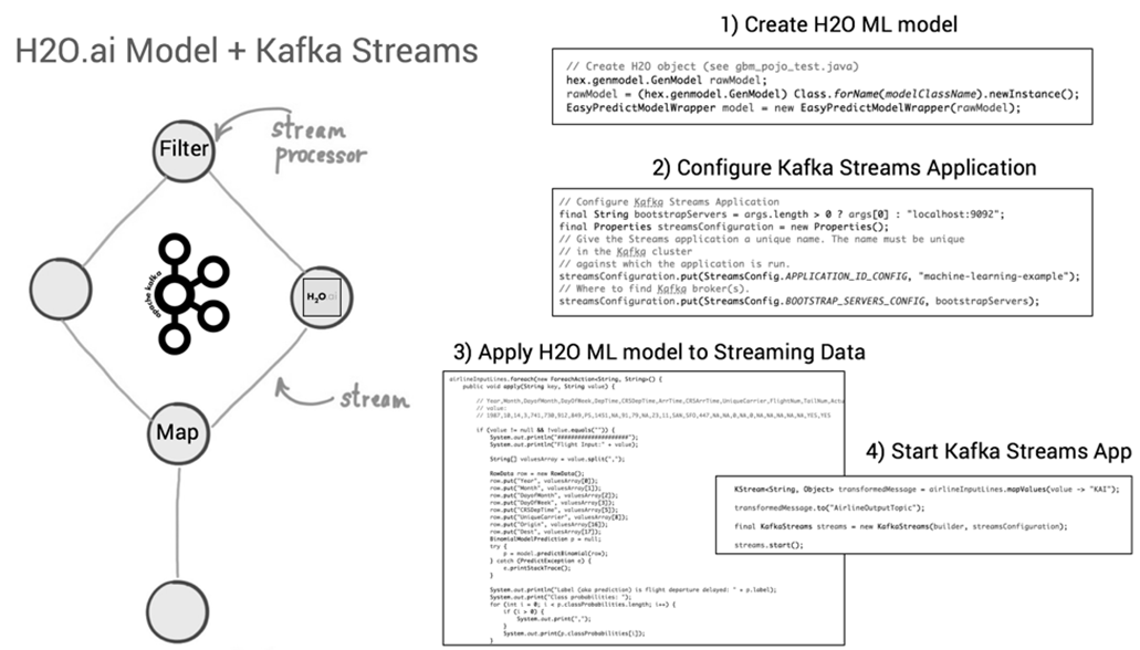
Abbildung 14: Deployment des generierten Java-Codes eines H2O ML-Models in einer Kafka Streams-Applikation

Machine Learning as a Service – “API-first” Ansatz

In den vorherigen Abschnitten kam bereits die Herausforderung zur Sprache, wenn es um die Überführung der Ergebnisse eines Datenexperiments in eine Produktivumgebung geht. Während die Mehrheit der Mitglieder eines Data Science Teams bevorzugt R, Python (und vermehrt Julia) als Programmiersprache einsetzen, gibt es auf der Abnehmerseite das Team der Softwareingenieure, die für technische Implementierungen in der Produktionsumgebung zuständig sind, womöglich einen völlig anderen Technologie-Stack verwenden (müssen). Im Extremfall droht das Neuimplementieren eines Machine Learning-Modells, im besseren Fall kann Code oder die ML-Modellspezifikation transferiert und mit wenig Aufwand eingebettet (vgl. das Beispiel H2O und Apache Kafka Streams Applikation) bzw. direkt in einer neuen Laufzeitumgebung ausführbar gemacht werden. Alternativ wählt man einen „API-first“-Ansatz und entkoppelt das Zusammenwirken von unterschiedlich implementierten Applikationen bzw. -Applikationsteilen via Web-API’s. Data Science-Teams machen hierzu z.B. die URL Endpunkte ihrer testbereiten Algorithmen bekannt, die von anderen Softwareentwicklern für eigene „smarte“ Applikationen konsumiert werden. Durch den Aufbau von REST-API‘s kann das Data Science-Team den Code ihrer ML-Modelle getrennt von den anderen Teams weiterentwickeln und damit eine Arbeitsteilung mit klaren Verantwortlichkeiten herbeiführen, ohne Teamkollegen, die nicht am Machine Learning-Aspekt des eines Projekts beteiligt sind, bei ihrer Arbeit zu blockieren.

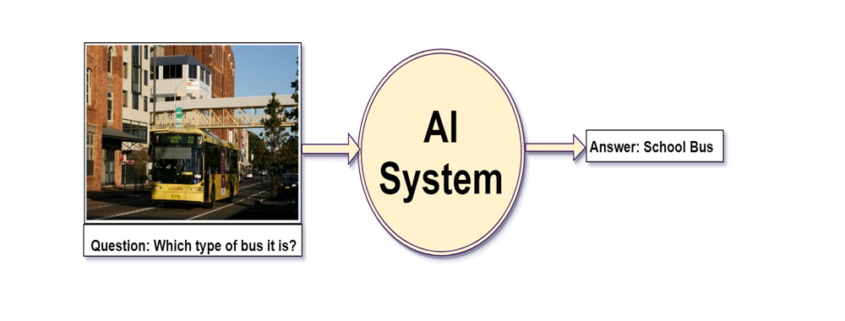
Bild 15 zeigt ein einfaches Szenario, bei dem die Gegenstandserkennung von beliebigen Bildern mit einem Deep Learning-Verfahren umgesetzt ist. Einzelne Fotos können dabei via Kommandozeileneditor als Input für die Bildanalyse an ein vortrainiertes Machine Learning-Modell übermittelt werden. Die Information zu den erkannten Gegenständen inkl. Wahrscheinlichkeitswerten kommt dafür im Gegenzug als JSON-Ausgabe zurück. Für die Umsetzung dieses Beispiels wurde in Python auf Basis der Open Source Deep-Learning-Bibliothek Keras, ein vortrainiertes ML-Modell mit Hilfe des Micro Webframeworks Flask über eine REST-API aufrufbar gemacht. Die in [17] beschriebene Applikation kümmert sich außerdem darum, dass beliebige Bilder via cURL geladen, vorverarbeitet (ggf. Wandlung in RGB, Standardisierung der Bildgröße auf 224 x 224 Pixel) und dann zur Klassifizierung der darauf abgebildeten Gegenstände an das ML-Modell übergeben wird. Das ML-Modell selbst verwendet eine sog. ResNet50-Architektur (die Abkürzung steht für 50 Layer Residual Network) und wurde auf Grundlage der öffentlichen ImageNet Bilddatenbank [18] vortrainiert. Zu dem ML-Modell-Input (in Bild 15: Fußballspieler in Aktion) meldet das System für den Tester nachvollziehbare Gegenstände wie Fußball, Volleyball und Trikot zurück, fragliche Klassifikationen sind dagegen Taschenlampe (Torch) und Schubkarre (Barrow).

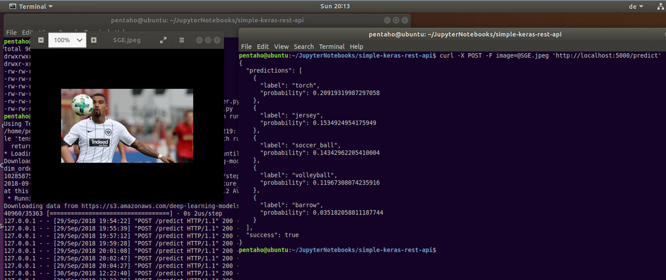
Abbildung 15: Gegenstandserkennung mit Machine Learning und vorgegebenen Bildern via REST-Service

Bei Aufbau und Bereitstellung von Machine Learning-Funktionen mittels REST-API’s bedenken IT-Architekten und beteiligte Teams, ob der Einsatzzweck eher Rapid Prototyping ist oder eine weitreichende Nutzung unterstützt werden muss. Während das oben beschriebene Szenario mit Python, Keras und Flask auf einem Laptop realisierbar ist, benötigen skalierbare Deep Learning Lösungen mehr Aufmerksamkeit hinsichtlich der Deployment-Architektur [19], in dem zusätzlich ein Message Broker mit In-Memory Datastore eingehende bzw. zu analysierende Bilder puffert und dann erst zur Batch-Verarbeitung weiterleitet usw. Der Einsatz eines vorgeschalteten Webservers, Load Balancers, Verwendung von Grafikprozessoren (GPUs) sind weitere denkbare Komponenten für eine produktive ML-Architektur.

Als abschließendes Beispiel für einen leistungsstarken (und kostenpflichtigen) Machine Learning Service soll die Bildanalyse von Google Cloud Vision [20] dienen. Stellt man dasselbe Bild mit der Fußballspielszene von Bild 15 und Bild 16 bereit, so erkennt der Google ML-Service neben den Gegenständen weit mehr Informationen: Kontext (Teamsport, Bundesliga), anhand der Gesichtserkennung den Spieler selbst  und aktuelle bzw. vorherige Mannschaftszugehörigkeiten usw. Damit zeigt sich am Beispiel des Tech-Giganten auch ganz klar: Es kommt vorallem auf die verfügbaren Trainingsdaten an, inwieweit dann mit Algorithmen und einer dazu passenden Automatisierung (neue) Erkenntnisse ohne langwierigen und teuren manuellen Aufwand gewinnen kann. Einige Unternehmen werden feststellen, dass ihr eigener – vielleicht einzigartige – Datenschatz einen echten monetären Wert hat?

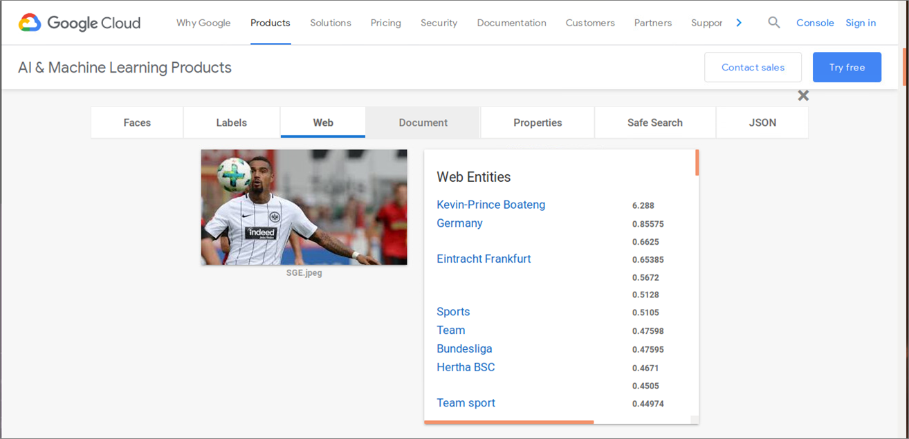
Abbildung 16: Machine Learning Bezahlprodukt (Google Vision)

Fazit

Machine Learning ist eine interessante “Challenge” für Architekten. Folgende Punkte sollte man bei künftigen Initativen berücksichtigen:

  • Finden Sie das richtige Geschäftsproblem bzw geeignete Use Cases
  • Identifizieren und definieren Sie die Einschränkungen (Sind z.B. genug Daten vorhanden?) für die zu lösende Aufgabenstellung
  • Nehmen Sie sich Zeit für das Design von Komponenten und Schnittstellen
  • Berücksichtigen Sie frühzeitig mögliche organisatorische Gegebenheiten und Einschränkungen
  • Denken Sie nicht erst zum Schluss an die Produktivsetzung Ihrer analytischen Modelle oder Machine Learning-Produkte
  • Der Prozess ist insgesamt eine Menge Arbeit, aber es ist keine Raketenwissenschaft.

Quellenverzeichnis

[1] Bill Schmarzo: “What’s the Difference Between Data Integration and Data Engineering?”, LinkedIn Pulse -> Link, 2018
[2] William Vorhies: “CRISP-DM – a Standard Methodology to Ensure a Good Outcome”, Data Science Central -> Link, 2016
[3] Bill Schmarzo: “A Winning Game Plan For Building Your Data Science Team”, LinkedIn Pulse -> Link, 2018
[4] D. Sculley, G. Holt, D. Golovin, E. Davydov, T. Phillips, D. Ebner, V. Chaudhary, M. Young, J.-F. Crespo, D. Dennison: “Hidden technical debt in Machine learning systems”. In NIPS’15 Proceedings of the 28th International Conference on Neural Information Processing Systems – Volume 2, 2015
[5] K. Bollhöfer: „Data Science – the what, the why and the how!“, Präsentation von The unbelievable Machine Company, 2015
[6] Carlton E. Sapp: “Preparing and Architecting for Machine Learning”, Gartner, 2017
[7] A. Geron: “California Housing” Dataset, Jupyter Notebook. GitHub.com -> Link, 2018
[8] R. Fehrmann: “Connecting a Jupyter Notebook to Snowflake via Spark” -> Link, 2018
[9] E. Ma, T. Grabs: „Snowflake and Spark: Pushing Spark Query Processing to Snowflake“ -> Link, 2017
[10] Dr. D. James: „Entscheidungsmatrix „Machine Learning“, it-novum.com ->  Link, 2018
[11] Oracle Analytics@YouTube: “Oracle DV – ML Model Comparison Example”, Video -> Link
[12] J. Weakley: Machine Learning in Snowflake, Towards Data Science Blog -> Link, 2019
[13] Dr. S. Sayad: An Introduction to Data Science, Website -> Link, 2019
[14] U. Bethke: Build a Predictive Model on Snowflake in 1 day with Xpanse AI, Blog à Link, 2019
[15] Sergei Izrailev: Design Patterns for Machine Learning in Production, Präsentation H2O World, 2017
[16] K. Wähner: How to Build and Deploy Scalable Machine Learning in Production with Apache Kafka, Confluent Blog -> Link, 2017
[17] A. Rosebrock: “Building a simple Keras + deep learning REST API”, The Keras Blog -> Link, 2018
[18] Stanford Vision Lab, Stanford University, Princeton University: Image database, Website -> Link
[19] A. Rosebrock: “A scalable Keras + deep learning REST API”, Blog -> Link, 2018
[20] Google Cloud Vision API (Beta Version) -> Link, abgerufen 2018


Simple Linear Regression: Mathematics explained with implementation in numpy

Simple Linear Regression

Being in the field of data science, we all are familiar with at least some of the measures shown in figure 1.1 (generated in python using statsmodels). But do we really understand how these measures are being calculated? or what is the math behind these measures? In this article, I hope that I can answer these questions for you. This article will start from the fundamentals of simple linear regression but by the end of this article, you will get an idea of how to program this in numpy (python library).


Fig. 1.1

Simple linear regression is a very simple approach for supervised learning where we are trying to predict a quantitative response Y based on the basis of only one variable x. Here x is an independent variable and Y is our dependent variable. Assuming that there is a linear relationship between our independent and dependent variable we can represent this relationship as:


Y = mx+c


where m and c are two unknown constants that represent the slope and the intercept of our linear model. Together, these constants are also known as parameters or coefficients. If you want to visualize these parameters see figure 1.2.

Fig. 1.2

Please note that we can only calculate the estimates of these parameters thus we have to rewrite our linear equation like:


\widehat{y} = \widehat{m}x + \widehat{c}


here y-hat represents a prediction of Y (actual value) based on x. Once we have found the estimates of these parameters, the equation can be used to predict the future value of Y provided a new/test value of x.

How to find the estimate of these parameters?

Let’s assume we have ‘n’ observations and for each independent variable value we have a value for dependent variable like this:

(x1,y1), (x2,y2),……,(xn,yn). Our goal is to find the best values of these parameters so the line in fig 1.1 should be as close as possible to the data points and we will be using the most common approach of Ordinary least squares to do that.  This best fit is found by minimizing the residual sum of squared errors which can be calculated as below:


RSS = {(y_1-\widehat{y1}})^2+{(y_2-\widehat{y2}})^2 +…..+{(y_n-\widehat{yn}})^2


or

RSS = {(y_1-\widehat{c}-{\widehat m_1x_1})}^2+ {(y_2-\widehat{c}-{\widehat m_1x_2})}^2 +…..+{(y_n-\widehat{c}-{\widehat m_1x_n})}^2


where

m_1 = \frac{\sum_i^n (x_i-\bar x)(y_i-\bar y)}{\sum_i^n (x_i-\bar x)^{2}}


and

\widehat{c} = \bar y - \widehat{m_1} \bar x


Measures to evaluate our regression model

We can use two measures to evaluate our simple linear regression model:

Residual Standard Error (RSE)

According to the book An Introduction to Statistical Learning with Applications in R (James, et al., 2013, pp. 68-71) explains RSE as an estimate of the standard deviation of the error ϵ and can be calculated as:


RSE = \sqrt{\frac{1}{n-2}\sum_i^n(y_i-\widehat y_i)^2}


R square

It is not always clear what is a good score for RSE so we use R square as an alternative to measuring the performance of our model. Please note that there are other measures also which we will discuss in my next article about multiple linear regression. We will also cover the difference between the R square and adjusted R square. The formula for R square can be seen below.


R^2 =1- \frac{\sum_i^n(y_i-\widehat y_i)^2}{(y_i-\bar y)^2}


Now that we have covered the theoretical part of simple linear regression, let’s write these formulas in python (numpy).


Python implementation

To implement this in python first we need a dataset on which we can work on. The dataset that we are going to use in this article is Advertising data and can be downloaded from here. Before we start the analysis we will use pandas library to load the dataset as a dataframe (see code below).

**Please check your path of the advertising file.

To show the first five rows of the dataset use df.head() and you will see output like this:


Let me try to explain what are we have to do here, we have the dataset of an ad company which has three different advertising channels TV, radio and newspaper. This company regularly invests in these channels and track their sales over time. However, the time variable is not present in this csv file. Anyway, this company wants to know how much sales will be impacted if they spent a certain amount on any of their advertising channels. As this is the case for simple linear regression we will be using only one predictor TV to fit our model. From here we will go step by step.

Step 1: Define the dependent and independent variable

Step 2: Define a function to find the slope (m)

So, when we applied the function in our current dataset we got a slope of 0.0475.

Step 3: Define a function to find the intercept (c)

and an intercept of 7.0325

Once we have the values for slope and intercept, it is now time to define functions to calculate the residual sum of squares (RSS) and the metrics we will use to evaluate our linear model i.e. residual standard error (RSE) and R-square.

Step 4: Define a function to find residual sum of squares (RSS)

As we discussed in the theory section that it is very hard to evaluate a model based on RSS as we can never generalize the thresholds for RSS and hence we need to settle for other measures.

Step 5: Define a function to calculate residual standard error (RSE)

Step 6: Define a function to find R-square

Here, we see that R-square offers an advantage over RSE as it always lies between 0 and 1, which makes it easier to evaluate our linear model. If you want to understand more about what constitutes a good measure of R-square you can read the explanation given in the book An introduction to statistical learning (mentioned this above also).

The final step now would be to define a function which can be used to predict our sales on the amount of budget spend on TV.

Now, let’s say if the advertising budget for TV is 1500 USD, what would be their sales?

Our linear model predicted that if the ad company would spend 1500 USD they will see an increase of 78 units. If you want to go through the whole code you can find the jupyter notebook here. In this notebook, I have also made a class wrapper at the end of this linear model. It will be really hard to explain the whole logic why I did it here, so I will keep that for another post.In the next article, I will explain the mathematics behind Multiple Linear Regression and how we can implement that in python. Please let me know if you have any question in the comments section. Thank you for reading !!

Visual Question Answering with Keras – Part 1

This is Part I of II of the Article Series Visual Question Answering with Keras

Making Computers Intelligent to answer from images

If we look closer in the history of Artificial Intelligence (AI), the Deep Learning has gained more popularity in the recent years and has achieved the human-level performance in the tasks such as Speech Recognition, Image Classification, Object Detection, Machine Translation and so on. However, as humans, not only we but also a five-year child can normally perform these tasks without much inconvenience. But the development of such systems with these capabilities has always considered an ambitious goal for the researchers as well as for developers.

In this series of blog posts, I will cover an introduction to something called VQA (Visual Question Answering), its available datasets, the Neural Network approach for VQA and its implementation in Keras and the applications of this challenging problem in real life. 

Table of Contents:

1 Introduction

2 What is exactly Visual Question Answering?

3 Prerequisites

4 Datasets available for VQA

4.1 DAQUAR Dataset

4.2 CLEVR Dataset

4.3 FigureQA Dataset

4.4 VQA Dataset

5 Real-life applications of VQA

6 Conclusion


  1. Introduction:

Let’s say you are given a below picture along with one question. Can you answer it?

I expect confidently you all say it is the Kitchen without much inconvenience which is also the right answer. Even a five-year child who just started to learn things might answer this question correctly.

Alright, but can you write a computer program for such type of task that takes image and question about the image as an input and gives us answer as output?

Before the development of the Deep Neural Network, this problem was considered as one of the difficult, inconceivable and challenging problem for the AI researcher’s community. However, due to the recent advancement of Deep Learning the systems are capable of answering these questions with the promising result if we have a required dataset.

Now I hope you have got at least some intuition of a problem that we are going to discuss in this series of blog posts. Let’s try to formalize the problem in the below section.

  1. What is exactly Visual Question Answering?:

We can define, “Visual Question Answering(VQA) is a system that takes an image and natural language question about the image as an input and generates natural language answer as an output.”

VQA is a research area that requires an understanding of vision(Computer Vision)  as well as text(NLP). The main beauty of VQA is that the reasoning part is performed in the context of the image. So if we have an image with the corresponding question then the system must able to understand the image well in order to generate an appropriate answer. For example, if the question is the number of persons then the system must able to detect faces of the persons. To answer the color of the horse the system need to detect the objects in the image. Many of these common problems such as face detection, object detection, binary object classification(yes or no), etc. have been solved in the field of Computer Vision with good results.

To summarize a good VQA system must be able to address the typical problems of CV as well as NLP.

To get a better feel of VQA you can try online VQA demo by CloudCV. You just go to this link and try uploading the picture you want and ask the related question to the picture, the system will generate the answer to it.


  1. Prerequisites:

In the next post, I will walk you through the code for this problem using Keras. So I assume that you are familiar with:

  1. Fundamental concepts of Machine Learning
  2. Multi-Layered Perceptron
  3. Convolutional Neural Network
  4. Recurrent Neural Network (especially LSTM)
  5. Gradient Descent and Backpropagation
  6. Transfer Learning
  7. Hyperparameter Optimization
  8. Python and Keras syntax
  1. Datasets available for VQA:

As you know problems related to the CV or NLP the availability of the dataset is the key to solve the problem. The complex problems like VQA, the dataset must cover all possibilities of questions answers in real-world scenarios. In this section, I will cover some of the datasets available for VQA.

4.1 DAQUAR Dataset:

The DAQUAR dataset is the first dataset for VQA that contains only indoor scenes. It shows the accuracy of 50.2% on the human baseline. It contains images from the NYU_Depth dataset.

Example of DAQUAR dataset

Example of DAQUAR dataset

The main disadvantage of DAQUAR is the size of the dataset is very small to capture all possible indoor scenes.

4.2 CLEVR Dataset:

The CLEVR Dataset from Stanford contains the questions about the object of a different type, colors, shapes, sizes, and material.

It has

  • A training set of 70,000 images and 699,989 questions
  • A validation set of 15,000 images and 149,991 questions
  • A test set of 15,000 images and 14,988 questions

Image Source: https://cs.stanford.edu/people/jcjohns/clevr/?source=post_page


4.3 FigureQA Dataset:

FigureQA Dataset contains questions about the bar graphs, line plots, and pie charts. It has 1,327,368 questions for 100,000 images in the training set.

4.4 VQA Dataset:

As comapred to all datasets that we have seen so far VQA dataset is relatively larger. The VQA dataset contains open ended as well as multiple choice questions. VQA v2 dataset contains:

  • 82,783 training images from COCO (common objects in context) dataset
  • 40, 504 validation images and 81,434 validation images
  • 443,757 question-answer pairs for training images
  • 214,354 question-answer pairs for validation images.

As you might expect this dataset is very huge and contains 12.6 GB of training images only. I have used this dataset in the next post but a very small subset of it.

This dataset also contains abstract cartoon images. Each image has 3 questions and each question has 10 multiple choice answers.

  1. Real-life applications of VQA:

There are many applications of VQA. One of the famous applications is to help visually impaired people and blind peoples. In 2016, Microsoft has released the “Seeing AI” app for visually impaired people to describe the surrounding environment around them. You can watch this video for the prototype of the Seeing AI app.

Another application could be on social media or e-commerce sites. VQA can be also used for educational purposes.

  1. Conclusion:

I hope this explanation will give you a good idea of Visual Question Answering. In the next blog post, I will walk you through the code in Keras.

If you like my explanations, do provide some feedback, comments, etc. and stay tuned for the next post.

A Bird’s Eye View: How Machine Learning Can Help You Charge Your E-Scooters

Bird scooters in Columbus, Ohio

Bird scooters in Columbus, Ohio

Ever since I started using bike-sharing to get around in Seattle, I have become fascinated with geolocation data and the transportation sharing economy. When I saw this project leveraging the mobility data RESTful API from the Los Angeles Department of Transportation, I was eager to dive in and get my hands dirty building a data product utilizing a company’s mobility data API.

Unfortunately, the major bike and scooter providers (Bird, JUMP, Lime) don’t have publicly accessible APIs. However, some folks have seemingly been able to reverse-engineer the Bird API used to populate the maps in their Android and iOS applications.

One interesting feature of this data is the nest_id, which indicates if the Bird scooter is in a “nest” — a centralized drop-off spot for charged Birds to be released back into circulation.

I set out to ask the following questions:

  1. Can real-time predictions be made to determine if a scooter is currently in a nest?
  2. For non-nest scooters, can new nest location recommendations be generated from geospatial clustering?

To answer these questions, I built a full-stack machine learning web application, NestGenerator, which provides an automated recommendation engine for new nest locations. This application can help power Bird’s internal nest location generation that runs within their Android and iOS applications. NestGenerator also provides real-time strategic insight for Bird chargers who are enticed to optimize their scooter collection and drop-off route based on proximity to scooters and nest locations in their area.

Bird

The electric scooter market has seen substantial growth with Bird’s recent billion dollar valuation  and their $300 million Series C round in the summer of 2018. Bird offers electric scooters that top out at 15 mph, cost $1 to unlock and 15 cents per minute of use. Bird scooters are in over 100 cities globally and they announced in late 2018 that they eclipsed 10 million scooter rides since their launch in 2017.

Bird scooters in Tel Aviv, Israel

Bird scooters in Tel Aviv, Israel

With all of these scooters populating cities, there’s much-needed demand for people to charge them. Since they are electric, someone needs to charge them! A charger can earn additional income for charging the scooters at their home and releasing them back into circulation at nest locations. The base price for charging each Bird is $5.00. It goes up from there when the Birds are harder to capture.

Data Collection and Machine Learning Pipeline

The full data pipeline for building “NestGenerator”

Data

From the details here, I was able to write a Python script that returned a list of Bird scooters within a specified area, their geolocation, unique ID, battery level and a nest ID.

I collected scooter data from four cities (Atlanta, Austin, Santa Monica, and Washington D.C.) across varying times of day over the course of four weeks. Collecting data from different cities was critical to the goal of training a machine learning model that would generalize well across cities.

Once equipped with the scooter’s latitude and longitude coordinates, I was able to leverage additional APIs and municipal data sources to get granular geolocation data to create an original scooter attribute and city feature dataset.

Data Sources:

  • Walk Score API: returns a walk score, transit score and bike score for any location.
  • Google Elevation API: returns elevation data for all locations on the surface of the earth.
  • Google Places API: returns information about places. Places are defined within this API as establishments, geographic locations, or prominent points of interest.
  • Google Reverse Geocoding API: reverse geocoding is the process of converting geographic coordinates into a human-readable address.
  • Weather Company Data: returns the current weather conditions for a geolocation.
  • LocationIQ: Nearby Points of Interest (PoI) API returns specified PoIs or places around a given coordinate.
  • OSMnx: Python package that lets you download spatial geometries and model, project, visualize, and analyze street networks from OpenStreetMap’s APIs.

Feature Engineering

After extensive API wrangling, which included a four-week prolonged data collection phase, I was finally able to put together a diverse feature set to train machine learning models. I engineered 38 features to classify if a scooter is currently in a nest.

Full Feature Set

Full Feature Set

The features boiled down into four categories:

  • Amenity-based: parks within a given radius, gas stations within a given radius, walk score, bike score
  • City Network Structure: intersection count, average circuity, street length average, average streets per node, elevation level
  • Distance-based: proximity to closest highway, primary road, secondary road, residential road
  • Scooter-specific attributes: battery level, proximity to closest scooter, high battery level (> 90%) scooters within a given radius, total scooters within a given radius


Log-Scale Transformation

For each feature, I plotted the distribution to explore the data for feature engineering opportunities. For features with a right-skewed distribution, where the mean is typically greater than the median, I applied these log transformations to normalize the distribution and reduce the variability of outlier observations. This approach was used to generate a log feature for proximity to closest scooter, closest highway, primary road, secondary road, and residential road.

An example of a log transformation

Statistical Analysis: A Systematic Approach

Next, I wanted to ensure that the features I included in my model displayed significant differences when broken up by nest classification. My thinking was that any features that did not significantly differ when stratified by nest classification would not have a meaningful predictive impact on whether a scooter was in a nest or not.

Distributions of a feature stratified by their nest classification can be tested for statistically significant differences. I used an unpaired samples t-test with a 0.01% significance level to compute a p-value and confidence interval to determine if there was a statistically significant difference in means for a feature stratified by nest classification. I rejected the null hypothesis if a p-value was smaller than the 0.01% threshold and if the 99.9% confidence interval did not straddle zero. By rejecting the null-hypothesis in favor of the alternative hypothesis, it’s deemed there is a significant difference in means of a feature by nest classification.

Battery Level Distribution Stratified by Nest Classification to run a t-test

Battery Level Distribution Stratified by Nest Classification to run a t-test

Log of Closest Scooter Distribution Stratified by Nest Classification to run a t-test

Throwing Away Features

Using the approach above, I removed ten features that did not display statistically significant results.

Statistically Insignificant Features Removed Before Model Development

Model Development

I trained two models, a random forest classifier and an extreme gradient boosting classifier since tree-based models can handle skewed data, capture important feature interactions, and provide a feature importance calculation. I trained the models on 70% of the data collected for all four cities and reserved the remaining 30% for testing.

After hyper-parameter tuning the models for performance on cross-validation data it was time to run the models on the 30% of test data set aside from the initial data collection.

I also collected additional test data from other cities (Columbus, Fort Lauderdale, San Diego) not involved in training the models. I took this step to ensure the selection of a machine learning model that would generalize well across cities. The performance of each model on the additional test data determined which model would be integrated into the application development.

Performance on Additional Cities Test Data

The Random Forest Classifier displayed superior performance across the board

The Random Forest Classifier displayed superior performance across the board

I opted to move forward with the random forest model because of its superior performance on AUC score and accuracy metrics on the additional cities test data. AUC is the Area under the ROC Curve, and it provides an aggregate measure of model performance across all possible classification thresholds.

AUC Score on Test Data for each Model

AUC Score on Test Data for each Model

Feature Importance

Battery level dominated as the most important feature. Additional important model features were proximity to high level battery scooters, proximity to closest scooter, and average distance to high level battery scooters.

Feature Importance for the Random Forest Classifier

Feature Importance for the Random Forest Classifier

The Trade-off Space

Once I had a working machine learning model for nest classification, I started to build out the application using the Flask web framework written in Python. After spending a few days of writing code for the application and incorporating the trained random forest model, I had enough to test out the basic functionality. I could finally run the application locally to call the Bird API and classify scooter’s into nests in real-time! There was one huge problem, though. It took more than seven minutes to generate the predictions and populate in the application. That just wasn’t going to cut it.

The question remained: will this model deliver in a production grade environment with the goal of making real-time classifications? This is a key trade-off in production grade machine learning applications where on one end of the spectrum we’re optimizing for model performance and on the other end we’re optimizing for low latency application performance.

As I continued to test out the application’s performance, I still faced the challenge of relying on so many APIs for real-time feature generation. Due to rate-limiting constraints and daily request limits across so many external APIs, the current machine learning classifier was not feasible to incorporate into the final application.

Run-Time Compliant Application Model

After going back to the drawing board, I trained a random forest model that relied primarily on scooter-specific features which were generated directly from the Bird API.

Through a process called vectorization, I was able to transform the geolocation distance calculations utilizing NumPy arrays which enabled batch operations on the data without writing any “for” loops. The distance calculations were applied simultaneously on the entire array of geolocations instead of looping through each individual element. The vectorization implementation optimized real-time feature engineering for distance related calculations which improved the application response time by a factor of ten.

Feature Importance for the Run-time Compliant Random Forest Classifier

Feature Importance for the Run-time Compliant Random Forest Classifier

This random forest model generalized well on test-data with an AUC score of 0.95 and an accuracy rate of 91%. The model retained its prediction accuracy compared to the former feature-rich model, but it gained 60x in application performance. This was a necessary trade-off for building a functional application with real-time prediction capabilities.

Geospatial Clustering

Now that I finally had a working machine learning model for classifying nests in a production grade environment, I could generate new nest locations for the non-nest scooters. The goal was to generate geospatial clusters based on the number of non-nest scooters in a given location.

The k-means algorithm is likely the most common clustering algorithm. However, k-means is not an optimal solution for widespread geolocation data because it minimizes variance, not geodetic distance. This can create suboptimal clustering from distortion in distance calculations at latitudes far from the equator. With this in mind, I initially set out to use the DBSCAN algorithm which clusters spatial data based on two parameters: a minimum cluster size and a physical distance from each point. There were a few issues that prevented me from moving forward with the DBSCAN algorithm.

  1. The DBSCAN algorithm does not allow for specifying the number of clusters, which was problematic as the goal was to generate a number of clusters as a function of non-nest scooters.
  2. I was unable to hone in on an optimal physical distance parameter that would dynamically change based on the Bird API data. This led to suboptimal nest locations due to a distortion in how the physical distance point was used in clustering. For example, Santa Monica, where there are ~15,000 scooters, has a higher concentration of scooters in a given area whereas Brookline, MA has a sparser set of scooter locations.

An example of how sparse scooter locations vs. highly concentrated scooter locations for a given Bird API call can create cluster distortion based on a static physical distance parameter in the DBSCAN algorithm. Left:Bird scooters in Brookline, MA. Right:Bird scooters in Santa Monica, CA.

An example of how sparse scooter locations vs. highly concentrated scooter locations for a given Bird API call can create cluster distortion based on a static physical distance parameter in the DBSCAN algorithm. Left:Bird scooters in Brookline, MA. Right:Bird scooters in Santa Monica, CA.

Given the granularity of geolocation scooter data I was working with, geospatial distortion was not an issue and the k-means algorithm would work well for generating clusters. Additionally, the k-means algorithm parameters allowed for dynamically customizing the number of clusters based on the number of non-nest scooters in a given location.

Once clusters were formed with the k-means algorithm, I derived a centroid from all of the observations within a given cluster. In this case, the centroids are the mean latitude and mean longitude for the scooters within a given cluster. The centroids coordinates are then projected as the new nest recommendations.

NestGenerator showcasing non-nest scooters and new nest recommendations utilizing the K-Means algorithm

NestGenerator showcasing non-nest scooters and new nest recommendations utilizing the K-Means algorithm.

NestGenerator Application

After wrapping up the machine learning components, I shifted to building out the remaining functionality of the application. The final iteration of the application is deployed to Heroku’s cloud platform.

In the NestGenerator app, a user specifies a location of their choosing. This will then call the Bird API for scooters within that given location and generate all of the model features for predicting nest classification using the trained random forest model. This forms the foundation for map filtering based on nest classification. In the app, a user has the ability to filter the map based on nest classification.

Drop-Down Map View filtering based on Nest Classification

Drop-Down Map View filtering based on Nest Classification

Nearest Generated Nest

To see the generated nest recommendations, a user selects the “Current Non-Nest Scooters & Predicted Nest Locations” filter which will then populate the application with these nest locations. Based on the user’s specified search location, a table is provided with the proximity of the five closest nests and an address of the Nest location to help inform a Bird charger in their decision-making.

NestGenerator web-layout with nest addresses and proximity to nearest generated nests

NestGenerator web-layout with nest addresses and proximity to nearest generated nests

Conclusion

By accurately predicting nest classification and clustering non-nest scooters, NestGenerator provides an automated recommendation engine for new nest locations. For Bird, this application can help power their nest location generation that runs within their Android and iOS applications. NestGenerator also provides real-time strategic insight for Bird chargers who are enticed to optimize their scooter collection and drop-off route based on scooters and nest locations in their area.

Code

The code for this project can be found on my GitHub

Comments or Questions? Please email me an E-Mail!


Attribution Models in Marketing

Attribution Models

A Business and Statistical Case

INTRODUCTION

A desire to understand the causal effect of campaigns on KPIs

Advertising and marketing costs represent a huge and ever more growing part of the budget of companies. Studies have found out this share is as high as 10% and increases with the size of companies (CMO study by American Marketing Association and Duke University, 2017). Measuring precisely the impact of a specific marketing campaign on the sales of a company is a critical step towards an efficient allocation of this budget. Would the return be higher for an euro spent on a Facebook ad, or should we better spend it on a TV spot? How much should I spend on Twitter ads given the volume of sales this channel is responsible for?

Attribution Models have lately received great attention in Marketing departments to answer these issues. The transition from offline to online marketing methods has indeed permitted the collection of multiple individual data throughout the whole customer journey, and  allowed for the development of user-centric attribution models. In short, Attribution Models use the information provided by Tracking technologies such as Google Analytics or Webtrekk to understand customer journeys from the first click on a Facebook ad to the final purchase and adequately ponderate the different marketing campaigns encountered depending on their responsibility in the final conversion.

Issues on Causal Effects

A key question then becomes: how to declare a channel is responsible for a purchase? In other words, how can we isolate the causal effect or incremental value of a campaign ?

          1. A/B-Tests

One method to estimate the pure impact of a campaign is the design of randomized experiments, wherein a control and treated groups are compared.  A/B tests belong to this broad category of randomized methods. Provided the groups are a priori similar in every aspect except for the treatment received, all subsequent differences may be attributed solely to the treatment. This method is typically used in medical studies to assess the effect of a drug to cure a disease.

Main practical issues regarding Randomized Methods are:

  • Assuring that control and treated groups are really similar before treatment. Uually a random assignment (i.e assuring that on a relevant set of observable variables groups are similar) is realized;
  • Potential spillover-effects, i.e the possibility that the treatment has an impact on the non-treated group as well (Stable unit treatment Value Assumption, or SUTVA in Rubin’s framework);
  • The costs of conducting such an experiment, and especially the costs linked to the deliberate assignment of individuals to a group with potentially lower results;
  • The number of such experiments to design if multiple treatments have to be measured;
  • Difficulties taking into account the interaction effects between campaigns or the effect of spending levels. Indeed, usually A/B tests are led by cutting off temporarily one campaign entirely and measuring the subsequent impact on KPI’s compared to the situation where this campaign is maintained;
  • The dynamical reproduction of experiments if we assume that treatment effects may change over time.

In the marketing context, multiple campaigns must be tested in a dynamical way, and treatment effect is likely to be heterogeneous among customers, leading to practical issues in the lauching of A/B tests to approximate the incremental value of all campaigns. However, sites with a lot of traffic and conversions can highly benefit from A/B testing as it provides a scientific and straightforward way to approximate a causal impact. Leading companies such as Uber, Netflix or Airbnb rely on internal tools for A/B testing automation, which allow them to basically test any decision they are about to make.

References:

Books:

Experiment!: Website conversion rate optimization with A/B and multivariate testing, Colin McFarland, ©2013 | New Riders  

A/B testing: the most powerful way to turn clicks into customers. Dan Siroker, Pete Koomen; Wiley, 2013.

Blogs:

https://eng.uber.com/xp

https://medium.com/airbnb-engineering/growing-our-host-community-with-online-marketing-9b2302299324

Study:

https://cmosurvey.org/wp-content/uploads/sites/15/2018/08/The_CMO_Survey-Results_by_Firm_and_Industry_Characteristics-Aug-2018.pdf

        2. Attribution models

Attribution Models do not demand to create an experimental setting. They take into account existing data and derive insights from the variability of customer journeys. One key difficulty is then to differentiate correlation and causality in the links observed between the exposition to campaigns and purchases. Indeed, selection effects may bias results as exposure to campaigns is usually dependant on user-characteristics and thus may not be necessarily independant from the customer’s baseline conversion probabilities. For example, customers purchasing from a discount price comparison website may be intrinsically different from customers buying from FB ad and this a priori difference may alone explain post-exposure differences in purchasing bahaviours. This intrinsic weakness must be remembered when interpreting Attribution Models results.

                          2.1 General Issues

The main issues regarding the implementation of Attribution Models are linked to

  • Causality and fallacious reasonning, as most models do not take into account the aforementionned selection biases.
  • Their difficult evaluation. Indeed, in almost all attribution models (except for those based on classification, where the accuracy of the model can be computed), the additionnal value brought by the use of a given attribution models cannot be evaluated using existing historical data. This additionnal value can only be approximated by analysing how the implementation of the conclusions of the attribution model have impacted a given KPI.
  • Tracking issues, leading to an uncorrect reconstruction of customer journeys
    • Cross-device journeys: cross-device issue arises from the use of different devices throughout the customer journeys, making it difficult to link datapoints. For example, if a customer searches for a product on his computer but later orders it on his mobile, the AM would then mistakenly consider it an order without prior campaign exposure. Though difficult to measure perfectly, the proportion of cross-device orders can approximate 20-30%.
    • Cookies destruction makes it difficult to track the customer his the whole journey. Both regulations and consumers’ rising concerns about data privacy issues mitigate the reliability and use of cookies.1 – From 2002 on, the EU has enacted directives concerning privacy regulation and the extended use of cookies for commercial targeting purposes, which have highly impacted marketing strategies, such as the ‘Privacy and Electronic Communications Directive’ (2002/58/EC). A research was conducted and found out that the adoption of this ‘Privacy Directive’ had led to 64% decrease in advertising methods compared to the rest of the world (Goldfarb et Tucker (2011)). The effect was stronger for generalized sites (Yahoo) than for specialized sites.2 – Users have grown more and more conscious of data privacy issues and have adopted protective measures concerning data privacy, such as automatic destruction of cookies after a session is ended, or simply giving away less personnal information (Goldfarb et Tucker (2012) ) .Valuable user information may be lost, though tracking technologies evolution have permitted to maintain tracking by other means. This issue may be particularly important in countries highly concerned with data privacy issues such as Germany.
    • Offline/Online bridge: an Attribution Model should take into account all campaigns to draw valuable insights. However, the exposure to offline campaigns (TV, newspapers) are difficult to track at the user level. One idea to tackle this issue would be to estimate the proportion of conversions led by offline campaigns through AB testing and deduce this proportion from the credit assigned to the online campaigns accounted for in the Attribution Model.
    • Touch point information available: clicks are easy to follow but irrelevant to take into account the influence of purely visual campaigns such as display ads or video.

                          2.2 Today’s main practices

Two main families of Attribution Models exist:

  • Rule-Based Attribution Models, which have been used for in the last decade but from which companies are gradualy switching.

Attribution depends on the individual journeys that have led to a purchase and is solely based on the rank of the campaign in the journey. Some models focus on a single touch points (First Click, Last Click) while others account for multi-touch journeys (Bathtube, Linear). It can be calculated at the customer level and thus doesn’t require large amounts of data points. We can distinguish two sub-groups of rule-based Attribution Models:

  • One Touch Attribution Models attribute all credit to a single touch point. The First-Click model attributes all credit for a converion to the first touch point of the customer journey; last touch attributes all credit to the last campaign.
  • Multi-touch Rule-Based Attribution Models incorporate information on the whole customer journey are thus an improvement compared to one touch models. To this family belong Linear model where credit is split equally between all channels, Bathtube model where 40% of credit is given to first and last clicks and the remaining 20% is distributed equally between the middle channels, or time-decay models where credit assigned to a click diminishes as the time between the click and the order increases..

The main advantages of rule-based models is their simplicity and cost effectiveness. The main problems are:

– They are a priori known and can thus lead to optimization strategies from competitors
– They do not take into account aggregate intelligence on customer journeys and actual incremental values.
– They tend to bias (depending on the model chosen) channels that are over-represented at the beggining or end of the funnel, according to theoretical assumptions that have no observationnal back-ups.

  • Data-Driven Attribution Models

These models take into account the weaknesses of rule-based models and make a relevant use of available data. Being data-driven, following attribution models cannot be computed using single user level data. On the contrary values are calculated through data aggregation and thus require a certain volume of customer journey information.

References:

https://dspace.mit.edu/handle/1721.1/64920


        3. Data-Driven Attribution Models in practice

                          3.1 Issues

Several issues arise in the computation of campaigns individual impact on a given KPI within a data-driven model.

  • Selection biases: Exposure to certain types of advertisement is usually highly correlated to non-observable variables which are in turn correlated to consumption practices. Differences in the behaviour of users exposed to different campaigns may thus only be driven by core differences in conversion probabilities between groups whether than by the campaign effect.
  • Complementarity: it may be that campaigns A and B only have an effect when combined, so that measuring their individual impact would lead to misleading conclusions. The model could then try to assess the effect of combinations of campaigns on top of the effect of individual campaigns. As the number of possible non-ordered combinations of k campaigns is 2k, it becomes clear that inclusing all possible combinations would however be time-consuming.
  • Order-sensitivity: The effect of a campaign A may depend on the place where it appears in the customer journey, meaning the rank of a campaign and not merely its presence could be accounted for in the model.
  • Relative Order-sensitivity: it may be that campaigns A and B only have an effect when one is exposed to campaign A before campaign B. If so, it could be useful to assess the effect of given combinations of campaigns as well. And this for all campaigns, leading to tremendous numbers of possible combinations.
  • All previous phenomenon may be present, increasing even more the potential complexity of a comprehensive Attribution Model. The number of all possible ordered combination of k campaigns is indeed :


                          3.2 Main models

                                  A) Logistic Regression and Classification models

If non converting journeys are available, Attribition Model can be shaped as a simple classification issue. Campaign types or campaigns combination and volume of campaign types can be included in the model along with customer or time variables. As we are interested in inference (on campaigns effect) whether than prediction, a parametric model should be used, such as Logistic Regression. Non paramatric models such as Random Forests or Neural Networks can also be used though the interpretation of campaigns value would be more difficult to derive from the model results.

A common pitfall is the usual issue of spurious correlations on one hand and the correct interpretation of coefficients in business terms.

An advantage if the possibility to evaluate the relevance of the model using common model validation methods to evaluate its predictive power (validation set \ AUC \pseudo R squared).

                                  B) Shapley Value

Theory

The Shapley Value is based on a Game Theory framework and is named after its creator, the Nobel Price Laureate Lloyd Shapley. Initially meant to calculate the marginal contribution of players in cooperative games, the model has received much attention in research and industry and has lately been applied to marketing issues. This model is typically used by Google Adords and other ad bidding vendors. Campaigns or marketing channels are in this model seen as compementary players looking forward to increasing a given KPI.
Contrarily to Logistic Regressions, it is a non-parametric model. Contrarily to Markov Chains, all results are built using existing journeys, and not simulated ones.

Channels are considered to enter the game sequentially under a certain joining order. Shapley value try to The Shapley value of channel i is the weighted sum of the marginal values that channel i adds to all possible coalitions that don’t contain channel i.
In other words, the main logic is to analyse the difference of gains when a channel i is added after a coalition Ck of k channels, k<=n. We then sum all the marginal contributions over all possible ordered combination Ck of all campaigns excluding i, with k<=n-1.

Subsets framework

A first an most usual way to compute the Shapley Vaue is to consider that when a channel enters coalition, its additionnal value is the same irrelevant of the order in which previous channels have appeared. In other words, journeys (A>B>C) and (B>A>C) trigger the same gains.
Shapley value is computed as the gains associated to adding a channel i to a subset of channels, weighted by the number of (ordered) sequences that the (unordered) subset represents, summed up on all possible subsets of the total set of campaigns where the channel i is not present.
The Shapley value of the channel ???????? is then:

where |S| is the number of campaigns of a coalition S and the sum extends over all subsets S that do not not contain channel j. ????(????)  is the value of the coalition S and ????(???? ∪ {????????})  the value of the coalition formed by adding ???????? to coalition S. ????(???? ∪ {????????}) − ????(????) is thus the marginal contribution of channel ???????? to the coalition S.

The formula can be rewritten and understood as:

This method is convenient when data on the gains of on all possible permutations of all unordered k subsets of the n campaigns are available. It is also more convenient if the order of campaigns prior to the introduction of a campaign is thought to have no impact.

Ordered sequences

Let us define ????((A>B)) as the value of the sequence A then B. What is we let ????((A>B)) be different from ????((B>A)) ?
This time we would need to sum over all possible permutation of the S campaigns present before  ???????? and the N-(S+1) campaigns after ????????. Doing so we will sum over all possible orderings (i.e all permutations of the n campaigns of the grand coalition containing all campaigns) and we can remove the permutation coefficient s!(p-s+1)!.

This method is convenient when the order of channels prior to and after the introduction of another channel is assumed to have an impact. It is also necessary to possess data for all possible permutations of all k subsets of the n campaigns, and not only on all (unordered) k-subsets of the n campaigns, k<=n. In other words, one must know the gains of A, B, C, A>B, B>A, etc. to compute the Shapley Value.

Differences between the two approaches

We simulate an ordered case where the value for each ordered sequence k for k<=3 is known. We compare it to the usual Shapley value calculated based on known gains of unordered subsets of campaigns. So as to compare relevant values, we have built the gains matrix so that the gains of a subset A, B i.e  ????({B,A}) is the average of the gains of ordered sequences made up with A and B (assuming the number of journeys where A>B equals the number of journeys where B>A, we have ????({B,A})=0.5( ????((A>B)) + ????((B>A)) ). We let the value of the grand coalition be different depending on the order of campaigns-keeping the constraints that it averages to the value used for the unordered case.

Note: mvA refers to the marginal value of A in a given sequence.
With traditionnal unordered coalitions:

With ordered sequences used to compute the marginal values:


We can see that the two approaches yield very different results. In the unordered case, the Shapley Value campaign C is the highest, culminating at 20, while A and B have the same Shapley Value mvA=mvB=15. In the ordered case, campaign A has the highest Shapley Value and all campaigns have different Shapley Values.

This example illustrates the inherent differences between the set and sequences approach to Shapley values. Real life data is more likely to resemble the ordered case as conversion probabilities may for any given set of campaigns be influenced by the order through which the campaigns appear.

Advantages

Shapley value has become popular in allocation problems in cooperative games because it is the unique allocation which satisfies different axioms:

  • Efficiency: Shaple Values of all channels add up to the total gains (here, orders) observed.
  • Symmetry: if channels A and B bring the same contribution to any coalition of campaigns, then their Shapley Value i sthe same
  • Null player: if a channel brings no additionnal gains to all coalitions, then its Shapley Value is zero
  • Strong monotony: the Shapley Value of a player increases weakly if all its marginal contributions increase weakly

These properties make the Shapley Value close to what we intuitively define as a fair attribution.

Issues

  • The Shapley Value is based on combinatory mathematics, and the number of possible coalitions and ordered sequences becomes huge when the number of campaigns increases.
  • If unordered, the Shapley Value assumes the contribution of campaign A is the same if followed by campaign B or by C.
  • If ordered, the number of combinations for which data must be available and sufficient is huge.
  • Channels rarely present or present in long journeys will be played down.
  • Generally, gains are supposed to grow with the number of players in the game. However, it is plausible that in the marketing context a journey with a high number of channels will not necessarily bring more orders than a journey with less channels involved.

References:

R package: GameTheoryAllocation

Article:
Zhao & al, 2018 “Shapley Value Methods for Attribution Modeling in Online Advertising “
https://link.springer.com/content/pdf/10.1007/s13278-017-0480-z.pdf
Courses: https://www.lamsade.dauphine.fr/~airiau/Teaching/CoopGames/2011/coopgames-7%5b8up%5d.pdf
Blogs: https://towardsdatascience.com/one-feature-attribution-method-to-supposedly-rule-them-all-shapley-values-f3e04534983d

                                  B) Markov Chains

Markov Chains are used to model random processes, i.e events that occur in a sequential manner and in such a way that the probability to move to a certain state only depends on the past steps. The number of previous steps that are taken into account to model the transition probability is called the memory parameter of the sequence, and for the model to have a solution must be comprised between 0 and 4. A Markov Chain process is thus defined entirely by its Transition Matrix and its initial vector (i.e the starting point of the process).

Markov Chains are applied in many scientific fields. Typically, they are used in weather forecasting, with the sequence of Sunny and Rainy days following a Markov Process of memory parameter 0, so that for each given day the probability that the next day will be rainy or sunny only depends on the weather of the current day. Other applications can be found in sociology to understand the dynamics of social classes intergenerational reproduction. To get more both mathematical and applied illustration, I recommend the reading of this course.

In the marketing context, Markov Chains are an interesting way to model the conversion funnel. To go from the from the Markov Model to the Attribution logic, we calculate the Removal Effect of each channel, i.e the difference in conversions that happen if the channel is removed. Please read below for an introduction to the methodology.

The first step in a Markov Chains Attribution Model is to build the transition matrix that captures the transition probabilities between the campaigns accross existing customer journeys. This Matrix is to be read as a “From state A to state B” table, from the left to the right. A first difficulty is finding the right memory parameter to use. A large memory parameter would allow to take more into account interraction effects within the conversion funnel but would lead to increased computationnal time, a non-readable transition matrix, and be more sensitive to noisy data. Please note that this transition matrix provides useful information on the conversion funnel and on the relationships between campaigns and can be used as such as an analytical tool. I suggest the clear and easily R code which can be found here or here.

Here is an illustration of a Markov Chain with memory Parameter of 0: the probability to go to a certain campaign B in the next step only depend on the campaign we are currently at:

The associated Transition Matrix is then (with null probabilities left as Blank):

The second step is  to compute the actual responsibility of a channel in total conversions. As mentionned above, the main philosophy to do so is to calculate the Removal Effect of each channel, i.e the changes in the number of conversions when a channel is entirely removed. All customer journeys which went through this channel are settled out to be unsuccessful. This calculation is done by applying the transition matrix with and without the removed channels to an initial vector that contains the number of desired simulations.

Building on our current example, we can then settle an initial vector with the desired number of simulations, e.g 10 000:


It is possible at this stage to add a constraint on the maximum number of times the matrix is applied to the data, i.e on the maximal number of campaigns a simulated journey is allowed to have.

Advantages

  • The dynamic journey is taken into account, as well as the transition between two states. The funnel is not assumed to be linear.
  • It is possile to build a conversion graph that maps the customer journey provides valuable insights.
  • It is possible to evaluate partly the accuracy of the Attribution Model based on Markov Chains. It is for example possible to see how well the transition matrix help predict the future by analysing the number of correct predictions at any given step over all sequences.

Disadvantages

  • It can be somewhat difficult to set the memory parameter. Complementarity effects between channels are not well taken into account if the memory is low, but a parameter too high will lead to over-sensitivity to noise in the data and be difficult to implement if customer journeys tend to have a number of campaigns below this memory parameter.
  • Long journeys with different channels involved will be overweighted, as they will count many times in the Removal Effect.  For example, if there are n-1 channels in the customer journey, this journey will be considered as failure for the n-1 channel-RE. If the volume effects (i.e the impact of the overall number of channels in a journey, irrelevant from their type° are important then results may be biased.

References:

R package: ChannelAttribution

Git:

https://github.com/MatCyt/Markov-Chain/blob/master/README.md

Course:

https://www.ssc.wisc.edu/~jmontgom/markovchains.pdf

Article:

“Mapping the Customer Journey: A Graph-Based Framework for Online Attribution Modeling”; Anderl, Eva and Becker, Ingo and Wangenheim, Florian V. and Schumann, Jan Hendrik, 2014. Available at SSRN: https://ssrn.com/abstract=2343077 or http://dx.doi.org/10.2139/ssrn.2343077

“Media Exposure through the Funnel: A Model of Multi-Stage Attribution”, Abhishek & al, 2012

“Multichannel Marketing Attribution Using Markov Chains”, Kakalejčík, L., Bucko, J., Resende, P.A.A. and Ferencova, M. Journal of Applied Management and Investments, Vol. 7 No. 1, pp. 49-60.  2018

Blogs:

https://analyzecore.com/2016/08/03/attribution-model-r-part-1

https://analyzecore.com/2016/08/03/attribution-model-r-part-2

                          3.3 To go further: Tackling selection biases with Quasi-Experiments

Exposure to certain types of advertisement is usually highly correlated to non-observable variables. Differences in the behaviour of users exposed to different campaigns may thus only be driven by core differences in converison probabilities between groups whether than by the campaign effect. These potential selection effects may bias the results obtained using historical data.

Quasi-Experiments can help correct this selection effect while still using available observationnal data.  These methods recreate the settings on a randomized setting. The goal is to come as close as possible to the ideal of comparing two populations that are identical in all respects except for the advertising exposure. However, populations might still differ with respect to some unobserved characteristics.

Common quasi-experimental methods used for instance in Public Policy Evaluation are:

  • Discontinuity Regressions
  • Matching Methods, such as Exact Matching,  Propensity-score matching or k-nearest neighbourghs.

References:

Article:

“Towards a digital Attribution Model: Measuring the impact of display advertising on online consumer behaviour”, Anindya Ghose & al, MIS Quarterly Vol. 40 No. 4, pp. 1-XX, 2016

https://pdfs.semanticscholar.org/4fa6/1c53f281fa63a9f0617fbd794d54911a2f84.pdf

        4. First Steps towards a Practical Implementation

Identify key points of interests

  • Identify the nature of touchpoints available: is the data based on clicks? If so, is there a way to complement the data with A/B tests to measure the influence of ads without clicks (display, video) ? For example, what happens to sales when display campaign is removed? Analysing this multiplier effect would give the overall responsibility of display on sales, to be deduced from current attribution values given to click-based channels. More interestingly, what is the impact of the removal of display campaign on the occurences of click-based campaigns ? This would give us an idea of the impact of display ads on the exposure to each other campaigns, which would help correct the attribution values more precisely at the campaign level.
  • Define the KPI to track. From a pure Marketing perspective, looking at purchases may be sufficient, but from a financial perspective looking at profits, though a bit more difficult to compute, may drive more interesting results.
  • Define a customer journey. It may seem obvious, but the notion needs to be clarified at first. Would it be defined by a time limit? If so, which one? Does it end when a conversion is observed? For example, if a customer makes 2 purchases, would the campaigns he’s been exposed to before the first order still be accounted for in the second order? If so, with a time decay?
  • Define the research framework: are we interested only in customer journeys which have led to conversions or in all journeys? Keep in mind that successful customer journeys are a non-representative sample of customer journeys. Models built on the analysis of biased samples may be conservative. Take an extreme example: 80% of customers who see campaign A buy the product, VS 1% for campaign B. However, campaign B exposure is great and 100 Million people see it VS only 1M for campaign A. An Attribution Model based on successful journeys will give higher credit to campaign B which is an auguable conclusion. Taking into account costs per campaign (in the case where costs are calculated by clicks) may of course tackle this issue partly, as campaign A could then exhibit higher returns, but a serious fallacious reasonning is at stake here.

Analyse the typical customer journey    

  • Performing a duration analysis on the data may help you improve the definition of the customer journey to be used by your organization. After which days are converison probabilities null? Should we consider the effect of campaigns disappears after x days without orders? For example, if 99% of orders are placed in the 30 days following a first click, it might be interesting to define the customer journey as a 30 days time frame following the first oder.
  • Look at the distribution of the number of campaigns in a typical journey. If you choose to calculate the effect of campaigns interraction in your Attribution Model, it may indeed help you determine the maximum number of campaigns to be included in a combination. Indeed, you may not need to assess the impact of channel combinations with above than 4 different channels if 95% of orders are placed after less then 4 campaigns.
  • Transition matrixes: what if a campaign A systematically leads to a campaign B? What happens if we remove A or B? These insights would give clues to ask precise questions for a latter AB test, for example to find out if there is complementarity between channels A and B – (implying none should be removed) or mere substitution (implying one can be given up).
  • If conversion rates are available: it can be interesting to perform a survival analysis i.e to analyse the likelihood of conversion based on duration since first click. This could help us excluse potential outliers or individuals who have very low conversion probabilities.

Summary

Attribution is a complex topic which will probably never be definitively solved. Indeed, a main issue is the difficulty, or even impossibility, to evaluate precisely the accuracy of the attribution model that we’ve built. Attribution Models should be seen as a good yet always improvable approximation of the incremental values of campaigns, and be presented with their intrinsinc limits and biases.

Introduction to ROC Curve

The abbreviation ROC stands for Receiver Operating Characteristic. Its main purpose is to illustrate the diagnostic ability of classifier as the discrimination threshold is varied. It was developed during World War II when Radar operators had to decide if the blip on the screen is an enemy target, a friendly ship or just a noise.  For these purposes they measured the ability of a radar receiver operator to make these important distinctions, which was called the Receiver Operating Characteristic.

Later it was found useful in interpreting medical test results and then in Machine learning classification problems. In order to get an introduction to binary classification and terms like ‘precision’ and ‘recall’ one can look into my earlier blog  here.

True positive rate and false positive rate

Let’s imagine a situation where a fire alarm is installed in a kitchen. The alarm is supposed to emit a sound in case fire smoke is detected in the room. Unfortunately, there is a lot of cooking done in the kitchen and the alarm may trigger the sound too often. Thus, instead of serving a purpose the alarm becomes a nuisance due to a large number of false alarms. In statistical terms these types of errors are called type 1 errors, or false positives.

One way to deal with this problem is to simply decrease sensitivity of the device. We do this by increasing the trigger threshold at the alarm setting. But then, not every alarm should have the same threshold setting. Consider the same type of device but kept in a bedroom. With high threshold, the device might miss smoke from a real short-circuit in the wires which poses a real danger of fire. This kind of failure is called Type 2 error or a false negative. Although the two devices are the same, different types of threshold settings are optimal for different circumstances.

To specify this more formally, let us describe the performance of a binary classifier at a particular threshold by the following parameters:


These parameters take different values at different thresholds. Hence, they define the performance of the classifier at particular threshold. But we want to examine in overall how good a classifier is. Fortunately, there is a way to do that. We plot the True Positive Rate (TPR) and False Positive rate (FPR) at different thresholds and this plot is called ROC curve.

Let’s try to understand this with an example.

A case with a distinct population distribution

Let’s suppose there is a disease which can be identified with deficiency of some parameter (maybe a certain vitamin). The distribution of population with this disease has a mean vitamin concentration sharply distinct from the mean of a healthy population, as shown below.

This is result of dummy data simulating population of 2000 people,the link to the code is given  in the end of this blog.  As the two populations are distinctly separated (there is no  overlap between the two distributions), we can expect that a classifier would have an easy job distinquishing healthy from sick people. We can run a logistic regression classifier with a threshold of .5 and be 100% succesful in detecting the decease.

The confusion matrix may look something like this.

In this ideal case with a threshold  of  .5 we do not make a single wrong classification. The True positive rate and False positive rate are 1 and 0, respectively. But we can shift the threshold. In that case, we will  get different confusion matrices. First we plot threshold vs. TPR.

We see for most values of threshold the TPR is close to 1 which again proves data is easy to classify and the classifier is returning high probabilities  for the most of positives .

Similarly Let’s plot threshold vs. FPR.

For most of the data points FPR is close to zero. This is also good. Now its time to plot the ROC curve using these results (TPR vs FPR).

Let’s try to interpret  the results,  all the points lie on line x=0 and y=1, it means for all the points FPR is zero or TPR is one, making  the curve a square. which means the classifier does perfectly well.

Case with overlapping  population distribution

The above example was about a perfect classifer. However, life is often not so easy. Now let us consider another more realistic situation in which the parameter distribution of the population is not as distinct as in the previous case. Rather, the mean of the parameter with healthy and not healthy datapoints are close and the distributions overlap, as shown in the next figure.

If we set the threshold to 0.5, the confusion matrix may look like this.

Now, any new choice of threshold location will affect both false positives and false negatives. In fact, there is a trade-off. If we shift the threshold with the goal to reduce false negatives, false positives will increase. If we move the threshold to the other direction and reduce false positive, false negatives will increase.

The plots (TPR vs Threshold) , (FPR vs Threshold) are shown below

If we plot the ROC curve from these results, it looks like this:

From the curve we see the classifier does not perform as well as the earlier one.

What else can be infered from this curve? We first need to understand what the diagonal in this plot represent. The diagonal represents ‘Line of no discrimination’, which we obtain if we randomly guess. This is the ROC curve for the worst possible classifier. Therefore, by comparing the obtained ROC curve with the diagonal, we see how much better our classifer is from random guessing.

The further away ROC curve from the diagonal is (the closest it is to the top left corner) , better the classifier is.

Area Under the curve

The overall performance of the classifier is given by the area under the ROC curve and is usually denoted as AUC. Since TPR and FPR lie within the range of 0 to 1, the AUC also assumes values between 0 and 1. The higher the value of AUC, the better is the overall performance of the classifier.

Let’s see this for the two different distributions which we saw earlier.

As we know the classifier had worked perfectly in the first case with points at (0,1) the area under the curve is 1 which is perfect. In the latter case the classifier was not able to perform as good, the ROC curve is between the diagonal and left hand corner. The AUC as we can see is less than 1.

Some other general characteristics

There are still few points that needs to be discussed on a General ROC curve

  • The ROC curve does not provide information about the actual values of thresholds used for the classifier.
  • Performance of different classifiers can be compared using the AUC of different Classifier. The larger the AUC, the better the classifier.
  • The vertical distance of the ROC curve from the no discrimination line gives a measure of ‘INFORMEDNESS’. This is known as Youden’s J satistic. This statistics can take values between 0 and 1.

Youden’s  J statistic is defined for every point on the ROC curve . The point at which Youden’s  J satistics reaches its maximum for a given ROC curve can be used to guide the selection of the threshold to be used for that classifier.

I hope this post does the job of providing an understanding of ROC curves  and AUC. The  Python program for simulating the example given earlier can be found here .

Please feel free to adjust the mean of the distributions and see the changes in the plot.

Fehler-Rückführung mit der Backpropagation

Dies ist Artikel 4 von 6 der Artikelserie –Einstieg in Deep Learning.

Das Gradienten(abstiegs)verfahren ist der Schlüssel zum Training einzelner Neuronen bzw. deren Gewichtungen zu den Neuronen der vorherigen Schicht. Wer dieses Prinzip verstanden hat, hat bereits die halbe Miete zum Verständnis des Trainings von künstlichen neuronalen Netzen.

Der Gradientenabstieg wird häufig fälschlicherweise mit der Backpropagation gleichgesetzt, jedoch ist das nicht ganz richtig, denn die Backpropagation ist mehr als die Anwendung des Gradientenabstiegs.

Bevor wir die Backpropagation erläutern, nochmal kurz zurück zur Forward-Propagation, die die eigentliche Prädiktion über ein künstliches neuronales Netz darstellt:

Forward-Propagation

Abbildung 1: Ein simples kleines künstliches neuronales Netz mit zwei Schichten (+ Eingabeschicht) und zwei Neuronen pro Schicht.

In einem kleinen künstlichen neuronalen Netz, wie es in der Abbildung 1 dargestellt ist, und das alle Neuronen über die Sigmoid-Funktion aktiviert, wird jedes Neuron eine Nettoeingabe z berechnen…

z = w^{T} \cdot x

… und diese Nettoeingabe in die Sigmoid-Funktion einspeisen…

\phi(z) = sigmoid(z) = \frac{1}{1 + e^{-z}}

… die dann das einzelne Neuron aktiviert. Die Aktivierung erfolgt also in der mittleren Schicht (N-Schicht) wie folgt:

N_{j} = \frac{1}{1 + e^{- \sum (w_{ij} \cdot x_{i}) }}

Die beiden Aktivierungsausgaben N werden dann als Berechnungsgrundlage für die Ausgaben der Ausgabeschicht o verwendet. Auch die Ausgabe-Neuronen berechnen ihre jeweilige Nettoeingabe z und aktivieren über Sigmoid(z).

Ausgabe eines Ausgabeknotens als Funktion der Eingänge und der Verknüpfungsgewichte für ein dreischichtiges neuronales Netz, mit nur zwei Knoten je Schicht, kann also wie folgt zusammen gefasst werden:

O_{k} = \frac{1}{1 + e^{- \sum (w_{jk} \cdot \frac{1}{1 + e^{- \sum (w_{ij} \cdot x_{i}) }}) }}

Abbildung 2: Forward-Propagation. Aktivierung via Sigmoid-Funktion.

Sollte dies die erste Forward-Propagation gewesen sein, wird der Output noch nicht auf den Input abgestimmt sein. Diese Abstimmung erfolgt in Form der Gewichtsanpassung im Training des neuronalen Netzes, über die zuvor erwähnte Gradientenmethode. Die Gradientenmethode ist jedoch von einem Fehler abhängig. Diesen Fehler zu bestimmen und durch das Netz zurück zu führen, das ist die Backpropagation.

Back-Propagation

Um die Gewichte entgegen des Fehlers anpassen zu können, benötigen wir einen möglichst exakten Fehler als Eingabe. Der Fehler berechnet sich an der Ausgabeschicht über eine Fehlerfunktion (Loss Function), beispielsweise über den MSE (Mean Squared Error) oder über die sogenannte Kreuzentropie (Cross Entropy). Lassen wir es in diesem Beispiel einfach bei einem simplen Vergleich zwischen dem realen Wert (Sollwert o_{real}
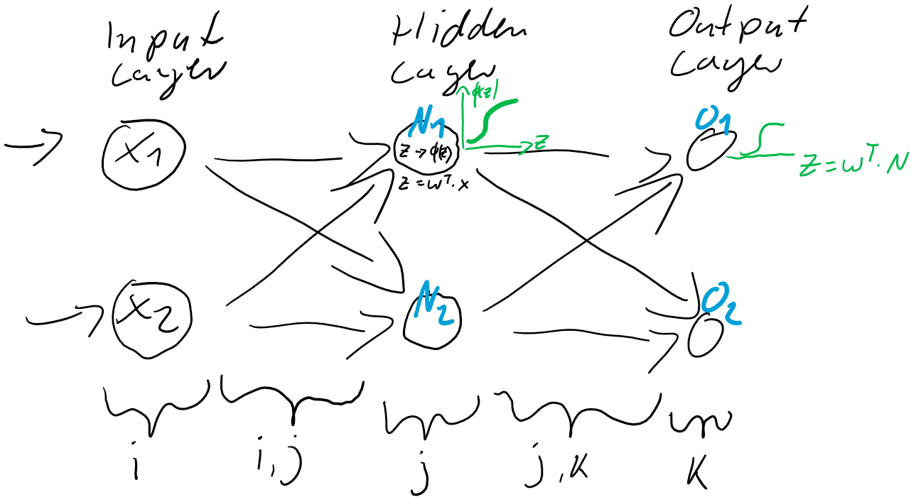
) und der Prädiktion (Ausgabe o) bleiben:

e_{o} = o_{real} - o

Der Fehler e ist also einfach der Unterschied zwischen dem Ziel-Wert und der Prädiktion. Jedes Training ist eine Wiederholung von Prädiktion (Forward) und Gewichtsanpassung (Back). Im ersten Schritt werden üblicherweise die Gewichtungen zufällig gesetzt, jede Gewichtung unterschiedlich nach Zufallszahl. So ist die Wahrscheinlichkeit, gleich zu Beginn die “richtigen” Gewichtungen gefunden zu haben auch bei kleinen neuronalen Netzen verschwindend gering. Der Fehler wird also groß sein und kann über den Gradientenabstieg durch Gewichtsanpassung verkleinert werden.

In diesem Beispiel berechnen wir die Fehler e_{1} und e_{2} und passen danach die Gewichte w_{j,k} (w_{1,1} & w_{2,1} und w_{1,2} & w_{2,2}) der Schicht zwischen dem Hidden-Layer N und dem Output-Layer o an.

Abbildung 3: Anpassung der Gewichtungen basierend auf dem Fehler in der Ausgabe-Schicht.

Die Frage ist nun, wie die Gewichte zwischen dem Input-Layer X 
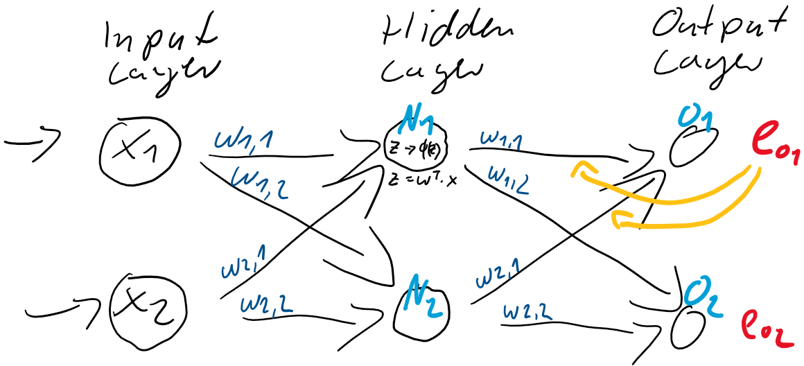
und dem Hidden-Layer N anzupassen sind. Es stellt sich die Frage, welchen Einfluss diese auf die Fehler in der Ausgabe-Schicht haben?

Um diese Gewichtungen anpassen zu können, benötigen wir den Fehler-Anteil der beiden Neuronen N_{1} und N_{2}. Dieser Anteil am Fehler der jeweiligen Neuronen ergibt sich direkt aus den Gewichtungen w_{j,k} zum Output-Layer:

e_{N_{1}} = e_{o1} \cdot \frac{w_{1,1}}{w_{1,1} + w_{1,2}} + e_{o2} \cdot \frac{w_{1,2}}{w_{1,1} + w_{1,2}}

e_{N_{2}} = e_{o1} \cdot \frac{w_{2,1}}{w_{2,1} + w_{2,2}} + e_{o2} \cdot \frac{w_{2,2}}{w_{2,1} + w_{2,2}}

Wenn man das nun generalisiert:

    \[ e_{N} = \left(\begin{array}{rr} \frac{w_{1,1}}{w_{1,1} + w_{1,2}} & \frac{w_{1,2}}{w_{1,1} + w_{1,2}} \\ \frac{w_{2,1}}{w_{2,1} + w_{2,2}} & \frac{w_{2,2}}{w_{2,1} + w_{2,2}} \end{array}\right) \cdot \left(\begin{array}{c} e_{1} \\ e_{2} \end{array}\right) \qquad \]

Dabei ist es recht aufwändig, die Gewichtungen stets ins Verhältnis zu setzen. Diese Berechnung können wir verkürzen, indem ganz einfach direkt nur die Gewichtungen ohne Relativierung zur Kalkulation des Fehleranteils benutzt werden. Die Relationen bleiben dabei erhalten!

    \[ e_{N} = \left(\begin{array}{rr} w_{1,1} & w_{1,2} \\ w_{2,1} & w_{2,2} \end{array}\right) \cdot \left(\begin{array}{c} e_{1} \\ e_{2} \end{array}\right) \qquad \]

Oder folglich in Kurzform: e_{N} = w^{T} \cdot e_{o}

Abbildung 4: Vollständige Gewichtsanpassung auf Basis der Fehler in der Ausgabeschicht und der Fehleranteile in der verborgenden Schicht.

Und nun können, basierend auf den Fehleranteilen der verborgenden Schicht N, die Gewichtungen w_{i,j} 
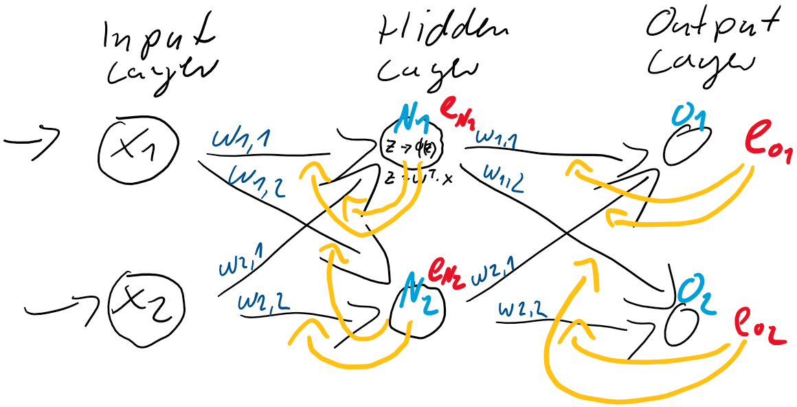
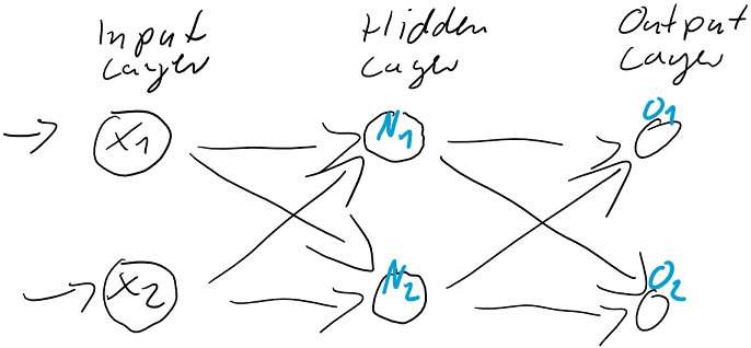
zwischen der Eingabe-Schicht I und der verborgenden Schicht N angepasst werden, entgegen dieser Fehler e_{N}.

Die Backpropagation besteht demnach aus zwei Schritten:

  1. Fehler-Berechnung durch Abgleich der Soll-Werte mit den Prädiktionen in der Ausgabeschicht und durch Fehler-Rückführung zu den Neuronen der verborgenden Schichten (Hidden-Layer)
  2. Anpassung der Gewichte entgegen des Gradientenanstiegs der Fehlerfunktion (Loss Function)

Buchempfehlungen

Die folgenden zwei Bücher haben mir sehr beim Verständnis und beim Verständlichmachen der Backpropagation in künstlichen neuronalen Netzen geholfen.

Neuronale Netze selbst programmieren: Ein verständlicher Einstieg mit Python Deep Learning. Das umfassende Handbuch: Grundlagen, aktuelle Verfahren und Algorithmen, neue Forschungsansätze (mitp Professional)