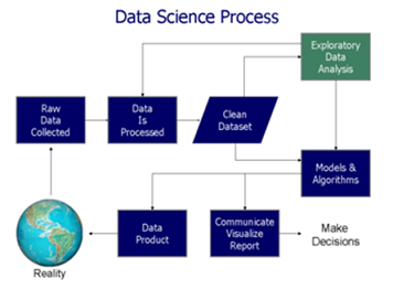
Erstellen und benutzen einer Geodatenbank

In diesem Artikel soll es im Gegensatz zum vorherigen Artikel Alles über Geodaten weniger darum gehen, was man denn alles mit Geodaten machen kann, dafür aber mehr darum wie man dies anstellt. Es wird gezeigt, wie man aus dem öffentlich verfügbaren Datensatz des OpenStreetMap-Projekts eine Geodatenbank erstellt und einige Beispiele dafür gegeben, wie man diese abfragen und benutzen kann.

Wahl der Datenbank

Prinzipiell gibt es zwei große “geo-kompatible” OpenSource-Datenbanken bzw. “Datenbank-AddOn’s”: Spatialite, welches auf SQLite aufbaut, und PostGIS, das PostgreSQL verwendet.

PostGIS bietet zum Teil eine einfachere Syntax, welche manchmal weniger Tipparbeit verursacht. So kann man zum Beispiel um die Entfernung zwischen zwei Orten zu ermitteln einfach schreiben:

während dies in Spatialite “nur” mit einer normalen Funktion möglich ist:

Trotztdem wird in diesem Artikel Spatialite (also SQLite) verwendet, da dessen Einrichtung deutlich einfacher ist (schließlich sollen interessierte sich alle Ergebnisse des Artikels problemlos nachbauen können, ohne hierfür einen eigenen Datenbankserver aufsetzen zu müssen).

Der Hauptunterschied zwischen PostgreSQL und SQLite (eigentlich der Unterschied zwischen SQLite und den meissten anderen Datenbanken) ist, dass für PostgreSQL im Hintergrund ein Server laufen muss, an welchen die entsprechenden Queries gesendet werden, während SQLite ein “normales” Programm (also kein Client-Server-System) ist welches die Queries selber auswertet.

Hierdurch fällt beim Aufsetzen der Datenbank eine ganze Menge an Konfigurationsarbeit weg: Welche Benutzer gibt es bzw. akzeptiert der Server? Welcher Benutzer bekommt welche Rechte? Über welche Verbindung wird auf den Server zugegriffen? Wie wird die Sicherheit dieser Verbindung sichergestellt? …

Während all dies bei SQLite (und damit auch Spatialite) wegfällt und die Einrichtung der Datenbank eigentlich nur “installieren und fertig” ist, muss auf der anderen Seite aber auch gesagt werden dass SQLite nicht gut für Szenarien geeignet ist, in welchen viele Benutzer gleichzeitig (insbesondere schreibenden) Zugriff auf die Datenbank benötigen.

Benötigte Software und ein Beispieldatensatz

Was wird für diesen Artikel an Software benötigt?

SQLite3 als Datenbank

libspatialite als “Geoplugin” für SQLite

spatialite-tools zum erstellen der Datenbank aus dem OpenStreetMaps (*.osm.pbf) Format

python3, die beiden GeoModule spatialite, folium und cartopy, sowie die Module pandas und matplotlib (letztere gehören im Bereich der Datenauswertung mit Python sowieso zum Standart). Für pandas gibt es noch die Erweiterung geopandas sowie eine praktisch unüberschaubare Anzahl weiterer geographischer Module aber bereits mit den genannten lassen sich eine Menge interessanter Dinge herausfinden.

– und natürlich einen Geodatensatz: Zum Beispiel sind aus dem OpenStreetMap-Projekt extrahierte Datensätze hier zu finden.

Es ist ratsam, sich hier erst einmal einen kleinen Datensatz herunterzuladen (wie zum Beispiel einen der Stadtstaaten Bremen, Hamburg oder Berlin). Zum einen dauert die Konvertierung des .osm.pbf-Formats in eine Spatialite-Datenbank bei größeren Datensätzen unter Umständen sehr lange, zum anderen ist die fertige Datenbank um ein vielfaches größer als die stark gepackte Originaldatei (für “nur” Deutschland ist die fertige Datenbank bereits ca. 30 GB groß und man lässt die Konvertierung (zumindest am eigenen Laptop) am besten über Nacht laufen – willkommen im Bereich “BigData”).

Erstellen eine Geodatenbank aus OpenStreetMap-Daten

Nach dem Herunterladen eines Datensatzes der Wahl im *.osm.pbf-Format kann hieraus recht einfach mit folgendem Befehl aus dem Paket spatialite-tools die Datenbank erstellt werden:

Erkunden der erstellten Geodatenbank

Nach Ausführen des obigen Befehls sollte nun eine Datei mit dem gewählten Namen (im Beispiel bremen-latest.sqlite) im aktuellen Ordner vorhanden sein – dies ist bereits die fertige Datenbank. Zunächst sollte man mit dieser Datenbank erst einmal dasselbe machen, wie mit jeder anderen Datenbank auch: Sich erst einmal eine Weile hinsetzen und schauen was alles an Daten in der Datenbank vorhanden und vor allem wo diese Daten in der erstellten Tabellenstruktur zu finden sind. Auch wenn dieses Umschauen prinzipiell auch vollständig über die Shell oder in Python möglich ist, sind hier Programme mit graphischer Benutzeroberfläche (z. B. spatialite-gui oder QGIS) sehr hilfreich und sparen nicht nur eine Menge Zeit sondern vor allem auch Tipparbeit. Wer dies tut, wird feststellen, dass sich in der generierten Datenbank einige dutzend Tabellen mit Namen wie pt_addresses, ln_highway und pg_boundary befinden.

Die Benennung der Tabellen folgt dem Prinzip, dass pt_*-Tabellen Punkte im Geokoordinatensystem wie z. B. Adressen, Shops, Bäckereien und ähnliches enthalten. ln_*-Tabellen enthalten hingegen geographische Entitäten, welche sich als Linien darstellen lassen, wie beispielsweise Straßen, Hochspannungsleitungen, Schienen, ect. Zuletzt gibt es die pg_*-Tabellen welche Polygone – also Flächen einer bestimmten Form enthalten. Dazu zählen Landesgrenzen, Bundesländer, Inseln, Postleitzahlengebiete, Landnutzung, aber auch Gebäude, da auch diese jeweils eine Grundfläche besitzen. In dem genannten Datensatz sind die Grundflächen von Gebäuden – zumindest in Europa – nahezu vollständig. Aber auch der Rest der Welt ist für ein “Wikipedia der Kartographie” insbesondere in halbwegs besiedelten Gebieten bemerkenswert gut erfasst, auch wenn nicht unbedingt davon ausgegangen werden kann, dass abgelegenere Gegenden (z. B. irgendwo auf dem Land in Südamerika) jedes Gebäude eingezeichnet ist.

Verwenden der Erstellten Datenbank

Auf diese Datenbank kann nun entweder direkt aus der Shell über den Befehl

zugegriffen werden oder man nutzt das gleichnamige Python-Paket:

Nach Eingabe der obigen Befehle in eine Python-Konsole, ein Jupyter-Notebook oder ein anderes Programm, welches die Anbindung an den Python-Interpreter ermöglicht, können die von der Datenbank ausgegebenen Ergebnisse nun direkt in ein Pandas Data Frame hineingeladen und verwendet/ausgewertet/analysiert werden.

Im Grunde wird hierfür “normales SQL” verwendet, wie in anderen Datenbanken auch. Der folgende Beispiel gibt einfach die fünf ersten von der Datenbank gefundenen Adressen aus der Tabelle pt_addresses aus:

Link zur Ausgabe

Es wird dem Leser sicherlich aufgefallen sein, dass die Spalte “Geometry” (zumindest für das menschliche Auge) nicht besonders ansprechend sowie auch nicht informativ aussieht: Der Grund hierfür ist, dass diese Spalte die entsprechende Position im geographischen Koordinatensystem aus Gründen wie dem deutlich kleineren Speicherplatzbedarf sowie der damit einhergehenden Optimierung der Geschwindigkeit der Datenbank selber, in binärer Form gespeichert und ohne weitere Verarbeitung auch als solche ausgegeben wird.

Glücklicherweise stellt spatialite eine ganze Reihe von Funktionen zur Verarbeitung dieser geographischen Informationen bereit, von denen im folgenden einige beispielsweise vorgestellt werden:

Für einzelne Punkte im Koordinatensystem gibt es beispielsweise die Funktionen X(geometry) und Y(geometry), welche aus diesem “binären Wirrwarr” den Längen- bzw. Breitengrad des jeweiligen Punktes als lesbare Zahlen ausgibt.

Ändert man also das obige Query nun entsprechend ab, erhält man als Ausgabe folgendes Ergebnis in welchem die Geometry-Spalte der ausgegebenen Adressen in den zwei neuen Spalten Longitude und Latitude in lesbarer Form zu finden ist:

Link zur Tabelle

Eine weitere häufig verwendete Funktion von Spatialite ist die Distance-Funktion, welche die Distanz zwischen zwei Orten berechnet.

Das folgende Beispiel sucht in der Datenbank die 10 nächstgelegenen Bäckereien zu einer frei wählbaren Position aus der Datenbank und listet diese nach zunehmender Entfernung auf (Achtung – die frei wählbare Position im Beispiel liegt in München, wer die selbe Position z. B. mit dem Bremen-Datensatz verwendet, wird vermutlich etwas weiter laufen müssen…):

Link zur Ausgabe

Ein Anwendungsfall für eine solche Liste können zum Beispiel Programme/Apps wie maps.me oder Google-Maps sein, in denen User nach Bäckereien, Geldautomaten, Supermärkten oder Apotheken “in der Nähe” suchen können sollen.

Diese Liste enthält nun alle Informationen die grundsätzlich gebraucht werden, ist soweit auch informativ und wird in den meißten Fällen der Datenauswertung auch genau so gebraucht, jedoch ist diese für das Auge nicht besonders ansprechend.

Viel besser wäre es doch, die gefundenen Positionen auf einer interaktiven Karte einzuzeichnen:

Was kann man sonst interessantes mit der erstellten Datenbank und etwas Python machen? Wer in Deutschland ein wenig herumgekommen ist, dem ist eventuell aufgefallen, dass sich die Endungen von Ortsnamen stark unterscheiden: Um München gibt es Stadteile und Dörfer namens Garching, Freising, Aubing, ect., rund um Stuttgart enden alle möglichen Namen auf “ingen” (Plieningen, Vaihningen, Echterdingen …) und in Berlin gibt es Orte wie Pankow, Virchow sowie eine bunte Auswahl weiterer *ow’s.

Das folgende Query spuckt gibt alle “village’s”, “town’s” und “city’s” aus der Tabelle pt_place, also Dörfer und Städte, aus:

Link zur Ausgabe

Graphisch mit matplotlib und cartopy in ein Koordinatensystem eingetragen sieht diese Verteilung folgendermassen aus:

Die Grafik zeigt, dass stark unterschiedliche Vorkommen der verschiedenen Ortsendungen in Deutschland (Clustering). Über das genaue Zustandekommen dieser Verteilung kann ich hier nur spekulieren, jedoch wird diese vermutlich ähnlichen Prozessen unterliegen wie beispielsweise die Entwicklung von Dialekten.

Wer sich die Karte etwas genauer anschaut wird merken, dass die eingezeichneten Landesgrenzen und Küstenlinien nicht besonders genau sind. Hieran wird ein interessanter Effekt von häufig verwendeten geographischen Entitäten, nämlich Linien und Polygonen deutlich. Im Beispiel werden durch die beiden Zeilen

die bereits im Modul cartopy hinterlegten Daten verwendet. Genaue Verläufe von Küstenlinien und Landesgrenzen benötigen mit wachsender Genauigkeit hingegen sehr viel Speicherplatz, da mehr und mehr zu speichernde Punkte benötigt werden (genaueres siehe hier).

Schlussfolgerung

Man kann also bereits mit einigen Grundmodulen und öffentlich verfügbaren Datensätzen eine ganze Menge im Bereich der Geodaten erkunden und entdecken. Gleichzeitig steht, insbesondere für spezielle Probleme, eine große Bandbreite weiterer Software zur Verfügung, für welche dieser Artikel zwar einen Grundsätzlichen Einstieg geben kann, die jedoch den Rahmen dieses Artikels sprengen würden.

A Bird’s Eye View: How Machine Learning Can Help You Charge Your E-Scooters

Bird scooters in Columbus, Ohio

Bird scooters in Columbus, Ohio

Ever since I started using bike-sharing to get around in Seattle, I have become fascinated with geolocation data and the transportation sharing economy. When I saw this project leveraging the mobility data RESTful API from the Los Angeles Department of Transportation, I was eager to dive in and get my hands dirty building a data product utilizing a company’s mobility data API.

Unfortunately, the major bike and scooter providers (Bird, JUMP, Lime) don’t have publicly accessible APIs. However, some folks have seemingly been able to reverse-engineer the Bird API used to populate the maps in their Android and iOS applications.

One interesting feature of this data is the nest_id, which indicates if the Bird scooter is in a “nest” — a centralized drop-off spot for charged Birds to be released back into circulation.

I set out to ask the following questions:

  1. Can real-time predictions be made to determine if a scooter is currently in a nest?
  2. For non-nest scooters, can new nest location recommendations be generated from geospatial clustering?

To answer these questions, I built a full-stack machine learning web application, NestGenerator, which provides an automated recommendation engine for new nest locations. This application can help power Bird’s internal nest location generation that runs within their Android and iOS applications. NestGenerator also provides real-time strategic insight for Bird chargers who are enticed to optimize their scooter collection and drop-off route based on proximity to scooters and nest locations in their area.

Bird

The electric scooter market has seen substantial growth with Bird’s recent billion dollar valuation  and their $300 million Series C round in the summer of 2018. Bird offers electric scooters that top out at 15 mph, cost $1 to unlock and 15 cents per minute of use. Bird scooters are in over 100 cities globally and they announced in late 2018 that they eclipsed 10 million scooter rides since their launch in 2017.

Bird scooters in Tel Aviv, Israel

Bird scooters in Tel Aviv, Israel

With all of these scooters populating cities, there’s much-needed demand for people to charge them. Since they are electric, someone needs to charge them! A charger can earn additional income for charging the scooters at their home and releasing them back into circulation at nest locations. The base price for charging each Bird is $5.00. It goes up from there when the Birds are harder to capture.

Data Collection and Machine Learning Pipeline

The full data pipeline for building “NestGenerator”

Data

From the details here, I was able to write a Python script that returned a list of Bird scooters within a specified area, their geolocation, unique ID, battery level and a nest ID.

I collected scooter data from four cities (Atlanta, Austin, Santa Monica, and Washington D.C.) across varying times of day over the course of four weeks. Collecting data from different cities was critical to the goal of training a machine learning model that would generalize well across cities.

Once equipped with the scooter’s latitude and longitude coordinates, I was able to leverage additional APIs and municipal data sources to get granular geolocation data to create an original scooter attribute and city feature dataset.

Data Sources:

  • Walk Score API: returns a walk score, transit score and bike score for any location.
  • Google Elevation API: returns elevation data for all locations on the surface of the earth.
  • Google Places API: returns information about places. Places are defined within this API as establishments, geographic locations, or prominent points of interest.
  • Google Reverse Geocoding API: reverse geocoding is the process of converting geographic coordinates into a human-readable address.
  • Weather Company Data: returns the current weather conditions for a geolocation.
  • LocationIQ: Nearby Points of Interest (PoI) API returns specified PoIs or places around a given coordinate.
  • OSMnx: Python package that lets you download spatial geometries and model, project, visualize, and analyze street networks from OpenStreetMap’s APIs.

Feature Engineering

After extensive API wrangling, which included a four-week prolonged data collection phase, I was finally able to put together a diverse feature set to train machine learning models. I engineered 38 features to classify if a scooter is currently in a nest.

Full Feature Set

Full Feature Set

The features boiled down into four categories:

  • Amenity-based: parks within a given radius, gas stations within a given radius, walk score, bike score
  • City Network Structure: intersection count, average circuity, street length average, average streets per node, elevation level
  • Distance-based: proximity to closest highway, primary road, secondary road, residential road
  • Scooter-specific attributes: battery level, proximity to closest scooter, high battery level (> 90%) scooters within a given radius, total scooters within a given radius


Log-Scale Transformation

For each feature, I plotted the distribution to explore the data for feature engineering opportunities. For features with a right-skewed distribution, where the mean is typically greater than the median, I applied these log transformations to normalize the distribution and reduce the variability of outlier observations. This approach was used to generate a log feature for proximity to closest scooter, closest highway, primary road, secondary road, and residential road.

An example of a log transformation

Statistical Analysis: A Systematic Approach

Next, I wanted to ensure that the features I included in my model displayed significant differences when broken up by nest classification. My thinking was that any features that did not significantly differ when stratified by nest classification would not have a meaningful predictive impact on whether a scooter was in a nest or not.

Distributions of a feature stratified by their nest classification can be tested for statistically significant differences. I used an unpaired samples t-test with a 0.01% significance level to compute a p-value and confidence interval to determine if there was a statistically significant difference in means for a feature stratified by nest classification. I rejected the null hypothesis if a p-value was smaller than the 0.01% threshold and if the 99.9% confidence interval did not straddle zero. By rejecting the null-hypothesis in favor of the alternative hypothesis, it’s deemed there is a significant difference in means of a feature by nest classification.

Battery Level Distribution Stratified by Nest Classification to run a t-test

Battery Level Distribution Stratified by Nest Classification to run a t-test

Log of Closest Scooter Distribution Stratified by Nest Classification to run a t-test

Throwing Away Features

Using the approach above, I removed ten features that did not display statistically significant results.

Statistically Insignificant Features Removed Before Model Development

Model Development

I trained two models, a random forest classifier and an extreme gradient boosting classifier since tree-based models can handle skewed data, capture important feature interactions, and provide a feature importance calculation. I trained the models on 70% of the data collected for all four cities and reserved the remaining 30% for testing.

After hyper-parameter tuning the models for performance on cross-validation data it was time to run the models on the 30% of test data set aside from the initial data collection.

I also collected additional test data from other cities (Columbus, Fort Lauderdale, San Diego) not involved in training the models. I took this step to ensure the selection of a machine learning model that would generalize well across cities. The performance of each model on the additional test data determined which model would be integrated into the application development.

Performance on Additional Cities Test Data

The Random Forest Classifier displayed superior performance across the board

The Random Forest Classifier displayed superior performance across the board

I opted to move forward with the random forest model because of its superior performance on AUC score and accuracy metrics on the additional cities test data. AUC is the Area under the ROC Curve, and it provides an aggregate measure of model performance across all possible classification thresholds.

AUC Score on Test Data for each Model

AUC Score on Test Data for each Model

Feature Importance

Battery level dominated as the most important feature. Additional important model features were proximity to high level battery scooters, proximity to closest scooter, and average distance to high level battery scooters.

Feature Importance for the Random Forest Classifier

Feature Importance for the Random Forest Classifier

The Trade-off Space

Once I had a working machine learning model for nest classification, I started to build out the application using the Flask web framework written in Python. After spending a few days of writing code for the application and incorporating the trained random forest model, I had enough to test out the basic functionality. I could finally run the application locally to call the Bird API and classify scooter’s into nests in real-time! There was one huge problem, though. It took more than seven minutes to generate the predictions and populate in the application. That just wasn’t going to cut it.

The question remained: will this model deliver in a production grade environment with the goal of making real-time classifications? This is a key trade-off in production grade machine learning applications where on one end of the spectrum we’re optimizing for model performance and on the other end we’re optimizing for low latency application performance.

As I continued to test out the application’s performance, I still faced the challenge of relying on so many APIs for real-time feature generation. Due to rate-limiting constraints and daily request limits across so many external APIs, the current machine learning classifier was not feasible to incorporate into the final application.

Run-Time Compliant Application Model

After going back to the drawing board, I trained a random forest model that relied primarily on scooter-specific features which were generated directly from the Bird API.

Through a process called vectorization, I was able to transform the geolocation distance calculations utilizing NumPy arrays which enabled batch operations on the data without writing any “for” loops. The distance calculations were applied simultaneously on the entire array of geolocations instead of looping through each individual element. The vectorization implementation optimized real-time feature engineering for distance related calculations which improved the application response time by a factor of ten.

Feature Importance for the Run-time Compliant Random Forest Classifier

Feature Importance for the Run-time Compliant Random Forest Classifier

This random forest model generalized well on test-data with an AUC score of 0.95 and an accuracy rate of 91%. The model retained its prediction accuracy compared to the former feature-rich model, but it gained 60x in application performance. This was a necessary trade-off for building a functional application with real-time prediction capabilities.

Geospatial Clustering

Now that I finally had a working machine learning model for classifying nests in a production grade environment, I could generate new nest locations for the non-nest scooters. The goal was to generate geospatial clusters based on the number of non-nest scooters in a given location.

The k-means algorithm is likely the most common clustering algorithm. However, k-means is not an optimal solution for widespread geolocation data because it minimizes variance, not geodetic distance. This can create suboptimal clustering from distortion in distance calculations at latitudes far from the equator. With this in mind, I initially set out to use the DBSCAN algorithm which clusters spatial data based on two parameters: a minimum cluster size and a physical distance from each point. There were a few issues that prevented me from moving forward with the DBSCAN algorithm.

  1. The DBSCAN algorithm does not allow for specifying the number of clusters, which was problematic as the goal was to generate a number of clusters as a function of non-nest scooters.
  2. I was unable to hone in on an optimal physical distance parameter that would dynamically change based on the Bird API data. This led to suboptimal nest locations due to a distortion in how the physical distance point was used in clustering. For example, Santa Monica, where there are ~15,000 scooters, has a higher concentration of scooters in a given area whereas Brookline, MA has a sparser set of scooter locations.

An example of how sparse scooter locations vs. highly concentrated scooter locations for a given Bird API call can create cluster distortion based on a static physical distance parameter in the DBSCAN algorithm. Left:Bird scooters in Brookline, MA. Right:Bird scooters in Santa Monica, CA.

An example of how sparse scooter locations vs. highly concentrated scooter locations for a given Bird API call can create cluster distortion based on a static physical distance parameter in the DBSCAN algorithm. Left:Bird scooters in Brookline, MA. Right:Bird scooters in Santa Monica, CA.

Given the granularity of geolocation scooter data I was working with, geospatial distortion was not an issue and the k-means algorithm would work well for generating clusters. Additionally, the k-means algorithm parameters allowed for dynamically customizing the number of clusters based on the number of non-nest scooters in a given location.

Once clusters were formed with the k-means algorithm, I derived a centroid from all of the observations within a given cluster. In this case, the centroids are the mean latitude and mean longitude for the scooters within a given cluster. The centroids coordinates are then projected as the new nest recommendations.

NestGenerator showcasing non-nest scooters and new nest recommendations utilizing the K-Means algorithm

NestGenerator showcasing non-nest scooters and new nest recommendations utilizing the K-Means algorithm.

NestGenerator Application

After wrapping up the machine learning components, I shifted to building out the remaining functionality of the application. The final iteration of the application is deployed to Heroku’s cloud platform.

In the NestGenerator app, a user specifies a location of their choosing. This will then call the Bird API for scooters within that given location and generate all of the model features for predicting nest classification using the trained random forest model. This forms the foundation for map filtering based on nest classification. In the app, a user has the ability to filter the map based on nest classification.

Drop-Down Map View filtering based on Nest Classification

Drop-Down Map View filtering based on Nest Classification

Nearest Generated Nest

To see the generated nest recommendations, a user selects the “Current Non-Nest Scooters & Predicted Nest Locations” filter which will then populate the application with these nest locations. Based on the user’s specified search location, a table is provided with the proximity of the five closest nests and an address of the Nest location to help inform a Bird charger in their decision-making.

NestGenerator web-layout with nest addresses and proximity to nearest generated nests

NestGenerator web-layout with nest addresses and proximity to nearest generated nests

Conclusion

By accurately predicting nest classification and clustering non-nest scooters, NestGenerator provides an automated recommendation engine for new nest locations. For Bird, this application can help power their nest location generation that runs within their Android and iOS applications. NestGenerator also provides real-time strategic insight for Bird chargers who are enticed to optimize their scooter collection and drop-off route based on scooters and nest locations in their area.

Code

The code for this project can be found on my GitHub

Comments or Questions? Please email me an E-Mail!


Allgemeines über Geodaten

Dieser Artikel ist der Auftakt in einer Artikelserie zum Thema “Geodatenanalyse”.

Von den vielen Arten an Datensätzen, die öffentlich im Internet verfügbar sind, bin ich in letzter Zeit vermehrt über eine besonders interessante Gruppe gestolpert, die sich gleich für mehrere Zwecke nutzen lassen: Geodaten.

Gerade in wirtschaftlicher Hinsicht bieten sich eine ganze Reihe von Anwendungsfällen, bei denen Geodaten helfen können, Einblicke in Tatsachen zu erlangen, die ohne nicht möglich wären. Der wohl bekannteste Fall hierfür ist vermutlich die einfache Navigation zwischen zwei Punkten, die jeder kennt, der bereits ein Navigationssystem genutzt oder sich eine Route von Google Maps berechnen lassen hat.
Hiermit können nicht nur Fragen nach dem schnellsten oder Energie einsparensten (und damit gleichermaßen auch witschaftlichsten) Weg z. B. von Berlin nach Hamburg beantwortet werden, sondern auch die bestmögliche Lösung für Ausnahmesituationen wie Stau oder Vollsperrungen berechnet werden (ja, Stau ist, zumindest in der Theorie immer noch eine “Ausnahmesituation” ;-)).
Neben dieser beliebten Art Geodaten zu nutzen, gibt es eine ganze Reihe weiterer Situationen in denen deren Nutzung hilfreich bis essentiell sein kann. Als Beispiel sei hier der Einzugsbereich von in Konkurrenz stehenden Einheiten, wie z. B. Supermärkten genannt. Ohne an dieser Stelle statistische Nachweise vorlegen zu können, kaufen (zumindest meiner persönlichen Beobachtung nach) die meisten Menschen fast immer bei dem Supermarkt ein, der am bequemsten zu erreichen ist und dies ist in der Regel der am nächsten gelegene. Besitzt man nun eine Datenbank mit der Information, wo welcher Supermarkt bzw. welche Supermarktkette liegt, kann man mit so genannten Voronidiagrammen recht einfach den jeweiligen Einzugsbereich der jeweiligen Supermärkte berechnen.
Entsprechende Karten können auch von beliebigen anderen Entitäten mit fester geographischer Position gezeichnet werden: Geldautomaten, Funkmasten, öffentlicher Nahverkehr, …

Ein anderes Beispiel, das für die Datenauswertung interessant ist, ist die kartographische Auswertung von Postleitzahlen. Diese sind in fast jedem Datensatz zu Kunden, Lieferanten, ect. vorhanden, bilden jedoch weder eine ordinale, noch eine sinnvolle kategorische Größe, da es viele tausend verschiedene gibt. Zudem ist auch eine einfache Gruppierung in gröbere Kategorien wie beispielsweise Postleitzahlen des Schemas 1xxxx oft kaum sinnvoll, da diese in aller Regel kein sinnvolles Mapping auf z. B. politische Gebiete – wie beispielsweise Bundesländer – zulassen. Ein Ausweg aus diesem Dilemma ist eine einfache kartographische Übersicht, welche die einzelnen Postleitzahlengebiete in einer Farbskala zeigt.

Im gezeigten Beispiel ist die Bevölkerungsdichte Deutschlands als Karte zu sehen. Hiermit wird schnell und übersichtlich deutlich, wo in Deutschland die Bevölkerung lokalisiert ist. Ähnliche Karten können beispielsweise erstellt werden, um Fragen wie “Wie ist meine Kundschaft verteilt?” oder “Wo hat die Werbekampange XYZ besonders gut funktioniert?” zu beantworten. Bezieht man weitere Daten wie die absolute Bevölkerung oder die Bevölkerungsdichte mit ein, können auch Antworten auf Fragen wie “Welchen Anteil der Bevölkerung habe ich bereits erreicht und wo ist noch nicht genutztes Potential?” oder “Ist mein Produkt eher in städtischen oder ländlichen Gebieten gefragt?” einfach und schnell gefunden werden.
Ohne die entsprechende geographische Zusatzinformation bleiben insbesondere Postleitzahlen leider oft als “nicht sinnvoll auswertbar” bei der Datenauswertung links liegen.
Eine ganz andere Art von Vorteil der Geodaten ist der educational point of view:
  • Wer erst anfängt, sich mit Datenbanken zu beschäftigen, findet mit Straßen, Postleitzahlen und Ländern einen deutlich einfacheren und vor allem besser verständlichen Zugang zu SQL als mit abstrakten Größen und Nummern wie ProductID, CustomerID und AdressID. Zudem lassen sich Geodaten nebenbei bemerkt mittels so genannter GeoInformationSystems (*gis-Programme), erstaunlich einfach und ansprechend plotten.
  • Wer sich mit SQL bereits ein wenig auskennt, kann mit den (beispielsweise von Spatialite oder PostGIS) bereitgestellten SQL-Funktionen eine ganze Menge über Datenbanken sowie deren Möglichkeiten – aber auch über deren Grenzen – erfahren.
  • Für wen relationale Datenbanken sowie deren Funktionen schon lange nichts Neues mehr darstellen, kann sich hier (selbst mit dem eigenen Notebook) erstaunlich einfach in das Thema “Bug Data” einarbeiten, da die Menge an öffentlich vorhandenen Geodaten z.B. des OpenStreetMaps-Projektes selbst in optimal gepackten Format vielen Dutzend GB entsprechen. Gerade die Möglichkeit, die viele *gis-Programme wie beispielsweise QGIS bieten, nämlich Straßen-, Schienen- und Stromnetze “on-the-fly” zu plotten, macht die Bedeutung von richtig oder falsch gesetzten Indices in verschiedenen Datenbanken allein anhand der Geschwindigkeit mit der sich die Plots aufbauen sehr eindrucksvoll deutlich.
Um an Datensätze zu kommen, reicht es in der Regel Google mit den entsprechenden Schlagworten zu versorgen.
Neben – um einen Vergleich zu nutzen – dem Brockhaus der Karten GoogleMaps gibt es beispielsweise mit dem OpenStreetMaps-Projekt einen freien Geodatensatz, welcher in diesem Kontext etwa als das Wikipedia der Karten zu verstehen ist.
Hier findet man zum Beispiel Daten wie Straßen-, Schienen- oder dem Stromnetz, aber auch die im obigen Voronidiagramm eingezeichneten Gebäude und Supermärkte stammen aus diesem Datensatz. Hiermit lassen sich recht einfach just for fun interessante Dinge herausfinden, wie z. B., dass es in Deutschland ca. 28 Mio Gebäude gibt (ein SQL-Einzeiler), dass der Berliner Osten auch ca. 30 Jahre nach der Wende noch immer vorwiegend von der Tram versorgt wird, während im Westen hauptsächlich die U-Bahn fährt. Oder über welche Trassen der in der Nordsee von Windkraftanlagen erzeugte Strom auf das Festland kommt und von da aus weiter verteilt wird.
Eher grundlegende aber deswegen nicht weniger nützliche Datensätze lassen sich unter dem Stichwort “natural earth” finden. Hier sind Daten wie globale Küstenlinien, mittels Echolot ausgemessene Meerestiefen, aber auch von Menschen geschaffene Dinge wie Landesgrenzen und Städte sehr übersichtlich zu finden.
Im Grunde sind der Vorstellung aber keinerlei Grenzen gesetzt und fast alle denkbaren geographischen Fakten können, manchmal sogar live via Sattelit, mitverfolgt werden. So kann man sich beispielsweise neben aktueller Wolkenbedekung, Regenradar und globaler Oberflächentemperatur des Planeten auch das Abschmelzen der Polkappen seit 1970 ansehen (NSIDC) oder sich live die Blitzeinschläge auf dem gesamten Planeten anschauen – mit Vorhersage darüber, wann und wo der Donner zu hören ist (das funktioniert wirklich! Beispielsweise auf lightningmaps).
Kurzum Geodaten sind neben ihrer wirtschaftlichen Relevanz – vor allem für die Logistik – auch für angehende Data Scientists sehr aufschlussreich und ein wunderbares Spielzeug, mit dem man sich lange beschäftigen und eine Menge interessanter Dinge herausfinden kann.

Attribution Models in Marketing

Attribution Models

A Business and Statistical Case

INTRODUCTION

A desire to understand the causal effect of campaigns on KPIs

Advertising and marketing costs represent a huge and ever more growing part of the budget of companies. Studies have found out this share is as high as 10% and increases with the size of companies (CMO study by American Marketing Association and Duke University, 2017). Measuring precisely the impact of a specific marketing campaign on the sales of a company is a critical step towards an efficient allocation of this budget. Would the return be higher for an euro spent on a Facebook ad, or should we better spend it on a TV spot? How much should I spend on Twitter ads given the volume of sales this channel is responsible for?

Attribution Models have lately received great attention in Marketing departments to answer these issues. The transition from offline to online marketing methods has indeed permitted the collection of multiple individual data throughout the whole customer journey, and  allowed for the development of user-centric attribution models. In short, Attribution Models use the information provided by Tracking technologies such as Google Analytics or Webtrekk to understand customer journeys from the first click on a Facebook ad to the final purchase and adequately ponderate the different marketing campaigns encountered depending on their responsibility in the final conversion.

Issues on Causal Effects

A key question then becomes: how to declare a channel is responsible for a purchase? In other words, how can we isolate the causal effect or incremental value of a campaign ?

          1. A/B-Tests

One method to estimate the pure impact of a campaign is the design of randomized experiments, wherein a control and treated groups are compared.  A/B tests belong to this broad category of randomized methods. Provided the groups are a priori similar in every aspect except for the treatment received, all subsequent differences may be attributed solely to the treatment. This method is typically used in medical studies to assess the effect of a drug to cure a disease.

Main practical issues regarding Randomized Methods are:

  • Assuring that control and treated groups are really similar before treatment. Uually a random assignment (i.e assuring that on a relevant set of observable variables groups are similar) is realized;
  • Potential spillover-effects, i.e the possibility that the treatment has an impact on the non-treated group as well (Stable unit treatment Value Assumption, or SUTVA in Rubin’s framework);
  • The costs of conducting such an experiment, and especially the costs linked to the deliberate assignment of individuals to a group with potentially lower results;
  • The number of such experiments to design if multiple treatments have to be measured;
  • Difficulties taking into account the interaction effects between campaigns or the effect of spending levels. Indeed, usually A/B tests are led by cutting off temporarily one campaign entirely and measuring the subsequent impact on KPI’s compared to the situation where this campaign is maintained;
  • The dynamical reproduction of experiments if we assume that treatment effects may change over time.

In the marketing context, multiple campaigns must be tested in a dynamical way, and treatment effect is likely to be heterogeneous among customers, leading to practical issues in the lauching of A/B tests to approximate the incremental value of all campaigns. However, sites with a lot of traffic and conversions can highly benefit from A/B testing as it provides a scientific and straightforward way to approximate a causal impact. Leading companies such as Uber, Netflix or Airbnb rely on internal tools for A/B testing automation, which allow them to basically test any decision they are about to make.

References:

Books:

Experiment!: Website conversion rate optimization with A/B and multivariate testing, Colin McFarland, ©2013 | New Riders  

A/B testing: the most powerful way to turn clicks into customers. Dan Siroker, Pete Koomen; Wiley, 2013.

Blogs:

https://eng.uber.com/xp

https://medium.com/airbnb-engineering/growing-our-host-community-with-online-marketing-9b2302299324

Study:

https://cmosurvey.org/wp-content/uploads/sites/15/2018/08/The_CMO_Survey-Results_by_Firm_and_Industry_Characteristics-Aug-2018.pdf

        2. Attribution models

Attribution Models do not demand to create an experimental setting. They take into account existing data and derive insights from the variability of customer journeys. One key difficulty is then to differentiate correlation and causality in the links observed between the exposition to campaigns and purchases. Indeed, selection effects may bias results as exposure to campaigns is usually dependant on user-characteristics and thus may not be necessarily independant from the customer’s baseline conversion probabilities. For example, customers purchasing from a discount price comparison website may be intrinsically different from customers buying from FB ad and this a priori difference may alone explain post-exposure differences in purchasing bahaviours. This intrinsic weakness must be remembered when interpreting Attribution Models results.

                          2.1 General Issues

The main issues regarding the implementation of Attribution Models are linked to

  • Causality and fallacious reasonning, as most models do not take into account the aforementionned selection biases.
  • Their difficult evaluation. Indeed, in almost all attribution models (except for those based on classification, where the accuracy of the model can be computed), the additionnal value brought by the use of a given attribution models cannot be evaluated using existing historical data. This additionnal value can only be approximated by analysing how the implementation of the conclusions of the attribution model have impacted a given KPI.
  • Tracking issues, leading to an uncorrect reconstruction of customer journeys
    • Cross-device journeys: cross-device issue arises from the use of different devices throughout the customer journeys, making it difficult to link datapoints. For example, if a customer searches for a product on his computer but later orders it on his mobile, the AM would then mistakenly consider it an order without prior campaign exposure. Though difficult to measure perfectly, the proportion of cross-device orders can approximate 20-30%.
    • Cookies destruction makes it difficult to track the customer his the whole journey. Both regulations and consumers’ rising concerns about data privacy issues mitigate the reliability and use of cookies.1 – From 2002 on, the EU has enacted directives concerning privacy regulation and the extended use of cookies for commercial targeting purposes, which have highly impacted marketing strategies, such as the ‘Privacy and Electronic Communications Directive’ (2002/58/EC). A research was conducted and found out that the adoption of this ‘Privacy Directive’ had led to 64% decrease in advertising methods compared to the rest of the world (Goldfarb et Tucker (2011)). The effect was stronger for generalized sites (Yahoo) than for specialized sites.2 – Users have grown more and more conscious of data privacy issues and have adopted protective measures concerning data privacy, such as automatic destruction of cookies after a session is ended, or simply giving away less personnal information (Goldfarb et Tucker (2012) ) .Valuable user information may be lost, though tracking technologies evolution have permitted to maintain tracking by other means. This issue may be particularly important in countries highly concerned with data privacy issues such as Germany.
    • Offline/Online bridge: an Attribution Model should take into account all campaigns to draw valuable insights. However, the exposure to offline campaigns (TV, newspapers) are difficult to track at the user level. One idea to tackle this issue would be to estimate the proportion of conversions led by offline campaigns through AB testing and deduce this proportion from the credit assigned to the online campaigns accounted for in the Attribution Model.
    • Touch point information available: clicks are easy to follow but irrelevant to take into account the influence of purely visual campaigns such as display ads or video.

                          2.2 Today’s main practices

Two main families of Attribution Models exist:

  • Rule-Based Attribution Models, which have been used for in the last decade but from which companies are gradualy switching.

Attribution depends on the individual journeys that have led to a purchase and is solely based on the rank of the campaign in the journey. Some models focus on a single touch points (First Click, Last Click) while others account for multi-touch journeys (Bathtube, Linear). It can be calculated at the customer level and thus doesn’t require large amounts of data points. We can distinguish two sub-groups of rule-based Attribution Models:

  • One Touch Attribution Models attribute all credit to a single touch point. The First-Click model attributes all credit for a converion to the first touch point of the customer journey; last touch attributes all credit to the last campaign.
  • Multi-touch Rule-Based Attribution Models incorporate information on the whole customer journey are thus an improvement compared to one touch models. To this family belong Linear model where credit is split equally between all channels, Bathtube model where 40% of credit is given to first and last clicks and the remaining 20% is distributed equally between the middle channels, or time-decay models where credit assigned to a click diminishes as the time between the click and the order increases..

The main advantages of rule-based models is their simplicity and cost effectiveness. The main problems are:

– They are a priori known and can thus lead to optimization strategies from competitors
– They do not take into account aggregate intelligence on customer journeys and actual incremental values.
– They tend to bias (depending on the model chosen) channels that are over-represented at the beggining or end of the funnel, according to theoretical assumptions that have no observationnal back-ups.

  • Data-Driven Attribution Models

These models take into account the weaknesses of rule-based models and make a relevant use of available data. Being data-driven, following attribution models cannot be computed using single user level data. On the contrary values are calculated through data aggregation and thus require a certain volume of customer journey information.

References:

https://dspace.mit.edu/handle/1721.1/64920


        3. Data-Driven Attribution Models in practice

                          3.1 Issues

Several issues arise in the computation of campaigns individual impact on a given KPI within a data-driven model.

  • Selection biases: Exposure to certain types of advertisement is usually highly correlated to non-observable variables which are in turn correlated to consumption practices. Differences in the behaviour of users exposed to different campaigns may thus only be driven by core differences in conversion probabilities between groups whether than by the campaign effect.
  • Complementarity: it may be that campaigns A and B only have an effect when combined, so that measuring their individual impact would lead to misleading conclusions. The model could then try to assess the effect of combinations of campaigns on top of the effect of individual campaigns. As the number of possible non-ordered combinations of k campaigns is 2k, it becomes clear that inclusing all possible combinations would however be time-consuming.
  • Order-sensitivity: The effect of a campaign A may depend on the place where it appears in the customer journey, meaning the rank of a campaign and not merely its presence could be accounted for in the model.
  • Relative Order-sensitivity: it may be that campaigns A and B only have an effect when one is exposed to campaign A before campaign B. If so, it could be useful to assess the effect of given combinations of campaigns as well. And this for all campaigns, leading to tremendous numbers of possible combinations.
  • All previous phenomenon may be present, increasing even more the potential complexity of a comprehensive Attribution Model. The number of all possible ordered combination of k campaigns is indeed :


                          3.2 Main models

                                  A) Logistic Regression and Classification models

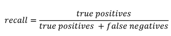
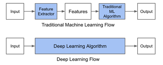
If non converting journeys are available, Attribition Model can be shaped as a simple classification issue. Campaign types or campaigns combination and volume of campaign types can be included in the model along with customer or time variables. As we are interested in inference (on campaigns effect) whether than prediction, a parametric model should be used, such as Logistic Regression. Non paramatric models such as Random Forests or Neural Networks can also be used though the interpretation of campaigns value would be more difficult to derive from the model results.

A common pitfall is the usual issue of spurious correlations on one hand and the correct interpretation of coefficients in business terms.

An advantage if the possibility to evaluate the relevance of the model using common model validation methods to evaluate its predictive power (validation set \ AUC \pseudo R squared).

                                  B) Shapley Value

Theory

The Shapley Value is based on a Game Theory framework and is named after its creator, the Nobel Price Laureate Lloyd Shapley. Initially meant to calculate the marginal contribution of players in cooperative games, the model has received much attention in research and industry and has lately been applied to marketing issues. This model is typically used by Google Adords and other ad bidding vendors. Campaigns or marketing channels are in this model seen as compementary players looking forward to increasing a given KPI.
Contrarily to Logistic Regressions, it is a non-parametric model. Contrarily to Markov Chains, all results are built using existing journeys, and not simulated ones.

Channels are considered to enter the game sequentially under a certain joining order. Shapley value try to The Shapley value of channel i is the weighted sum of the marginal values that channel i adds to all possible coalitions that don’t contain channel i.
In other words, the main logic is to analyse the difference of gains when a channel i is added after a coalition Ck of k channels, k<=n. We then sum all the marginal contributions over all possible ordered combination Ck of all campaigns excluding i, with k<=n-1.

Subsets framework

A first an most usual way to compute the Shapley Vaue is to consider that when a channel enters coalition, its additionnal value is the same irrelevant of the order in which previous channels have appeared. In other words, journeys (A>B>C) and (B>A>C) trigger the same gains.
Shapley value is computed as the gains associated to adding a channel i to a subset of channels, weighted by the number of (ordered) sequences that the (unordered) subset represents, summed up on all possible subsets of the total set of campaigns where the channel i is not present.
The Shapley value of the channel ???????? is then:

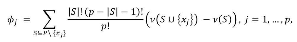
where |S| is the number of campaigns of a coalition S and the sum extends over all subsets S that do not not contain channel j. ????(????)  is the value of the coalition S and ????(???? ∪ {????????})  the value of the coalition formed by adding ???????? to coalition S. ????(???? ∪ {????????}) − ????(????) is thus the marginal contribution of channel ???????? to the coalition S.

The formula can be rewritten and understood as:

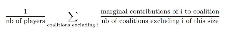
This method is convenient when data on the gains of on all possible permutations of all unordered k subsets of the n campaigns are available. It is also more convenient if the order of campaigns prior to the introduction of a campaign is thought to have no impact.

Ordered sequences

Let us define ????((A>B)) as the value of the sequence A then B. What is we let ????((A>B)) be different from ????((B>A)) ?
This time we would need to sum over all possible permutation of the S campaigns present before  ???????? and the N-(S+1) campaigns after ????????. Doing so we will sum over all possible orderings (i.e all permutations of the n campaigns of the grand coalition containing all campaigns) and we can remove the permutation coefficient s!(p-s+1)!.

This method is convenient when the order of channels prior to and after the introduction of another channel is assumed to have an impact. It is also necessary to possess data for all possible permutations of all k subsets of the n campaigns, and not only on all (unordered) k-subsets of the n campaigns, k<=n. In other words, one must know the gains of A, B, C, A>B, B>A, etc. to compute the Shapley Value.

Differences between the two approaches

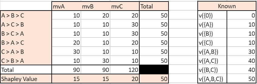
We simulate an ordered case where the value for each ordered sequence k for k<=3 is known. We compare it to the usual Shapley value calculated based on known gains of unordered subsets of campaigns. So as to compare relevant values, we have built the gains matrix so that the gains of a subset A, B i.e  ????({B,A}) is the average of the gains of ordered sequences made up with A and B (assuming the number of journeys where A>B equals the number of journeys where B>A, we have ????({B,A})=0.5( ????((A>B)) + ????((B>A)) ). We let the value of the grand coalition be different depending on the order of campaigns-keeping the constraints that it averages to the value used for the unordered case.

Note: mvA refers to the marginal value of A in a given sequence.
With traditionnal unordered coalitions:

With ordered sequences used to compute the marginal values:


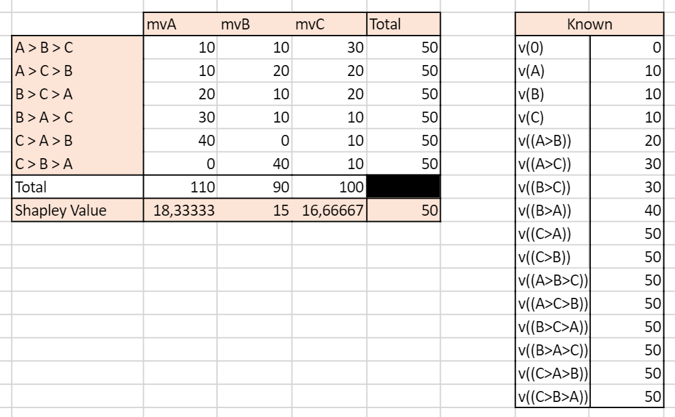
We can see that the two approaches yield very different results. In the unordered case, the Shapley Value campaign C is the highest, culminating at 20, while A and B have the same Shapley Value mvA=mvB=15. In the ordered case, campaign A has the highest Shapley Value and all campaigns have different Shapley Values.

This example illustrates the inherent differences between the set and sequences approach to Shapley values. Real life data is more likely to resemble the ordered case as conversion probabilities may for any given set of campaigns be influenced by the order through which the campaigns appear.

Advantages

Shapley value has become popular in allocation problems in cooperative games because it is the unique allocation which satisfies different axioms:

  • Efficiency: Shaple Values of all channels add up to the total gains (here, orders) observed.
  • Symmetry: if channels A and B bring the same contribution to any coalition of campaigns, then their Shapley Value i sthe same
  • Null player: if a channel brings no additionnal gains to all coalitions, then its Shapley Value is zero
  • Strong monotony: the Shapley Value of a player increases weakly if all its marginal contributions increase weakly

These properties make the Shapley Value close to what we intuitively define as a fair attribution.

Issues

  • The Shapley Value is based on combinatory mathematics, and the number of possible coalitions and ordered sequences becomes huge when the number of campaigns increases.
  • If unordered, the Shapley Value assumes the contribution of campaign A is the same if followed by campaign B or by C.
  • If ordered, the number of combinations for which data must be available and sufficient is huge.
  • Channels rarely present or present in long journeys will be played down.
  • Generally, gains are supposed to grow with the number of players in the game. However, it is plausible that in the marketing context a journey with a high number of channels will not necessarily bring more orders than a journey with less channels involved.

References:

R package: GameTheoryAllocation

Article:
Zhao & al, 2018 “Shapley Value Methods for Attribution Modeling in Online Advertising “
https://link.springer.com/content/pdf/10.1007/s13278-017-0480-z.pdf
Courses: https://www.lamsade.dauphine.fr/~airiau/Teaching/CoopGames/2011/coopgames-7%5b8up%5d.pdf
Blogs: https://towardsdatascience.com/one-feature-attribution-method-to-supposedly-rule-them-all-shapley-values-f3e04534983d

                                  B) Markov Chains

Markov Chains are used to model random processes, i.e events that occur in a sequential manner and in such a way that the probability to move to a certain state only depends on the past steps. The number of previous steps that are taken into account to model the transition probability is called the memory parameter of the sequence, and for the model to have a solution must be comprised between 0 and 4. A Markov Chain process is thus defined entirely by its Transition Matrix and its initial vector (i.e the starting point of the process).

Markov Chains are applied in many scientific fields. Typically, they are used in weather forecasting, with the sequence of Sunny and Rainy days following a Markov Process of memory parameter 0, so that for each given day the probability that the next day will be rainy or sunny only depends on the weather of the current day. Other applications can be found in sociology to understand the dynamics of social classes intergenerational reproduction. To get more both mathematical and applied illustration, I recommend the reading of this course.

In the marketing context, Markov Chains are an interesting way to model the conversion funnel. To go from the from the Markov Model to the Attribution logic, we calculate the Removal Effect of each channel, i.e the difference in conversions that happen if the channel is removed. Please read below for an introduction to the methodology.

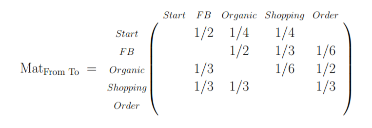
The first step in a Markov Chains Attribution Model is to build the transition matrix that captures the transition probabilities between the campaigns accross existing customer journeys. This Matrix is to be read as a “From state A to state B” table, from the left to the right. A first difficulty is finding the right memory parameter to use. A large memory parameter would allow to take more into account interraction effects within the conversion funnel but would lead to increased computationnal time, a non-readable transition matrix, and be more sensitive to noisy data. Please note that this transition matrix provides useful information on the conversion funnel and on the relationships between campaigns and can be used as such as an analytical tool. I suggest the clear and easily R code which can be found here or here.

Here is an illustration of a Markov Chain with memory Parameter of 0: the probability to go to a certain campaign B in the next step only depend on the campaign we are currently at:

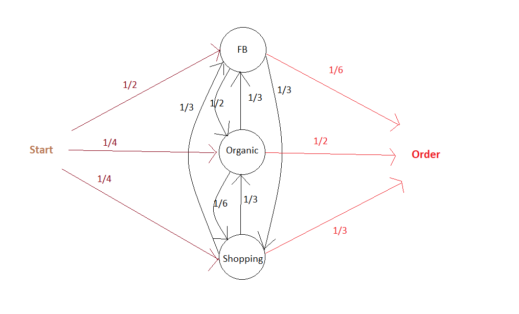
The associated Transition Matrix is then (with null probabilities left as Blank):

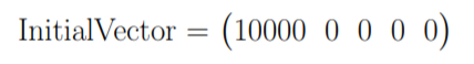
The second step is  to compute the actual responsibility of a channel in total conversions. As mentionned above, the main philosophy to do so is to calculate the Removal Effect of each channel, i.e the changes in the number of conversions when a channel is entirely removed. All customer journeys which went through this channel are settled out to be unsuccessful. This calculation is done by applying the transition matrix with and without the removed channels to an initial vector that contains the number of desired simulations.

Building on our current example, we can then settle an initial vector with the desired number of simulations, e.g 10 000:


It is possible at this stage to add a constraint on the maximum number of times the matrix is applied to the data, i.e on the maximal number of campaigns a simulated journey is allowed to have.

Advantages

  • The dynamic journey is taken into account, as well as the transition between two states. The funnel is not assumed to be linear.
  • It is possile to build a conversion graph that maps the customer journey provides valuable insights.
  • It is possible to evaluate partly the accuracy of the Attribution Model based on Markov Chains. It is for example possible to see how well the transition matrix help predict the future by analysing the number of correct predictions at any given step over all sequences.

Disadvantages

  • It can be somewhat difficult to set the memory parameter. Complementarity effects between channels are not well taken into account if the memory is low, but a parameter too high will lead to over-sensitivity to noise in the data and be difficult to implement if customer journeys tend to have a number of campaigns below this memory parameter.
  • Long journeys with different channels involved will be overweighted, as they will count many times in the Removal Effect.  For example, if there are n-1 channels in the customer journey, this journey will be considered as failure for the n-1 channel-RE. If the volume effects (i.e the impact of the overall number of channels in a journey, irrelevant from their type° are important then results may be biased.

References:

R package: ChannelAttribution

Git:

https://github.com/MatCyt/Markov-Chain/blob/master/README.md

Course:

https://www.ssc.wisc.edu/~jmontgom/markovchains.pdf

Article:

“Mapping the Customer Journey: A Graph-Based Framework for Online Attribution Modeling”; Anderl, Eva and Becker, Ingo and Wangenheim, Florian V. and Schumann, Jan Hendrik, 2014. Available at SSRN: https://ssrn.com/abstract=2343077 or http://dx.doi.org/10.2139/ssrn.2343077

“Media Exposure through the Funnel: A Model of Multi-Stage Attribution”, Abhishek & al, 2012

“Multichannel Marketing Attribution Using Markov Chains”, Kakalejčík, L., Bucko, J., Resende, P.A.A. and Ferencova, M. Journal of Applied Management and Investments, Vol. 7 No. 1, pp. 49-60.  2018

Blogs:

https://analyzecore.com/2016/08/03/attribution-model-r-part-1

https://analyzecore.com/2016/08/03/attribution-model-r-part-2

                          3.3 To go further: Tackling selection biases with Quasi-Experiments

Exposure to certain types of advertisement is usually highly correlated to non-observable variables. Differences in the behaviour of users exposed to different campaigns may thus only be driven by core differences in converison probabilities between groups whether than by the campaign effect. These potential selection effects may bias the results obtained using historical data.

Quasi-Experiments can help correct this selection effect while still using available observationnal data.  These methods recreate the settings on a randomized setting. The goal is to come as close as possible to the ideal of comparing two populations that are identical in all respects except for the advertising exposure. However, populations might still differ with respect to some unobserved characteristics.

Common quasi-experimental methods used for instance in Public Policy Evaluation are:

  • Discontinuity Regressions
  • Matching Methods, such as Exact Matching,  Propensity-score matching or k-nearest neighbourghs.

References:

Article:

“Towards a digital Attribution Model: Measuring the impact of display advertising on online consumer behaviour”, Anindya Ghose & al, MIS Quarterly Vol. 40 No. 4, pp. 1-XX, 2016

https://pdfs.semanticscholar.org/4fa6/1c53f281fa63a9f0617fbd794d54911a2f84.pdf

        4. First Steps towards a Practical Implementation

Identify key points of interests

  • Identify the nature of touchpoints available: is the data based on clicks? If so, is there a way to complement the data with A/B tests to measure the influence of ads without clicks (display, video) ? For example, what happens to sales when display campaign is removed? Analysing this multiplier effect would give the overall responsibility of display on sales, to be deduced from current attribution values given to click-based channels. More interestingly, what is the impact of the removal of display campaign on the occurences of click-based campaigns ? This would give us an idea of the impact of display ads on the exposure to each other campaigns, which would help correct the attribution values more precisely at the campaign level.
  • Define the KPI to track. From a pure Marketing perspective, looking at purchases may be sufficient, but from a financial perspective looking at profits, though a bit more difficult to compute, may drive more interesting results.
  • Define a customer journey. It may seem obvious, but the notion needs to be clarified at first. Would it be defined by a time limit? If so, which one? Does it end when a conversion is observed? For example, if a customer makes 2 purchases, would the campaigns he’s been exposed to before the first order still be accounted for in the second order? If so, with a time decay?
  • Define the research framework: are we interested only in customer journeys which have led to conversions or in all journeys? Keep in mind that successful customer journeys are a non-representative sample of customer journeys. Models built on the analysis of biased samples may be conservative. Take an extreme example: 80% of customers who see campaign A buy the product, VS 1% for campaign B. However, campaign B exposure is great and 100 Million people see it VS only 1M for campaign A. An Attribution Model based on successful journeys will give higher credit to campaign B which is an auguable conclusion. Taking into account costs per campaign (in the case where costs are calculated by clicks) may of course tackle this issue partly, as campaign A could then exhibit higher returns, but a serious fallacious reasonning is at stake here.

Analyse the typical customer journey    

  • Performing a duration analysis on the data may help you improve the definition of the customer journey to be used by your organization. After which days are converison probabilities null? Should we consider the effect of campaigns disappears after x days without orders? For example, if 99% of orders are placed in the 30 days following a first click, it might be interesting to define the customer journey as a 30 days time frame following the first oder.
  • Look at the distribution of the number of campaigns in a typical journey. If you choose to calculate the effect of campaigns interraction in your Attribution Model, it may indeed help you determine the maximum number of campaigns to be included in a combination. Indeed, you may not need to assess the impact of channel combinations with above than 4 different channels if 95% of orders are placed after less then 4 campaigns.
  • Transition matrixes: what if a campaign A systematically leads to a campaign B? What happens if we remove A or B? These insights would give clues to ask precise questions for a latter AB test, for example to find out if there is complementarity between channels A and B – (implying none should be removed) or mere substitution (implying one can be given up).
  • If conversion rates are available: it can be interesting to perform a survival analysis i.e to analyse the likelihood of conversion based on duration since first click. This could help us excluse potential outliers or individuals who have very low conversion probabilities.

Summary

Attribution is a complex topic which will probably never be definitively solved. Indeed, a main issue is the difficulty, or even impossibility, to evaluate precisely the accuracy of the attribution model that we’ve built. Attribution Models should be seen as a good yet always improvable approximation of the incremental values of campaigns, and be presented with their intrinsinc limits and biases.

Introduction to ROC Curve

The abbreviation ROC stands for Receiver Operating Characteristic. Its main purpose is to illustrate the diagnostic ability of classifier as the discrimination threshold is varied. It was developed during World War II when Radar operators had to decide if the blip on the screen is an enemy target, a friendly ship or just a noise.  For these purposes they measured the ability of a radar receiver operator to make these important distinctions, which was called the Receiver Operating Characteristic.

Later it was found useful in interpreting medical test results and then in Machine learning classification problems. In order to get an introduction to binary classification and terms like ‘precision’ and ‘recall’ one can look into my earlier blog  here.

True positive rate and false positive rate

Let’s imagine a situation where a fire alarm is installed in a kitchen. The alarm is supposed to emit a sound in case fire smoke is detected in the room. Unfortunately, there is a lot of cooking done in the kitchen and the alarm may trigger the sound too often. Thus, instead of serving a purpose the alarm becomes a nuisance due to a large number of false alarms. In statistical terms these types of errors are called type 1 errors, or false positives.

One way to deal with this problem is to simply decrease sensitivity of the device. We do this by increasing the trigger threshold at the alarm setting. But then, not every alarm should have the same threshold setting. Consider the same type of device but kept in a bedroom. With high threshold, the device might miss smoke from a real short-circuit in the wires which poses a real danger of fire. This kind of failure is called Type 2 error or a false negative. Although the two devices are the same, different types of threshold settings are optimal for different circumstances.

To specify this more formally, let us describe the performance of a binary classifier at a particular threshold by the following parameters:


These parameters take different values at different thresholds. Hence, they define the performance of the classifier at particular threshold. But we want to examine in overall how good a classifier is. Fortunately, there is a way to do that. We plot the True Positive Rate (TPR) and False Positive rate (FPR) at different thresholds and this plot is called ROC curve.

Let’s try to understand this with an example.

A case with a distinct population distribution

Let’s suppose there is a disease which can be identified with deficiency of some parameter (maybe a certain vitamin). The distribution of population with this disease has a mean vitamin concentration sharply distinct from the mean of a healthy population, as shown below.

This is result of dummy data simulating population of 2000 people,the link to the code is given  in the end of this blog.  As the two populations are distinctly separated (there is no  overlap between the two distributions), we can expect that a classifier would have an easy job distinquishing healthy from sick people. We can run a logistic regression classifier with a threshold of .5 and be 100% succesful in detecting the decease.

The confusion matrix may look something like this.

In this ideal case with a threshold  of  .5 we do not make a single wrong classification. The True positive rate and False positive rate are 1 and 0, respectively. But we can shift the threshold. In that case, we will  get different confusion matrices. First we plot threshold vs. TPR.

We see for most values of threshold the TPR is close to 1 which again proves data is easy to classify and the classifier is returning high probabilities  for the most of positives .

Similarly Let’s plot threshold vs. FPR.

For most of the data points FPR is close to zero. This is also good. Now its time to plot the ROC curve using these results (TPR vs FPR).

Let’s try to interpret  the results,  all the points lie on line x=0 and y=1, it means for all the points FPR is zero or TPR is one, making  the curve a square. which means the classifier does perfectly well.

Case with overlapping  population distribution

The above example was about a perfect classifer. However, life is often not so easy. Now let us consider another more realistic situation in which the parameter distribution of the population is not as distinct as in the previous case. Rather, the mean of the parameter with healthy and not healthy datapoints are close and the distributions overlap, as shown in the next figure.

If we set the threshold to 0.5, the confusion matrix may look like this.

Now, any new choice of threshold location will affect both false positives and false negatives. In fact, there is a trade-off. If we shift the threshold with the goal to reduce false negatives, false positives will increase. If we move the threshold to the other direction and reduce false positive, false negatives will increase.

The plots (TPR vs Threshold) , (FPR vs Threshold) are shown below

If we plot the ROC curve from these results, it looks like this:

From the curve we see the classifier does not perform as well as the earlier one.

What else can be infered from this curve? We first need to understand what the diagonal in this plot represent. The diagonal represents ‘Line of no discrimination’, which we obtain if we randomly guess. This is the ROC curve for the worst possible classifier. Therefore, by comparing the obtained ROC curve with the diagonal, we see how much better our classifer is from random guessing.

The further away ROC curve from the diagonal is (the closest it is to the top left corner) , better the classifier is.

Area Under the curve

The overall performance of the classifier is given by the area under the ROC curve and is usually denoted as AUC. Since TPR and FPR lie within the range of 0 to 1, the AUC also assumes values between 0 and 1. The higher the value of AUC, the better is the overall performance of the classifier.

Let’s see this for the two different distributions which we saw earlier.

As we know the classifier had worked perfectly in the first case with points at (0,1) the area under the curve is 1 which is perfect. In the latter case the classifier was not able to perform as good, the ROC curve is between the diagonal and left hand corner. The AUC as we can see is less than 1.

Some other general characteristics

There are still few points that needs to be discussed on a General ROC curve

  • The ROC curve does not provide information about the actual values of thresholds used for the classifier.
  • Performance of different classifiers can be compared using the AUC of different Classifier. The larger the AUC, the better the classifier.
  • The vertical distance of the ROC curve from the no discrimination line gives a measure of ‘INFORMEDNESS’. This is known as Youden’s J satistic. This statistics can take values between 0 and 1.

Youden’s  J statistic is defined for every point on the ROC curve . The point at which Youden’s  J satistics reaches its maximum for a given ROC curve can be used to guide the selection of the threshold to be used for that classifier.

I hope this post does the job of providing an understanding of ROC curves  and AUC. The  Python program for simulating the example given earlier can be found here .

Please feel free to adjust the mean of the distributions and see the changes in the plot.

A Gentle Introduction to Precision and Recall.

The idea of this blog is to give an intuitive understanding of Precision and Recall for a binary classification problem. I will shy away from explaining it in a textbook way but rather will try to give an intuition. Nevertheless, let me write the textbook formula first:

The problem with this nomenclature is that despite being correct, it can be a bit confusing, especially for beginners. For example ‘False Positives’ could be understood from a classifier point of view or from a population point of view.

Visualizing with an example

Let’s suppose we have a classifier to differentiate jeans from a T-shirts in a lot of cloths. This lot has 100 pieces altogether with 70 jeans and 30 T-shirts. Let us see this visually. Until this point, we just have a collection of clothes and have no classifier.

We already know that altogether we truly have 70 Jeans and 30 T-shirts.

Now let’s run the classifier to identify the jeans from T-shirts. We can assume the result of the classifier is following (number inside the box is the result of classifier):

We see that out of 70 jeans the classifier identifies 63 correctly as jeans and the remaining 7 as non-Jeans. Out of 30 T-shirts, the classifier identifies 11 falsely as jeans the remaining 19 correctly as non-Jeans.

So Recall is nothing but the proportion of identified jeans out of total jeans, which is

Recall = 63 / 70

Precision is the true jeans identified out of the total number of classified jeans. Which is:

Precision = 63 / (63+11)

Hence we see, in a way Recall has to do with the ability of classifier to deal with jeans and precision has to do with ability to deal with both Jeans and Non-Jeans.

This seems to provide better intuition than the textbook formula.

Diving Deeper with another example

Let us go through one more example to cement the idea. Let’s imagine there is a village which has a notoriously high number of criminals. A special cop arrives to tackle the law and order situation. He interviews every resident and locks some residents based on hunches.

If there are still many criminals roaming on the street the recall is bad, as recall deals with the ability to deal with the quantity which classifier is supposed to find (in this case criminals).

If there are too many innocents rotting in jail the precision is bad. As precision has also to do with the ability to deal with ‘others‘ that is not the quantity which the classifier is supposed to find (in this case these are the innocents).

Now we see, we don’t want too many criminals roaming on the street nor do we want many innocents rotting in the jail. Hence we need both recall and precision to be high or in other words, their mean to be high. But this cannot be arithmetic mean. Let’s see why using an example.

If for a village of 2000 residents there are 100 criminals. And if the cop straight away locks all 2000 residents, the confusion matrix looks like this:


Recall= 100/ (100+0) = 1

Precision = 100/ (100+1900) = 0.05

Arithmetic mean for Precision and Recall = (1+.05)/2 = 0.525

This would look like a pretty good classifier even though we know that in reality it’s a bad classifier (or a bad cop who just locks up every person he meets). It can be shown that the same happens in reverse. If the cop does not lock up anyone, the arithmetic mean does not show the true picture again.

That’s why we use harmonic mean. We call it F1 Score and it is calculated as follows: (2 * 1 * 0.05) / (1 + 0.05) = 0.0952

Now, this looks like a more realistic score. So, the performance of a classifier can be judged with a harmonic mean between precision and recall.

Let’s try to understand one more thing.

Often, classifiers work by returning probabilities of positives and negatives. One way to turn them into a confusion matrix is to use a threshold of 0.5. This means that if the probability of being positive is more than 0.5, we consider the case as positive (in our case a criminal). Otherwise, it is a negative.

But there might be cases where we want our recall to be very high. For example, if there is a classifier for identifying Ebola. We do not want any of the cases to be missed because otherwise we are risking an outbreak of the decease with disastrous consequences.

In this case, the threshold needs to be kept really low (maybe near .1 or smaller) so that we raise a flag for every case that has at least 10 % probability and get this person retested. This is an important measure in order to prevent an outbreak, despite the fact that there are a lot of false cases that needs to be rechecked.

There might be other cases where there are many false alarms (maybe fraud transaction in banks) which may be of low risk and it would be expensive to investigate all those cases. In those case, we might want to have a threshold higher than 0.5.

This gives us a taste of things to come. A classifiers efficiency can be plotted for different thresholds which gives us something called a ROC curve. But let’s save that for another post.

How is automation changing data science and machine learning?

We have come a long way since the introduction of data science and machine learning. The recent study has found that the volume of business data doubles in less than 14 months. Today, the collection of data is no longer a problem, but the filtration, analysis, and maintenance of relevant information is a bigger issue.

We need to hire data science professionals, and they demand over $100k annually. Paying that sort of money for a professional is not feasible for every single organization, especially small and middle-sized companies. Google recently announced that it is going to make machine learning technology possible for every business.

The access to machine learning technology is now possible, even for small businesses due to automation. Google, Microsoft, and other companies have come up with automated machine learning tools that enable small businesses to use machine learning technology to enhance their business performance and profit.

Image Source: Google Cloud

With that said, the world still needs a lot of machine learning professionals. Many machine learning professionals prefer Python for machine learning due to its features and a wide range of libraries.

According to the Gartner report, around 40% of data science tasks will be automated by 2020. The data science tools can automate some parts of data science processes, but it is not complete automation.

With that said, it has been helping a lot to accelerate the tasks. We still need data science professionals to deal with real-world problems. The algorithms are not yet able to handle messy data. The significant chunk of data science professionals often prefers performing with data science with Python for sophisticated tasks.

Automation in Data Science

Let me show you the figure right at the beginning before moving forward.

Image Source: Wikipedia

If I had to use only one word to describe the entire data science process, I would use the word “headache.” According to the recent report, the median salary of data scientists easily surpasses $100k annually. The pay will be higher in the time to come.

One needs to pay a lot of money and invest a lot of time to get insights from the collected data. The data scientists need to spend almost 50-60% of their time in data processing and the rest of their time in modeling and deployment.

The cloud platforms like Amazon Web Services, Google, Microsoft Azure, and so on make the job more comfortable, but there is still a lot of work to maintain and extract useful insights from the collected data.

The data science process has lots of inefficiencies. At first, they need to spend over 50% of their total time on processing messy real-world data. After that, there could be a need to customize models, according to specific problems.

The significant contribution of automation is making a significant portion of data processing parts automated. Secondly, the automated platforms can make tracking of various models easier from multiple parameters. The time needed to launch the algorithm is minimal.

One example of an extensive tool to handle a data science project is Alteryx. IT has come up with powerful automated solutions that can drastically reduce the data processing and model development time for smoothening the entire data science workflow. The data science platform, Alteryx, is so amazing that its share price doubled in a span of little more than a year.

Some other great tools that can help you in data science automation are Rapidminer, H20.ai, KNIME, and so on. However, the lack of skilled data scientists can create a problem despite these tools. It is where the role of automated machine learning pops in.

How is Machine Learning Transformed with the entrance of Automation?

The traditional machine learning process was too complicated. One requires to have a lot of expensive machine learning professionals working for months to come up with models to process machine learning tasks.

Image Source: Medium

To make traditional machine learning work, one needs to gather data, standardize data, process features, create and train the machine learning model from problems, validate the models, and deploy the models at last.

You must have heard of how machine learning is only for corporations in the past. But, that has drastically changed in recent time, and it is all due to automation. Keep in mind that the above machine learning model is a simple one. There is a lot of extra works for complicated models. Even for the simple ones, you need to spend a lot of time and money, which makes it impossible for small and medium companies.

The automation in machine learning is all about automating the entire process to make machine learning easier. The only thing you need to do is feed data to the system (not a massive volume of data). You do not need even to cross the three-figure number of images to continue with automated machine learning platforms.

Microsoft has its automl platform along with Google. Other automl platforms can do the trick for you. Using those platforms do not cost you an arm and a leg. If you check out the price, you will be surprised.

There is no need for you to create or deploy models or even test the models. The algorithm will do the job for you. It takes examples and models of historical models to process the data and use a machine learning algorithm.

Even non-statistician can implement machine learning technology with limited data, thanks to automation in machine learning. You can make use of predictive analytics and can get easy solutions for simple prediction problems without scratching your head. Numerous libraries can assist you in the automated generation of machine learning pipelines.

How are the jobs of data scientists simplified by the introduction of automation in machine learning and data science?

It is true that the introduction of automation has drastically reduced the time for completing the tasks for data scientists. They no longer have to spend their valuable time in time-consuming, monotonous works that are necessary but do not provide a lot of value.

However, the need for skilled data scientists still exist, and it will always be there in the time to come. There are challenging works for data scientists that we cannot replace with machines, such as listening to clients, figuring out the root cause of business issues, development and selection of the right solution for the specific business problem.

Just like in other types of jobs, the advancement of automation technologies will modify the tasks that data scientists need to perform. They will be able to allocate more time on things that matter rather than monotonous tasks.

Final Verdict

The automation of machine learning and data science are in the beginning stage. However, they are already making a massive impact on the business world. The huge corporations are investing in Big Data and Machine Learning technologies. We can expect a considerable improvement in these technologies shortly.

Sooner, the competitive advantage of a business will depend on how well they can use the technologies, instead of access to machine learning or Big Data technologies.  I hope this article was valuable to you. If you want to add something or express your thoughts, feel free to leave a comment. I will gladly read and reply to your comment.

A common trap when it comes to sampling from a population that intrinsically includes outliers

I will discuss a common fallacy concerning the conclusions drawn from calculating a sample mean and a sample standard deviation and more importantly how to avoid it.

Suppose you draw a random sample x_1, x_2, … x_N of size N and compute the ordinary (arithmetic) sample mean  x_m and a sample standard deviation sd from it.  Now if (and only if) the (true) population mean µ (first moment) and population variance (second moment) obtained from the actual underlying PDF  are finite, the numbers x_m and sd make the usual sense otherwise they are misleading as will be shown by an example.

By the way: The common correlation coefficient will also be undefined (or in practice always point to zero) in the presence of infinite population variances. Hopefully I will create an article discussing this related fallacy in the near future where a suitable generalization to Lévy-stable variables will be proposed.

 Drawing a random sample from a heavy tailed distribution and discussing certain measures

As an example suppose you have a one dimensional random walker whose step length is distributed by a symmetric standard Cauchy distribution (Lorentz-profile) with heavy tails, i.e. an alpha-stable distribution with alpha being equal to one. The PDF of an individual independent step is given by p(x) = \frac{\pi^{-1}}{(1 + x^2)} , thus neither the first nor the second moment exist whereby the first exists and vanishes at least in the sense of a principal value due to symmetry.

Still let us generate N = 3000 (pseudo) standard Cauchy random numbers in R* to analyze the behavior of their sample mean and standard deviation sd as a function of the reduced sample size n \leq N.

*The R-code is shown at the end of the article.

Here are the piecewise sample mean (in blue) and standard deviation (in red) for the mentioned Cauchy sampling. We see that both the sample mean and sd include jumps and do not converge.

Especially the mean deviates relatively largely from zero even after 3000 observations. The sample sd has no target due to the population variance being infinite.

If the data is new and no prior distribution is known, computing the sample mean and sd will be misleading. Astonishingly enough the sample mean itself will have the (formally exact) same distribution as the single step length p(x)
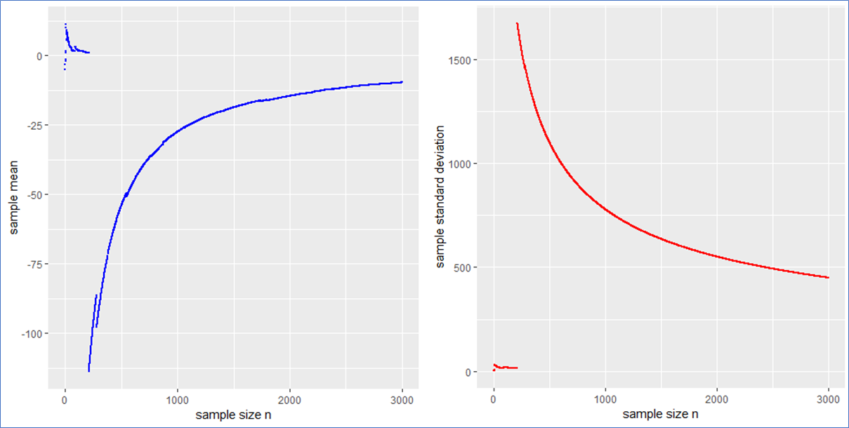
. This means that the sample mean is also standard Cauchy distributed implying that with a different Cauchy sample one could have easily observed different sample means far of the presented values in blue.

What sense does it make to present the usual interval x_m \pm sd / \sqrt{N} in such a case? What to do?

The sample median, median absolute difference (mad) and Inter-Quantile-Range (IQR) are more appropriate to describe such a data set including outliers intrinsically. To make this plausible I present the following plot, whereby the median is shown in black, the mad in green and the IQR in orange.

This example shows that the median, mad and IQR converge quickly against their assumed values and contain no major jumps. These quantities do an obviously better job in describing the sample. Even in the presence of outliers they remain robust, whereby the mad converges more quickly than the IQR. Note that a standard Cauchy sample will contain half of its sample in the interval median \pm 
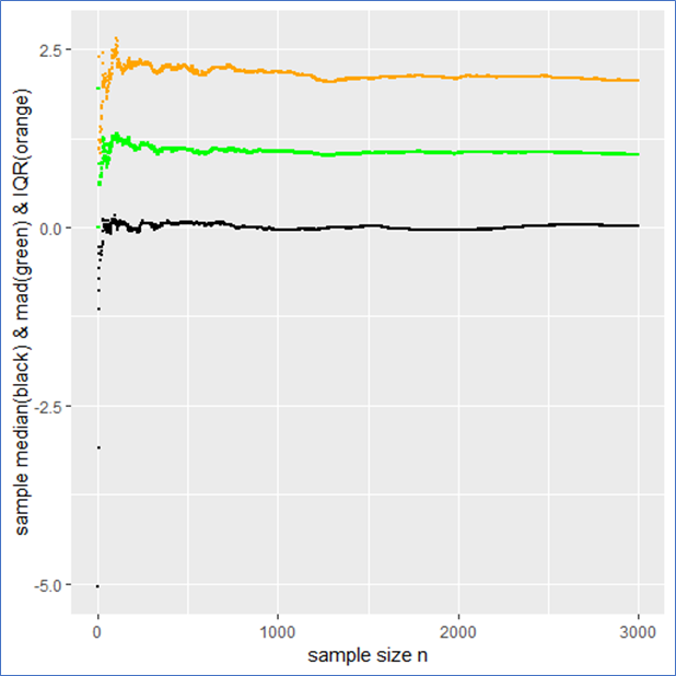
mad meaning that the IQR is twice the mad.

Drawing a random sample from a PDF that has finite moments

Just for comparison I also show the above quantities for a standard normal (pseudo) sample labeled with the same color as before as a counter example. In this case not only do both the sample mean and median but also the sd and mad converge towards their expected values (see plot below). Here all the quantities describe the data set properly and there is no trap since there are no intrinsic outliers. The sample mean itself follows a standard normal, so that the sd in deed makes sense and one could calculate a standard error \frac{sd}{\sqrt{N}} from it to present the usual stochastic confidence intervals for the sample mean.

A careful observation shows that in contrast to the Cauchy case here the sampled mean and sd converge more quickly than the sample median and the IQR. However still the sampled mad performs about as well as the sd. Again the mad is twice the IQR.

And here are the graphs of the prementioned quantities for a pseudo normal sample:

The take-home-message:

Just be careful when you observe outliers and calculate sample quantities right away, you might miss something. At best one carefully observes how the relevant quantities change with sample size as demonstrated in this article.

Such curves should become of broader interest in order to improve transparency in the Data Science process and reduce fallacies as well.

Thank you for reading.

P.S.: Feel free to play with the set random seed in the R-code below and observe how other quantities behave with rising sample size. Of course you can also try different PDFs at the beginning of the code. You can employ a Cauchy, Gaussian, uniform, exponential or Holtsmark (pseudo) random sample.


QUIZ: Which one of the recently mentioned random samples contains a trap** and why?

**in the context of this article


R-code used to generate the data and for producing plots:


Cross-industry standard process for data mining

Introduced in 1996, the cross-industry standard process for data mining (CRISP-DM) became the most
common procedure for all data mining projects. This method consists of six phases: Business
understanding, Data understanding, Data preparation, Modeling, Evaluation and Deployment (see
Figure 1). It is being used not just as a reference manual but as a user guide as it explains every phase
in detail (Hipp, 2000). The six phases of this model are explained below:

Figure 1: Different phases of CRISP-DM

Business Understanding

It includes understanding the business problem and determining the
objective of the business as well as of the project. It is also important to understand the previous work
done on the project (if any) to achieve the business goals and to examine if the scope of the project has changed.

The job of a Data Scientist is not limited to coding or just make a machine learning model and I guess that’s why this whole lifecycle was developed.  The key points a project owner should take care in this process are:

– Identify stakeholders  and involve them to define the scope your project
– Describe your product (your machine learning model)
– Identify how your product ties into the client’s business processes
– Identify metrics / KPIs for measuring success

Evaluating a model is a different thing as it can only tell you how good are your predictions but identifying the success metric is really important for any data science project because when your model is deployed in production this measure will tell you if your model actually works or not. Now, let’s discuss what is this success metric
Consider that you are working in an e-commerce company where Head of finance ask you to create a machine learning model to predict if a specific product will return or not. The problem is not hard to understand, its a binary classification problem and you know you can do the job. But before you start working with the data you should define a metric to measure the success. What do you think your success metric could be? I would go with the return rate, in other words, calculate the rate for how many orders are actually coming back and if this measure is getting decrease you would know your model works and if not then FIX IT !!

Data understanding

The initial step in this phase is to gather all the data from different sources. It is
then important to describe the data, generate graphs for distribution in order to get familiar with the
data. This phase is important as without enough data or without understanding about the data analysis
cannot be performed. In data mining terms this can be compared to Exploratory data analysis (EDA)
where techniques from descriptive statistics are used to have an insight into the data. For instance, if it is
a time series data it makes sense to know from when until when the data is available before diving deep into
the data.

Data preparation

This phase takes most of the time in data mining project as a lot of methods from
data cleaning, feature subset, feature engineering, the transformation of data etc. are used before the final
dataset is trained for modeling purpose. The single dataset can also be prepared in different forms as some
algorithms can learn more with a certain type of data, some algorithms can deal with imbalance dataset
and for some algorithms, the target variable must be balanced. This phase also requires sometimes to
calculate new KPI’s according to the business need or sometimes to reduce the dimension of the dataset.

Modeling and Evaluation

Various models are selected and build in this process and appropriate hyperparameters are
selected after an intensive grid search.  Once all the models are built it is now time to evaluate and compare performances of all the models.

Deployment

A model is of no use if it is not deployed into production. Until now you have been doing the job of a data scientist but for deployment, you need some software engineering

skills. There are several ways to deploy a machine learning model or python code. Few of them are:

  • Re-implement your python code in C++, Java etc. (LOL)
  • Save the coefficients and use them to get predictions
  • Serialized objects (REST API with flask, Django)

To understand the concept of deploying an ML model using REST API this post is highly recommended.

Training eines Neurons mit dem Gradientenverfahren

Dies ist Artikel 3 von 6 der Artikelserie –Einstieg in Deep Learning.

Das Training von neuronalen Netzen erfolgt nach der Forward-Propagation über zwei Schritte:

  1. Fehler-Rückführung über aller aktiver Neuronen aller Netz-Schichten, so dass jedes Neuron “seinen” Einfluss auf den Ausgabefehler kennt.
  2. Anpassung der Gewichte entgegen den Gradienten der Fehlerfunktion

Beide Schritte werden in der Regel zusammen als Backpropagation bezeichnet. Machen wir erstmal einen Schritt vor und betrachten wir, wie ein Neuron seine Gewichtsverbindungen zu seinen Vorgängern anpasst.

Gradientenabstiegsverfahren

Der Gradientenabstieg ist ein generalisierbarer Algorithmus zur Optimierung, der in vielen Verfahren des maschinellen Lernens zur Anwendung kommt, jedoch ganz besonders als sogenannte Backpropagation im Deep Learning den Erfolg der künstlichen neuronalen Netze erst möglich machen konnte.

Der Gradientenabstieg lässt sich vom Prinzip her leicht erklären: Angenommen, man stünde im Gebirge im dichten Nebel. Das Tal, und somit der Weg nach Hause, ist vom Nebel verdeckt. Wohin laufen wir? Wir können das Ziel zwar nicht sehen, tasten uns jedoch so heran, dass unser Gehirn den Gradienten (den Unterschied der Höhen beider Füße) berechnet, somit die Steigung des Bodens kennt und sich entgegen dieser Steigung unser Weg fortsetzt.

Konkret funktioniert der Gradientenabstieg so: Wir starten bei einem zufälligen Theta \theta 
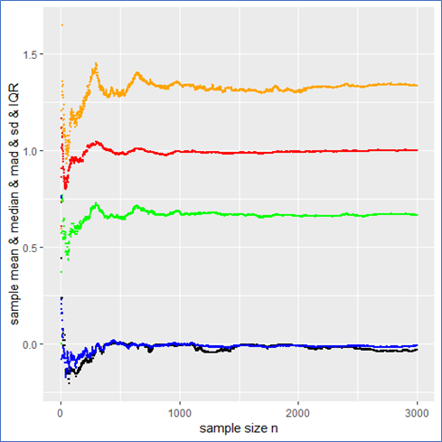
(Random Initialization). Wir berechnen die Ausgabe (Forwardpropogation) und vergleichen sie über eine Verlustfunktion (z. B. über die Funktion Mean Squared Error) mit dem tatsächlich korrekten Wert. Auf Grund der zufälligen Initialisierung haben wir eine nahe zu garantierte Falschheit der Ergebnisse und somit einen Verlust. Für die Verlustfunktion berechnen wir den Gradienten für gegebene Eingabewerte. Voraussetzung dafür ist, dass die Funktion ableitbar ist. Wir bewegen uns entgegen des Gradienten in Richtung Minimum der Verlustfunktion. Ist dieses Minimum (fast) gefunden, spricht man auch davon, dass der Lernalgorithmus konvergiert.

Das Gradientenabstiegsverfahren ist eine Möglichkeit der Gradientenverfahren, denn wollten wir maximieren, würden wir uns entlang des Gradienten bewegen, was in anderen Anwendungen sinnvoll ist.

Ob als “Cost Function” oder als “Loss Function” bezeichnet, in jedem Fall ist es eine “Error Function”, aber auf die Benennung kommen wir später zu sprechen. Jedenfalls versuchen wir die Fehlerrate zu senken! Leider sind diese Funktionen in der Praxis selten so einfach konvex (zwei Berge mit einem Tal dazwischen).


Aber Achtung: Denn befinden wir uns nur zwischen zwei Bergen, finden wir das Tal mit Sicherheit über den Gradienten. Befinden wir uns jedoch in einem richtigen Gebirge mit vielen Bergen und Tälern, gilt es, das richtige Tal zu finden. Bei der Optimierung der Gewichtungen von künstlichen neuronalen Netzen wollen wir die besten Gewichtungen finden, die uns zu den geringsten Ausgaben der Verlustfunktion führen. Wir suchen also das globale Minimum unter den vielen (lokalen) Minima.

Programmier-Beispiel in Python

Nachfolgend ein Beispiel des Gradientenverfahrens zur Berechnung einer Regression. Wir importieren numpy und matplotlib.pyplot und erzeugen uns künstliche Datenpunkte:

Nun wollen wir einen Lernalgorithmus über das Gradientenverfahren erstellen. Im Grunde haben wir hier es bereits mit einem linear aktivierten Neuron zutun:

Bei der linearen Regression, die wir durchführen wollen, nehmen wir zwei-dimensionale Daten (wobei wir die Regression prinzipiell auch mit x-Dimensionen durchführen können, dann hätte unser Neuron weitere Eingänge). Wir empfangen einen Bias (w_0
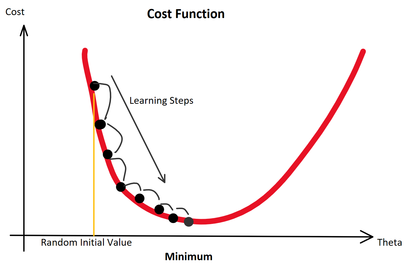
) der stets mit einer Eingangskonstante multipliziert und somit als Wert erhalten bleibt. Der Bias ist das Alpha \alpha in einer Schulmathe-tauglichen Formel wie y = \beta \cdot x + \alpha.

Beta \beta ist die Steigung, der Gradient, der Funktion.

Sowohl \alpha als auch \beta sind uns unbekannt, versuchen wir jedoch über die Betrachtung unserer Prädiktion durch Berechnung der Formel \^y = \beta \cdot x + \alpha und den darauffolgenden Abgleich mit dem tatsächlichen y herauszufinden. Anfangs behaupten wir beispielsweise einfach, sowohl \beta als auch \alpha seien 0.00. Folglich wird \^y = \beta \cdot x + \alpha ebenfalls gleich 0.00 sein und die Fehlerfunktion (Loss Function) wird maximal sein. Dies war der erste Durchlauf des Trainings, die sogenannte erste Epoche!

Die Epochen (Durchläufe) und dazugehörige Fehlergrößen. Wenn die Fehler sinken und mit weiteren Epochen nicht mehr wesentlich besser werden, heißt es, das der Lernalogorithmus konvergiert.

Als Fehlerfunktion verwenden wir bei der Regression die MSE-Funktion (Mean Squared Error):

MSE = \sum(\^y_i - y_i)^2

Um diese Funktion wird sich nun alles drehen, denn diese beschreibt den Fehler und gibt uns auch die Auskunft darüber, ob wie stark und in welche Richtung sie ansteigt, so dass wir uns entgegen der Steigung bewegen können. Wer die Regeln der Ableitung im Kopf hat, weiß, dass die Ableitung der Formel leichter wird, wenn wir sie vorher auf halbe Werte runterskalieren. Da die Proportionen dabei erhalten bleiben und uns quadrierte Fehlerwerte unserem menschlichen Verstand sowieso nicht so viel sagen (unser Gehirn denkt nunmal nicht exponential), stört das nicht:

MSE = \frac{\frac{1}{2} \cdot \sum(\^y_i - y_i)^2}{n}

MSE = \frac{\frac{1}{2} \cdot \sum(w^T \cdot x_i - y_i)^2}{n}

Wenn die Mathematik der partiellen Ableitung (Ableitung einer Funktion nach jedem Gradienten) abhanden gekommen ist, bitte nochmal folgende Regeln nachschlagen, um die nachfolgende Ableitung verstehen zu können:

  • Allgemeine partielle Ableitung
  • Kettenregel

Ableitung der MSD-Funktion nach dem einen Gewicht w 
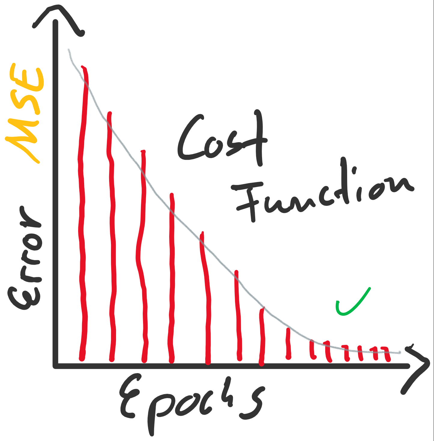
bzw. partiell nach jedem vorhandenen w_j:

\frac{\partial}{\partial w_j}MSE = \frac{\partial}{\partial w} \frac{1}{2} \cdot \sum(\^y - y_i)^2

\frac{\partial}{\partial w_j}MSE = \frac{\partial}{\partial w} \frac{1}{2} \cdot \sum(w^T \cdot x_i - y_i)^2

\frac{\partial}{\partial w_j}MSE = \frac{2}{n} \cdot \sum(w^T \cdot x_i - y_i) \cdot x_{ij}

Woher wir das x_{ij} am Ende her haben? Das ergibt sie aus der Kettenregel: Die äußere Funktion wurde abgeleitet, so wurde aus \frac{1}{2} \cdot \sum(w^T \cdot x_i - y_i)^2 dann \frac{2}{n} \cdot \sum(w^T \cdot x_i - y_i). Jedoch muss im Sinne eben dieser Kettenregel auch die innere Funktion abgeleitet werden. Da wir nach w_j ableiten, bleibt nur x_ij erhalten.

Damit können wir arbeiten! So kompliziert ist die Formel nun auch wieder nicht: \frac{2}{n} \cdot \sum(w^T \cdot x_i - y_i) \cdot x_{ij}

Mit dieser Formel können wir unsere Gewichte an den Fehler anpassen: (f\nabla ist der Gradient der Funktion!)

w_j = w_j - \nabla MSE(w_j)

Initialisieren der Gewichtungen

Die Gewichtungen \alpha und \beta müssen anfänglich mit Werten initialisiert werden. In der Regression bietet es sich an, die Gewichte anfänglich mit 0.00 zu initialisieren.

Bei vielen neuronalen Netzen, mit nicht-linearen Aktivierungsfunktionen, ist das jedoch eher ungünstig und zufällige Werte sind initial besser. Gut erprobt sind normal-verteilte Zufallswerte.

Lernrate

Nur eine Kleinigkeit haben wir bisher vergessen: Wir brauchen einen Faktor, mit dem wir anpassen. Hier wäre der Faktor 1. Das ist in der Regel viel zu groß. Dieser Faktor wird geläufig als Lernrate (Learning Rate) \eta (eta) bezeichnet:

w_j = w_j - \eta \cdot \nabla MSE(w_j)

Die Lernrate \eta ist ein Knackpunkt und der erste Parameter des Lernalgorithmus, den es anzupassen gilt, wenn das Training nicht konvergiert.

Die Lernrate \eta darf nicht zu groß klein gewählt werden, da das Training sonst zu viele Epochen benötigt. Ungeduldige erhöhen die Lernrate möglicherweise aber so sehr, dass der Lernalgorithmus im Minimum der Fehlerfunktion vorbeiläuft und diesen stets überspringt. Hier würde der Algorithmus also sozusagen konvergieren, weil nicht mehr besser werden, aber das resultierende Modell wäre weit vom Optimum entfernt.

Beginnen wir mit der Implementierung als Python-Klasse:

Die Klasse sollte so funktionieren, bevor wir sie verwenden, sollten wir die Input-Werte standardisieren:

Bei diesem Beispiel mit künstlich erzeugten Werten ist das Standardisieren bzw. das Fehlen des Standardisierens zwar nicht kritisch, aber man sollte es sich zur Gewohnheit machen. Testweise es einfach mal weglassen 🙂

Kommen wir nun zum Einsatz der Klasse, die die Regression via Gradientenabstieg absolvieren soll:

Was tut diese Instanz der Klasse LinearRegressionGD nun eigentlich?

Bildlich gesprochen, legt sie eine Gerade auf den Boden des Koordinatensystems, denn die Gewichtungen werden mit 0.00 initialisiert, y ist also gleich 0.00, egal welche Werte in x 
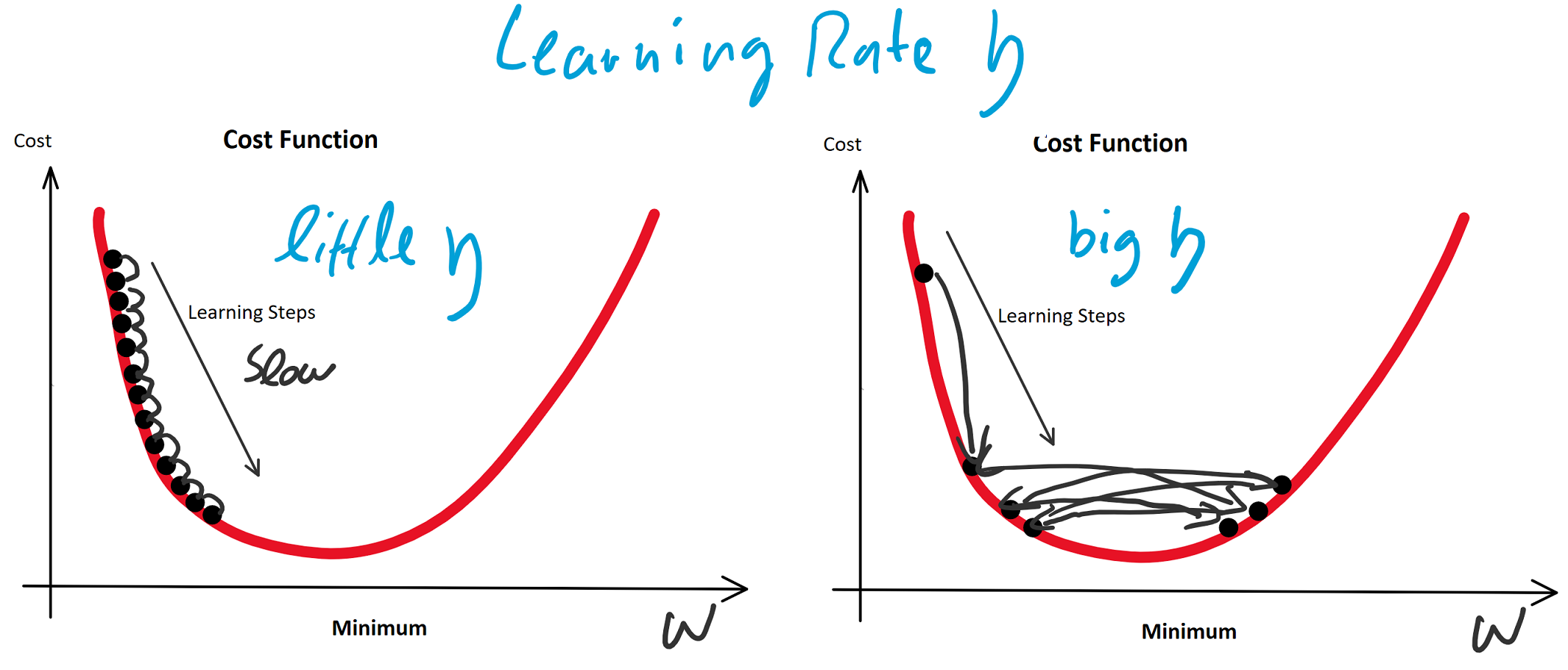
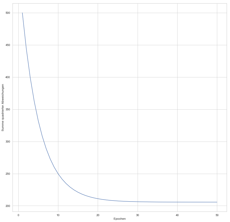
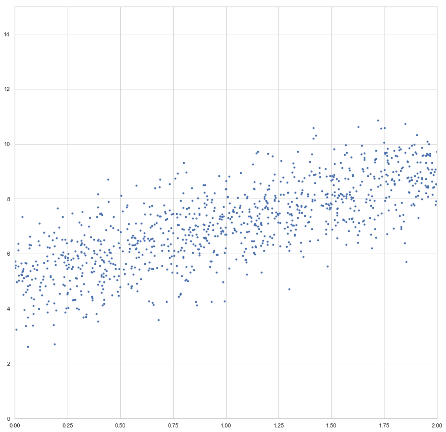
enthalten sind. Der Fehler ist dann aber sehr groß (sollte maximal sein, im Vergleich zu zukünftigen Epochen). Die Gewichte werden also angepasst, die Gerade somit besser in die Punktwolke platziert. Mit jeder Epoche wird die Gerade erneut in die Punktwolke gelegt, der Gesamtfehler (über alle
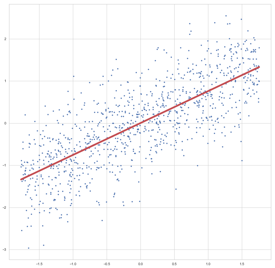
 x, da wir es hier mit dem Batch-Verfahren zutun haben) berechnet, die Werte angepasst… bis die vorgegebene Zahl an Epochen abgelaufen ist.

Schauen wir uns das Ergebnis des Trainings an:

Die Linie sieht passend aus, oder? Da wir hier nicht zu sehr in die Theorie der Regressionsanalyse abdriften möchten, lassen wir das testen und prüfen der Akkuratesse mal aus, hier möchte ich auf meinen Artikel Regressionsanalyse in Python mit Scikit-Learn verweisen.

Prüfen sollten wir hingegen mal, wie schnell der Lernalgorithmus mit der vorgegebenen Lernrate eta konvergiert:

Hier die Verlaufskurve der Cost Function:

Die Kurve zeigt uns, dass spätestens nach 40 Epochen kaum noch Verbesserung (im Sinne der Gesamtfehler-Minimierung) erreicht wird.

Wichtige Hinweise

Natürlich war das nun nur ein erster kleiner Einstieg und wer es verstanden hat, hat viel gewonnen. Denn erst dann kann man sich vorstellen, wie ein einzelnen Neuron eines künstlichen neuronalen Netzes grundsätzlich trainiert werden kann.

Folgendes sollte noch beachtet werden:

  • Lernrate \eta:
    Die Lernrate ist ein wichtiger Parameter. Wer das Programmier-Beispiel bei sich zum Laufen gebracht hat, einfach mal die Lernrate auf Werte zwischen 10.00 und 0.00000001 setzen, schauen was passiert 🙂
  • Globale Minima vs lokale Minima:
    Diese lineare zwei-dimensionale Regression ist ziemlich einfach. Neuronale Netze sind hingegen komplexer und haben nicht einfach nur eine simple konvexe Fehlerfunktion. Hier gibt es mehrere Hügel und Täler in der Fehlerfunktion und die Gefahr ist groß, in einem lokalen, nicht aber in einem globalen Minimum zu landen.
  • Stochastisches Gradientenverfahren:
    Wir haben hier das sogenannte Batch-Verfahren verwendet. Dieses ist grundsätzlich besser als die stochastische Methode. Denn beim Batch verwenden wir den gesamten Stapel an x-Werten für die Fehlerbestimmung. Allerdings ist dies bei großen Daten zu rechen- und speicherintensiv. Dann werden kleinere Unter-Stapel (Sub-Batches) zufällig aus den x-Werten ausgewählt, der Fehler daraus bestimmt (was nicht ganz so akkurat ist, wie als würden wir den Fehler über alle x berechnen) und der Gradient bestimmt. Dies ist schon Rechen- und Speicherkapazität, erfordert aber meistens mehr Epochen.

Buchempfehlung

Die folgenden zwei Bücher haben mir bei der Erstellung dieses Beispiels geholfen und kann ich als hilfreiche und deutlich weiterführende Lektüre empfehlen:


Machine Learning mit Python und Scikit-Learn und TensorFlow: Das umfassende Praxis-Handbuch für Data Science, Predictive Analytics und Deep Learning (mitp Professional) Hands-On Machine Learning with Scikit-Learn and TensorFlow: Concepts, Tools, and Techniques for Building Intelligent Systems