Applying Data Science Techniques in Python to Evaluate Ionospheric Perturbations from Earthquakes

Multi-GNSS (Galileo, GPS, and GLONASS) Vertical Total Electron Content Estimates: Applying Data Science techniques in Python to Evaluate Ionospheric Perturbations from Earthquakes

1 Introduction

Today, Global Navigation Satellite System (GNSS) observations are routinely used to study the physical processes that occur within the Earth’s upper atmosphere. Due to the experienced satellite signal propagation effects the total electron content (TEC) in the ionosphere can be estimated and the derived Global Ionosphere Maps (GIMs) provide an important contribution to monitoring space weather. While large TEC variations are mainly associated with solar activity, small ionospheric perturbations can also be induced by physical processes such as acoustic, gravity and Rayleigh waves, often generated by large earthquakes.

In this study Ionospheric perturbations caused by four earthquake events have been observed and are subsequently used as case studies in order to validate an in-house software developed using the Python programming language. The Python libraries primarily utlised are Pandas, Scikit-Learn, Matplotlib, SciPy, NumPy, Basemap, and ObsPy. A combination of Machine Learning and Data Analysis techniques have been applied. This in-house software can parse both receiver independent exchange format (RINEX) versions 2 and 3 raw data, with particular emphasis on multi-GNSS observables from GPS, GLONASS and Galileo. BDS (BeiDou) compatibility is to be added in the near future.

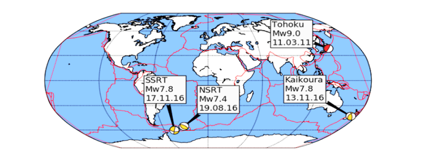
Several case studies focus on four recent earthquakes measuring above a moment magnitude (MW) of 7.0 and include: the 11 March 2011 MW 9.1 Tohoku, Japan, earthquake that also generated a tsunami; the 17 November 2013 MW 7.8 South Scotia Ridge Transform (SSRT), Scotia Sea earthquake; the 19 August 2016 MW 7.4 North Scotia Ridge Transform (NSRT) earthquake; and the 13 November 2016 MW 7.8 Kaikoura, New Zealand, earthquake.

Ionospheric disturbances generated by all four earthquakes have been observed by looking at the estimated vertical TEC (VTEC) and residual VTEC values. The results generated from these case studies are similar to those of published studies and validate the integrity of the in-house software.

2 Data Cleaning and Data Processing Methodology

Determining the absolute VTEC values are useful in order to understand the background ionospheric conditions when looking at the TEC perturbations, however small-scale variations in electron density are of primary interest. Quality checking processed GNSS data, applying carrier phase leveling to the measurements, and comparing the TEC perturbations with a polynomial fit creating residual plots are discussed in this section.

Time delay and phase advance observables can be measured from dual-frequency GNSS receivers to produce TEC data. Using data retrieved from the Center of Orbit Determination in Europe (CODE) site (ftp://ftp.unibe.ch/aiub/CODE), the differential code biases are subtracted from the ionospheric observables.

2.1 Determining VTEC: Thin Shell Mapping Function

The ionospheric shell height, H, used in ionosphere modeling has been open to debate for many years and typically ranges from 300 – 400 km, which corresponds to the maximum electron density within the ionosphere. The mapping function compensates for the increased path length traversed by the signal within the ionosphere. Figure 1 demonstrates the impact of varying the IPP height on the TEC values.

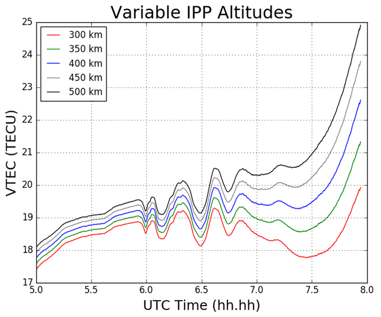
Figure 1 Impact on TEC values from varying IPP heights. The height of the thin shell, H, is increased in 50km increments from 300 to 500 km.

2.2 Phase Smoothing

For dual-frequency GNSS users TEC values can be retrieved with the use of dual-frequency measurements by applying calculations. Calculation of TEC for pseudorange measurements in practice produces a noisy outcome and so the relative phase delay between two carrier frequencies – which produces a more precise representation of TEC fluctuations – is preferred. To circumvent the effect of pseudorange noise on TEC data, GNSS pseudorange measurements can be smoothed by carrier phase measurements, with the use of the carrier phase smoothing technique, which is often referred to as carrier phase leveling.

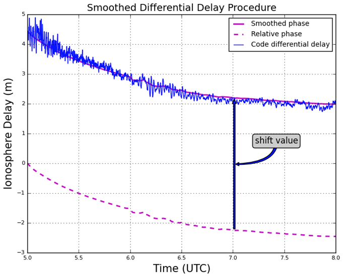
Figure 2 Phase smoothed code differential delay

2.3 Residual Determination

For the purpose of this study the monitoring of small-scale variations in ionospheric electron density from the ionospheric observables are of particular interest. Longer period variations can be associated with diurnal alterations, and changes in the receiver- satellite elevation angles. In order to remove these longer period variations in the TEC time series as well as to monitor more closely the small-scale variations in ionospheric electron density, a higher-order polynomial is fitted to the TEC time series. This higher-order polynomial fit is then subtracted from the observed TEC values resulting in the residuals. The variation of TEC due to the TID perturbation are thus represented by the residuals. For this report the polynomial order applied was typically greater than 4, and was chosen to emulate the nature of the arc for that particular time series. The order number selected is dependent on the nature of arcs displayed upon calculating the VTEC values after an initial inspection of the VTEC plots.

3 Results

3.1 Tohoku Earthquake

For this particular report, the sampled data focused on what was retrieved from the IGS station, MIZU, located at Mizusawa, Japan. The MIZU site is 39N 08′ 06.61″ and 141E 07′ 58.18″. The location of the data collection site, MIZU, and the earthquake epicenter can be seen in Figure 3.

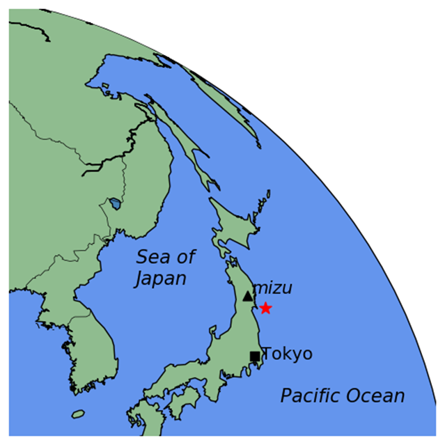
Figure 3 MIZU IGS station and Tohoku earthquake epicenter [generated using the Python library, Basemap]

Figure 4 displays the ionospheric delay in terms of vertical TEC (VTEC), in units of TECU (1 TECU = 1016 el m-2). The plot is split into two smaller subplots, the upper section displaying the ionospheric delay (VTEC) in units of TECU, the lower displaying the residuals. The vertical grey-dashed lined corresponds to the epoch of the earthquake at 05:46:23 UT (2:46:23 PM local time) on March 11 2011. In the upper section of the plot, the blue line corresponds to the absolute VTEC value calculated from the observations, in this case L1 and L2 on GPS, whereby the carrier phase leveling technique was applied to the data set. The VTEC values are mapped from the STEC values which are calculated from the LOS between MIZU and the GPS satellite PRN18 (on Figure 4 denoted G18). For this particular data set as seen in Figure 4, a polynomial fit of  five degrees was applied, which corresponds to the red-dashed line. As an alternative to polynomial fitting, band-pass filtering can be employed when TEC perturbations are desired. However for the scope of this report polynomial fitting to the time series of TEC data was the only method used. In the lower section of Figure 4 the residuals are plotted. The residuals are simply the phase smoothed delay values (the blue line) minus the polynomial fit line (the red-dashed line). All ionosphere delay plots follow the same layout pattern and all time data is represented in UT (UT = GPS – 15 leap seconds, whereby 15 leap seconds correspond to the amount of leap seconds at the time of the seismic event). The time series shown for the ionosphere delay plots are given in terms of decimal of the hour, so that the format follows hh.hh.

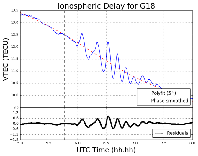
Figure 4 VTEC and residual plot for G18 at MIZU on March 11 2011

3.2 South Georgia Earthquake

In the South Georgia Island region located in the North Scotia Ridge Transform (NSRT) plate boundary between the South American and Scotia plates on 19 August 2016, a magnitude of 7.4 MW earthquake struck at 7:32:22 UT. This subsection analyses the data retrieved from KEPA and KRSA. As well as computing the GPS and GLONASS TEC values, four Galileo satellites (E08, E14, E26, E28) are also analysed. Figure 5 demonstrates the TEC perturbations as computed for the Galileo L1 and L5 carrier frequencies.

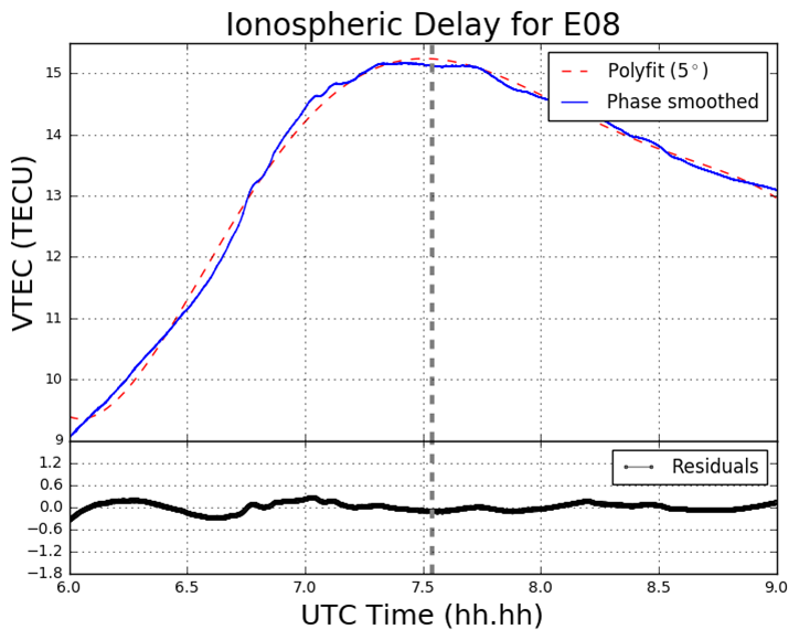
Figure 5 VTEC and residual plots at KRSA on 19 August 2016. The plots are from the perspective of the GNSS receiver at KRSA, for four Galileo satellites (a) E08; (b) E14; (c) E24; (d) E26. The y-axes and x-axes in all plots do not conform with one another but are adjusted to fit the data. The y-axes for the residual section of each plot is consistent with one another.

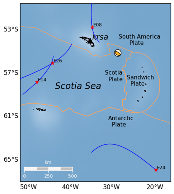
Figure 6 Geometry of the Galileo (E08, E14, E24 and E26) satellites’ projected ground track whereby the IPP is set to 300km altitude. The orange lines correspond to tectonic plate boundaries.

4 Conclusion

The proximity of the MIZU site and magnitude of the Tohoku event has provided a remarkable – albeit a poignant – opportunity to analyse the ocean-ionospheric coupling aftermath of a deep submarine seismic event. The Tohoku event has also enabled the observation of the origin and nature of the TIDs generated by both a major earthquake and tsunami in close proximity to the epicenter. Further, the Python software developed is more than capable of providing this functionality, by drawing on its mathematical packages, such as NumPy, Pandas, SciPy, and Matplotlib, as well as employing the cartographic toolkit provided from the Basemap package, and finally by utilizing the focal mechanism generation library, Obspy.

Pre-seismic cursors have been investigated in the past and strongly advocated in particular by Kosuke Heki. The topic of pre-seismic ionospheric disturbances remains somewhat controversial. A potential future study area could be the utilization of the Python program – along with algorithmic amendments – to verify the existence of this phenomenon. Such work would heavily involve the use of Scikit-Learn in order to ascertain the existence of any pre-cursors.

Finally, the code developed is still retained privately and as of yet not launched to any particular platform, such as GitHub. More detailed information on this report can be obtained here:

Download as PDF

Data Science Survey by lexoro.ai

Ergebnisse unserer ersten Data Science Survey

Wie denken Data Scientists über ihre Skills, ihre Karriere und ihre Arbeitgeber? Data Science, Machine Learning, Künstliche Intelligenz – mehr als bloße Hype-Begriffe und entfernte Zukunftsmusik! Wir stecken mitten in massiven strukturellen Veränderungen. Die Digitalisierungswelle der vergangenen Jahre war nur der Anfang. Jede Branche ist betroffen. Schnell kann ein Gefühl von Bedrohung und Angst vor dem Unbekannten aufkommen. Tatsächlich liegen aber nie zuvor dagewesene Chancen und Potentiale vor unseren Füßen. Die Herausforderung ist es diese zu erkennen und dann die notwendigen Veränderungen umzusetzen.
Diese Survey möchte deshalb die Begriffe Data Science und Machine Learning einmal genauer beleuchten. Was steckt überhaupt hinter diesen Begriffen? Was muss ein Data Scientist können? Welche Gedanken macht sich ein Data Scientist über seine Karriere? Und sind Unternehmen hinsichtlich des Themas Machine Learning gut aufgestellt? Nun möchten wir die Ergebnisse dieser Umfrage vorstellen:


Link zu den Ergebnissen der ersten Data Science Survey by lexoro.ai

Interesse an einem Austausch zu verschiedenen Karriereperspektiven im Bereich Data Science/ Machine Learning? Dann registrieren Sie sich direkt auf dem lexoro Talent Check-In und ein lexoro-Berater wird sich bei Ihnen melden.

Pentaho User Meeting: Warum das CERN und die Bundespolizei auf Open Source setzen

Anzeige

Was bewegt die größte Forschungsorganisation der Welt dazu, Open Source-Technologien einzusetzen? Wieso nutzt die Bundespolizei das offene Tool Pentaho Data Integration, um ihr Data Warehouse zu befüllen? Die Antworten geben die Anwender selbst auf dem Pentaho User Meeting am 6. März in Frankfurt.

Das CERN und die Bundespolizei sind nur zwei der Referenten, die auf dem Anwendertreffen ihre Datenprojekte vorstellen. Auf dem Pentaho User Meeting treffen sich seit Jahren alle Pentaho-Anwender aus dem deutschsprachigen Raum. Da spielt es keine Rolle, ob das Datenprojekt schon seit Jahren läuft oder noch nicht mal begonnen hat. Ob Newbie oder Professional – wer sich täglich mit Unternehmensdaten beschäftigt, ist auf dem User Meeting willkommen.

Das Pentaho User Meeting findet am 6. März von 10.00 bis 18.00 Uhr statt. Die Teilnahme ist kostenlos, aus Organisationsgründen (Raum, Catering) wird um eine Anmeldung gebeten. Anmelden können Sie sich hier.

Alles dreht sich um die Aufbereitung und Analyse von Daten

Das Pentaho User Meeting findet seit 2014 statt und dient dem Erfahrungs- und Wissensaustausch beim Einsatz mit der Data Analytics- und Big Data-Plattform Pentaho. Jeder Anwender ist herzlich eingeladen, sein Projekt oder Eigenentwicklung vorzustellen. In den letzten Jahren nahmen ca. 100 Anwender am Treffen teil, unter den Referenten waren u.a. Bosch, Swissport, Deutsche See und Wiener Wohnen Kundenservice.

Am 6. März wird es unter anderem um diese Themen gehen:

  • Realtime Analytics bei der Bundespolizei
  • Pentaho in einer Kubernetes-Verwaltung beim Fondsverwalter Netfonds
  • Migration von Reports von Business Objects auf Pentaho im CERN
  • Datei-Handling mit Pentaho Data Integration bei der Kapitalgesellschaft Hansainvest
  • Vorhersagemodelle für Predictive Analytics
  • IoT Analytics Use Case: das Smart Trains-Projekt von Virgin und Hitachi
  • SAP-Daten mit Pentaho integrieren und analysieren
  • Service Management Analytics: 360 Grad-Blick auf IT Services

Interviews mit den Referenten finden Sie hier.

Für Networking und Gespräche mit den Referenten und Anwendern bleibt in den Pausen genügend Zeit. Nach Abschluss der Veranstaltung laden wir alle Teilnehmer herzlich zu einem Get together bei Pizza und Bier ein! Alle Informationen zum Event, die Agenda und Anmeldung finden Sie hier.

Ps.: Aktuelle Updates zum Event gibt es auf Twitter unter #PUM18

New Sponsor: Cloudera

Dear readers,

we have good news: We welcome Cloudera as our new Data Science Blog Sponsor! Cloudera is one of the most famous platform and solution provider for big data analytics and machine learning. This also means editorial contributions by Cloudera for at least one year.

At Cloudera, we believe that data can make what is impossible today, possible tomorrow. We empower people to transform complex data into clear and actionable insights. We deliver the modern platform for machine learning and analytics optimized for the cloud. The world’s largest enterprises trust Cloudera to help solve their most challenging business problems.

Learn more about our new sponsor at cloudera.com.

Process Mining – Der Trend für 2018

Etwa seit dem Jahr 2010 erlebt Process Mining einerseits als Technologie und Methode einen Boom, andererseits fristet Process Mining noch ein gewisses Nischendasein. Wie wird sich dieser Trend 2018 und 2019 entwickeln?

Was ist Process Mining?

Process Mining (siehe auch: Artikel über Process Mining) ist ein Verfahren der Datenanalyse mit dem Ziel der Visualisierung und Analyse von Prozessflüssen. Es ist ein Data Mining im Sinne der Gewinnung von Informationen aus Daten heraus, nicht jedoch Data Mining im Sinne des unüberwachten maschinellen Lernens. Konkret formuliert, ist Process Mining eine Methode, um Prozess datenbasiert zur Rekonstruieren und zu analysieren. Im Mittelpunkt stehen dabei Zeitstempel (TimeStamps), die auf eine Aktivität (Event) in einem IT-System hinweisen und sich über Vorgangnummern (CaseID) verknüpfen lassen.

Process Mining als Analyseverfahren ist zweiteilig: Als erstes muss über eine Programmiersprache (i.d.R. PL/SQL oder T-SQL, seltener auch R oder Python) ein Skript entwickelt werden, dass auf die Daten eines IT-Systems (meistens Datenbank-Tabellen eines ERP-Systems, manchmal auch LogFiles z. B. von Webservern) zugreift und die darin enthaltenden (und oftmals verteilten) Datenspuren in ein Protokoll (ein sogenanntes EventLog) überführt.

Ist das EventLog erstellt, wird diese in ein Process Mining Tool geladen, dass das EventLog visuell als Flow-Chart darstellt, Filter- und Analysemöglichkeiten anbietet. Auch Alertings, Dashboards mit Diagrammen oder Implementierungen von Machine Learning Algorithmen (z. B. zur Fraud-Detection) können zum Funktionsumfang dieser Tools gehören. Die angebotenen Tools unterscheiden sich von Anbieter zu Anbieter teilweise erheblich.

Welche Branchen setzen bislang auf Process Mining?

Diese Analysemethodik hat sicherlich bereits in allen Branchen ihren Einzug gefunden, jedoch arbeiten gegenwärtig insbesondere größere Industrieunternehmen, Energieversorger, Handelsunternehmen und Finanzdienstleister mit Process Mining. Process Mining hat sich bisher nur bei einigen wenigen Mittelständlern etabliert, andere denken noch über die Einführung nach oder haben noch nie etwas von Process Mining gehört.

Auch Beratungsunternehmen (Prozess-Consulting) und Wirtschaftsprüfungen (Audit) setzen Process Mining seit Jahren ein und bieten es direkt oder indirekt als Leistung für ihre Kunden an.

Welche IT-Systeme und Prozesse werden analysiert?

Und auch hier gilt: Alle möglichen operativen Prozesse werden analysiert, beispielsweise der Gewährleistungsabwicklung (Handel/Hersteller), Kreditgenehmigung (Banken) oder der Vertragsänderungen (Kundenübergabe zwischen Energie- oder Telekommunikationsanbietern). Entsprechend werden alle IT-Systeme analysiert, u. a. ERP-, CRM-, PLM-, DMS- und ITS-Systeme.

Allen voran werden Procure-to-Pay- und Order-to-Cash-Prozesse analysiert, die für viele Unternehmen typische Einstiegspunkte in Process Mining darstellen, auch weil einige Anbieter von Process Mining Tools die nötigen Skripte (ggf. als automatisierte Connectoren) der EventLog-Generierung aus gängigen ERP-Systemen für diese Prozesse bereits mitliefern.

Welche Erfolge wurden mit Process Mining bereits erreicht?

Die Erfolge von Process Mining sind in erster Linie mit der gewonnenen Prozesstransparenz zu verbinden. Process Mining ist eine starke Analysemethode, um Potenziale der Durchlaufzeiten-Optimierung aufzudecken. So lassen sich recht gut unnötige Wartezeiten und störende Prozesschleifen erkennen. Ebenfalls eignet sich Process Mining wunderbar für die datengetriebene Prozessanalyse mit Blick auf den Compliance-Check bis hin zur Fraud-Detection.

Process Mining ist als Methode demnach sehr erfolgreich darin, die Prozessqualität zu erhöhen. Das ist natürlich an einen gewissen Personaleinsatz gebunden und funktioniert nicht ohne Schulungen, bedingt jedoch i.d.R. weniger eingebundene Mitarbeiter als bei klassischen Methoden der Ist-Prozessanalyse.

Ferner sollten einige positive Nebeneffekte Erwähnung finden. Durch den Einsatz von Process Mining, gerade wenn dieser erst nach einigen Herausforderungen zum Erfolg wurde, konnte häufig beobachtet werden, dass involvierte Mitarbeiter ein höheres Prozessbewustsein entwickelt haben, was sich auch indirekt bemerkbar machte (z. B. dadurch, dass Soll-Prozessdokumentationen realitätsnäher gestaltet wurden). Ein großer Nebeneffekt ist ganz häufig eine verbesserte Datenqualität und das Bewusstsein der Mitarbeiter über Datenquellen, deren Inhalte und Wissenspotenziale.

Wo haperte es bisher?

Ins Stottern kam Process Mining bisher insbesondere an der häufig mangelhaften Datenverfügbarkeit und Datenqualität in vielen IT-Systemen, insbesondere bei mittelständischen Unternehmen. Auch die Eigenständigkeit der Process Mining Tools (Integration in die BI, Anbindung an die IT, Lizenzkosten) und das fehlen von geschulten Mitarbeiter-Kapazitäten für die Analyse sorgen bei einigen Unternehmen für Frustration und Zweifel am langfristigen Erfolg.

Als Methode schwächelt Process Mining bei der Aufdeckung von Möglichkeiten der Reduzierung von Prozesskosten. Es mag hier einige gute Beispiele für die Prozesskostenreduzierung geben, jedoch haben insbesondere Mittelständische Unternehmen Schwierigkeiten darin, mit Process Mining direkt Kosten zu senken. Dieser Aspekt lässt insbesondere kostenfokussierte Unternehmer an Process Mining zweifeln, insbesondere wenn die Durchführung der Analyse mit hohen Lizenz- und Berater-Kosten verbunden ist.

Was wird sich an Process Mining ändern müssen?

Bisher wurde Process Mining recht losgelöst von anderen Themen des Prozessmanagements betrachtet, woran die Tool-Anbieter nicht ganz unschuldig sind. Process Mining wird sich zukünftig mehr von der Stabstelle mit Initiativ-Engagement hin zur Integration in den Fachbereichen entwickeln und Teil des täglichen Workflows werden. Auch Tool-seitig werden aktuelle Anbieter für Process Mining Software einem verstärkten Wettbewerb stellen müssen. Process Mining wird toolseitig enger Teil der Unternehmens-BI und somit ein Teil einer gesamtheitlichen Business Intelligence werden.

Um sich von etablierten BI-Anbietern abzusetzen, implementieren und bewerben einige Anbieter für Process Mining Software bereits Machine Learning oder Deep Learning Algorithmen, die selbstständig Prozessmuster auf Anomalien hin untersuchen, die ein Mensch (vermutlich) nicht erkennen würde. Process Mining mit KI wird zu Process Analytics, und somit ein Trend für die Jahre 2018 und 2019.

Für wen wird Process Mining 2018 interessant?

Während größere Industrieunternehmen, Großhändler, Banken und Versicherungen längst über Process Mining Piloten hinaus und zum produktiven Einsatz übergegangen sind (jedoch von einer optimalen Nutzung auch heute noch lange entfernt sind!), wird Process Mining zunehmend auch für mittelständische Unternehmen interessant – und das für alle geschäftskritischen Prozesse.

Während Process Mining mit ERP-Daten bereits recht verbreitet ist, wurden andere IT-Systeme bisher seltener analysiert. Mit der höheren Datenverfügbarkeit, die dank Industrie 4.0 und mit ihr verbundene Konzepte wie M2M, CPS und IoT, ganz neue Dimensionen erlangt, wird Process Mining auch Teil der Smart Factory und somit der verstärkte Einsatz in der Produktion und Logistik absehbar.

Lesetipp: Process Mining 2018 – If you can’t measure it, you can’t improve it: Process Mining bleibt auch im neuen Jahr mit hoher Wahrscheinlichkeit ein bestimmendes Thema in der Datenanalytik. Sechs Experten teilen ihre Einschätzungen zur weiteren Entwicklung 2018 und zeigen auf, warum das Thema von so hoher Relevanz ist. (www.internet-of-things.de – 10. Januar 2018)

New Sponsor: lexoro.ai

We wish our readers a happy new year and have good news: We welcome lexoro as our new Data Science Blog Sponsor for 2018!

lexoro GmbH is a Talent Management and Consulting company in the cosmos of the broad topic of Artificial Intelligence. Our focus lies on the relevant technologies and trends in the fields of data science, machine learning and big data. We identify and connect the best talents and experts behind the buzzwords, and help technology-focused industrial and consulting firms in finding the right people with the right skills to build and grow their analytics teams. In addition, we advise companies in identifying their individual challenges, hurdles and opportunities that go along with the great hype of Artificial Intelligence. We develop A.I. Prototypes and make the market transparent with industry-typical use cases.

Do you want to know more about lexoro? Visit them on lexoro.ai!

Neues Weiterbildungsangebot zu Programmiersprache R an der TU Dortmund

Anzeige: Neues Weiterbildungsangebot zu Programmiersprache R an der TU Dortmund

In der Tagesseminarreihe Dortmunder R-Kursean der Technischen Universität Dortmund vermitteln erfahrene Experten die praktische Anwendung der Open-Source Statistiksoftware R. Die Teilnehmenden erwerben dadurch Schlüsselkompetenzen im Umgang mit Big Data.

Das Seminar R-Basiskurs für Anfänger findet am 22.02. & 23.02.18 statt. Den Teilnehmern wird der praxisrelevante Part der Programmiersprache näher gebracht, um so die Grundlagen zur ersten Datenanalyse — vom Datensatz zu statistischen Kennzahlen und ersten Datenvisualisierungen — zu schaffen. Anmeldeschluss ist der 01.02.2018.

Das Seminar R-Vertiefungskurs für Fortgeschrittene findet am 06.03. & 07.03.18 statt. Die Veranstaltung ist ideal für Teilnehmende mit ersten Vorkenntnissen, die ihre Analysen effizient mit R durchführen möchten. Anmeldeschluss ist der 13.02.2018.

Weitere inhaltliche Informationen zu den R-Kursen finden Sie unter:
http://dortmunder-r-kurse.de/

My Desk for Data Science

In my last post I anounced a blog parade about what a data scientist’s workplace might look like.

Here are some photos of my desk and my answers to the questions:

How many monitors do you use (or wish to have)?

I am mostly working at my desk in my office with a tower PC and three monitors.
I definitely need at least three monitors to work productively as a data scientist. Who does not know this: On the left monitor the data model is displayed, on the right monitor the data mapping and in the middle I do my work: programming the analysis scripts.

What hardware do you use? Apple? Dell? Lenovo? Others?

I am note an Apple guy. When I need to work mobile, I like to use ThinkPad notebooks. The ThinkPads are (in my experience) very robust and are therefore particularly good for mobile work. Besides, those notebooks look conservative and so I’m not sad if there comes a scratch on the notebook. However, I do not solve particularly challenging analysis tasks on a notebook, because I need my monitors for that.

Which OS do you use (or prefer)? MacOS, Linux, Windows? Virtual Machines?

As a data scientist, I have to be able to communicate well with my clients and they usually use Microsoft Windows as their operating system. I also use Windows as my main operating system. Of course, all our servers run on Linux Debian, but most of my tasks are done directly on Windows.
For some notebooks, I have set up a dual boot, because sometimes I need to start native Linux, for all other cases I work with virtual machines (Linux Ubuntu or Linux Mint).

What are your favorite databases, programming languages and tools?

I prefer the Microsoft SQL Server (T-SQL), C# and Python (pandas, numpy, scikit-learn). This is my world. But my customers are kings, therefore I am working with Postgre SQL, MongoDB, Neo4J, Tableau, Qlik Sense, Celonis and a lot more. I like to get used to new tools and technologies again and again. This is one of the benefits of being a data scientist.

Which data dou you analyze on your local hardware? Which in server clusters or clouds?

There have been few cases yet, where I analyzed really big data. In cases of analyzing big data we use horizontally scalable systems like Hadoop and Spark. But we also have customers analyzing middle-sized data (more than 10 TB but less than 100 TB) on one big server which is vertically scalable. Most of my customers just want to gather data to answer questions on not so big amounts of data. Everything less than 10TB we can do on a highend workstation.

If you use clouds, do you prefer Azure, AWS, Google oder others?

Microsoft Azure! I am used to tools provided by Microsoft and I think Azure is a well preconfigured cloud solution.

Where do you make your notes/memos/sketches. On paper or digital?

My calender is managed digital, because I just need to know everywhere what appointments I have. But my I prefer to wirte down my thoughts on paper and that´s why I have several paper-notebooks.

Now it is your turn: Join our Blog Parade!

So what does your workplace look like? Show your desk on your blog until 31/12/2017 and we will show a short introduction of your post here on the Data Science Blog!


Show your Data Science Workplace!

The job of a data scientist is often a mystery to outsiders. Of course, you do not really need much more than a medium-sized notebook to use data science methods for finding value in data. Nevertheless, data science workplaces can look so different and, let’s say, interesting. And that’s why I want to launch a blog parade – which I want to start with this article – where you as a Data Scientist or Data Engineer can show your workplace and explain what tools a data scientist in your opinion really needs.

I am very curious how many monitors you prefer, whether you use Apple, Dell, HP or Lenovo, MacOS, Linux or Windows, etc., etc. And of course, do you like a clean or messy desk?

What is a Blog Parade?

A blog parade is a call to blog owners to report on a specific topic. Everyone who participates in the blog parade, write on their blog a contribution to the topic. The organizer of the blog parade collects all the articles and will recap those articles in a short form together, of course with links to the articles.

How can I participate?

Write an article on your blog! Mention this blog parade here, show and explain your workplace (your desk with your technical equipment) in an article. If you’re missing your own blog, articles can also be posted directly to LinkedIn (LinkedIn has its own blogging feature that every LinkedIn member can use). Alternative – as a last resort – it would also be possible to send me your article with a photo about your workplace directly to: redaktion@data-science-blog.com.
Please make me aware of an article, via e-mail or with a comment (below) on this article.

Who can participate?

Any data scientist or anyone close to Data Science: Everyone concerned with topics such as data analytics, data engineering or data security. Please do not over-define data science here, but keep it in a nutshell, so that all professionals who manage and analyze data can join in with a clear conscience.

And yes, I will participate too. I will propably be the first who write an article about my workplace (I just need a new photo of my desk).

When does the article have to be finished?

By 31/12/2017, the article must have been published on your blog (or LinkedIn or wherever) and the release has to be reported to me.
But beware: Anyone who has previously written an article will also be linked earlier. After all, reporting on your article will take place immediately after I hear about it.
If you publish an artcile tomorrow, it will be shown the day after tomorrow here on the Data Science Blog.

What is in it for me to join?

Nothing! Except perhaps the fun factor of sharing your idea of ​​a nice desk for a data expert with others, so as to share creativity or a certain belief in what a data scientist needs.
Well and for bloggers: There is a great backlink from this data science blog for you 🙂

What should I write? What are the minimum requirements of content?

The article does not have to (but may be) particularly long. Anyway, here on this data science blog only a shortened version of your article will appear (with a link, of course).

Minimum requirments:

  • Show a photo (at least one!) of your workplace desk!
  • And tell us something about:
    • How many monitors do you use (or wish to have)?
    • What hardware do you use? Apple? Dell? Lenovo? Others?
    • Which OS do you use (or prefer)? MacOS, Linux, Windows? Virtual Machines?
    • What are your favorite databases, programming languages and tools? (e.g. Python, R, SAS, Postgre, Neo4J,…)
    • Which data dou you analyze on your local hardware? Which in server clusters or clouds?
    • If you use clouds, do you prefer Azure, AWS, Google oder others?
    • Where do you make your notes/memos/sketches. On paper or digital?

Not allowed:
Of course, please do not provide any information, which could endanger your company`s IT security.

Absolutly allowed:
Bringing some joke into the matter 🙂 We are happy to vote in the comments on the best or funniest desk for election, there may be also a winner later!


The resulting Blog Posts: https://data-science-blog.com/data-science-insights/show-your-desk/


Big Data Essentials – Intro

1. Big Data Definition

Data umfasst Nummern, Text, Bilder, Audio, Video und jede Art von Informationen die in Ihrem Computer gespeichert werden können. Big Data umfasst Datenmengen, die eine oder mehrere der folgenden Eigenschaften aufweisen: Hohes Volumen (High Volume), hohe Vielfalt (High Variety) und / oder eine notwendige hohe Geschwindigkeit (High Velocity) zur Auswertung. Diese drei Eigenschaften werden oft auch als die 3V’s von Big Data bezeichnet.

1.1. Volumen: Menge der erzeugten Daten

Volumen bezieht sich auf die Menge der generierten Daten. Traditionelle Datenanalysemodelle erfordern typischerweise Server mit großen Speicherkapazitäten, bei massiver Rechenleistung sind diese Modelle nicht gut skalierbar. Um die Rechenleistung zu erhöhen, müssen Sie weiter investieren, möglicherweise auch in teurere proprietäre Hardware. Die NASA ist eines von vielen Unternehmen, die enorme Mengen an Daten sammeln. Ende 2014 sammelte die NASA alle paar Sekunden etwa 1,73 GB an Daten. Und auch dieser Betrag der Datenansammlung steigt an, so dass die Datenerfassung entsprechend exponentiell mitwachsen muss. Es resultieren sehr hohe Datenvolumen und es kann schwierig sein, diese zu speichern.

1.2. Vielfalt: Unterschiedliche Arten von Daten

Das  traditionelle  Datenmodell (ERM)  erfordert  die  Entwicklung  eines  Schemas,  das  die  Daten in ein Korsett zwingt. Um das Schema zu erstellen, muss man das Format der Daten kennen, die gesammelt werden. Daten  können  wie  XML-Dateien  strukturiert  sein,  halb  strukturiert  wie  E-Mails oder unstrukturiert wie Videodateien.

Wikipedia – als Beispiel – enthält mehr als nur Textdaten, es enthält Hyperlinks, Bilder, Sound-Dateien und viele andere Datentypen mit mehreren verschiedenen Arten von Daten. Insbesondere unstrukturierte   Daten haben   eine   große   Vielfalt.  Es   kann   sehr   schwierig   sein, diese Vielfalt in einem Datenmodell zu beschreiben.

1.3. Geschwindigkeit: Geschwindigkeit, mit der Daten genutzt werden

Traditionelle Datenanalysemodelle wurden für die Stapelverarbeitung (batch processing) entwickelt. Sie sammeln die gesamte Datenmenge und verarbeiten sie, um sie in die Datenbank zu speichern. Erst mit einer Echtzeitanalyse der Daten kann schnell auf Informationen reagiert werden. Beispielsweise können Netzwerksensoren, die mit dem Internet der Dinge (IoT) verbunden sind, tausende von Datenpunkten pro Sekunde erzeugen. Im Gegensatz zu Wikipedia, deren Daten später verarbeitet werden können, müssen Daten von Smartphones und anderen Netzwerkteilnehmern mit entsprechender Sensorik in  Echtzeit  verarbeitet  werden.

2. Geschichte von Big Data

2.1. Google Solution

  • Google File System speichert die Daten, Bigtable organisiert die Daten und MapReduce verarbeitet es.
  • Diese Komponenten arbeiten zusammen auf einer Sammlung von Computern, die als Cluster bezeichnet werden.
  • Jeder einzelne Computer in einem Cluster wird als Knoten bezeichnet.

2.2 Google File System

Das Google File System (GFS) teilt Daten in Stücke ‚Chunks’ auf. Diese ‚Chunks’ werden verteilt und auf verschiedene Knoten in einem Cluster nachgebildet. Der Vorteil ist nicht nur die mögliche parallele Verarbeitung bei der späteren Analysen, sondern auch die Datensicherheit. Denn die Verteilung und die Nachbildung schützen vor Datenverlust.

2.3. Bigtable

Bigtable ist ein Datenbanksystem, das GFS zum Speichern und Abrufen von Daten verwendet. Trotz seines Namens ist Bigtable nicht nur eine sehr große Tabelle. Bigtable ordnet die Datenspeicher mit einem Zeilenschlüssel, einem Spaltenschlüssel und einem Zeitstempel zu. Auf diese Weise können dieselben Informationen über einen längeren Zeitraum hinweg erfasst werden, ohne dass bereits vorhandene Einträge überschrieben werden. Die Zeilen sind dann in den Untertabellen partitioniert, die über einem Cluster verteilt sind. Bigtable wurde entwickelt, um riesige Datenmengen zu bewältigen, mit der Möglichkeit, neue Einträge zum Cluster hinzuzufügen, ohne dass eine der vorhandenen Dateien neu konfiguriert werden muss.

2.4. MapReduce

Als dritter Teil des Puzzles wurde ein Parallelverarbeitungsparadigma namens MapReduce genutzt, um die bei GFS gespeicherten Daten zu verarbeiten. Der Name MapReduce wird aus den Namen von zwei Schritten im Prozess übernommen. Obwohl der Mapreduce-Prozess durch Apache Hadoop berühmt geworden ist, ist das kaum eine neue Idee. In der Tat können viele gängige Aufgaben wie Sortieren und Falten von Wäsche als Beispiele für den MapReduce- Prozess betrachtet werden.

Quadratische Funktion:

  • wendet die gleiche Logik auf jeden Wert an, jeweils einen Wert
  • gibt das Ergebnis für jeden Wert aus
    (map square'(1 2 3 4)) = (1 4 9 16)

Additionsfunktion

  • wendet die gleiche Logik auf alle Werte an, die zusammen genommen werden.
    (reduce + ‘(1 4 9 16)) = 30

Die Namen Map und Reduce können bei der Programmierung mindestens bis in die 70er-Jahre zurückverfolgt werden. In diesem Beispiel sieht man, wie die Liste das MapReduce-Modell verwendet. Zuerst benutzt man Map der Quadratfunktion auf einer Eingangsliste für die Quadratfunktion, da sie abgebildet ist, alle angelegten Eingaben und erzeugt eine einzige Ausgabe pro Eingabe, in diesem Fall (1, 4, 9 und 16). Additionsfunktion reduziert die Liste und erzeugt eine einzelne Ausgabe von 30, der die Summe aller Eingänge ist.

Google nutzte die Leistung von MapReduce, um einen Suchmaschinen-Markt zu dominieren. Das Paradigma kam in der 19. Websearch-Engine zum Einsatz und etablierte sich innerhalb weniger Jahre und ist bis heute noch relevant. Google verwendete MapReduce auf verschiedene Weise, um die Websuche zu verbessern. Es wurde verwendet, um den Seiteninhalt zu indexieren und ein Ranking über die Relevant einer Webseite zu berechnen.

Dieses  Beispiel  zeigt  uns  den MapReduce-Algorithmus, mit dem Google Wordcount auf Webseiten ausführte. Die Map-Methode verwendet als Eingabe einen Schlüssel (key) und einen Wert, wobei der Schlüssel den Namen des Dokuments darstellt  und  der  Wert  der  Kontext  dieses Dokuments ist. Die Map-Methode durchläuft jedes Wort im Dokument und gibt es als Tuple zurück, die aus dem Wort und dem Zähler 1 besteht.

Die   Reduce-Methode   nimmt   als   Eingabe auch  einen  Schlüssel  und  eine  Liste  von  Werten an, in der der Schlüssel ein Wort darstellt. Die  Liste  von  Werten  ist  die  Liste  von  Zählungen dieses Worts. In diesem Beispiel ist der Wert 1. Die Methode “Reduce” durchläuft alle Zählungen. Wenn die Schleife beendet ist, um die Methode zu reduzieren, wird sie als Tuple zurückgegeben, die aus dem Wort und seiner Gesamtanzahl besteht.